Configuration Wizard
The Visual Designer lets you select a chart layout and chart type, configure series, set properties for axes, set properties for a chart’s title and legend or configure a Navigator pane. To use the ASP NET AJAX Chart Visual Designer, open Visual Studio 2012, add a ScriptManager, and then put a RadHtmlChart on the page. Then choose the Design tab and click Smart Tag to open the RadHtmlChart Tasks window. Click the Open Configuration Wizard link (Figure 1) to open a dialog box (Figure 2), that provides a Visual Designer.
Figure 1: Select Open Configuration Wizard from the Smart Tag of a RadHtmlChart.
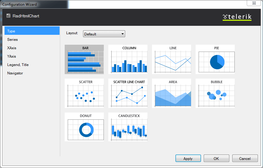
Figure 2: You can use the Configuration Wizard to select a chart layout and chart type, configure a series,set properties for axes, set properties for a chart’s title and legend or configure a Navigator pane.

The tabs and their functionality of the RadHtmlChart Configuration Wizard are explained below.
Type
The Type tab of the Configuration Wizard allows you to select the chart layout and the corresponding chart type you will create.You need to select the layout and the type of the chart first because not all chart series can be combined in the same chart. Selecting the proper type will prevent you from adding a series that will not be supported by the chart layout and the corresponding chart type you will be creating. For example, a PieSeries can be the only series in a chart with Default or Sparkline layout; a Scatter chart cannot host a Line chart because of the different x-axis type, etc.
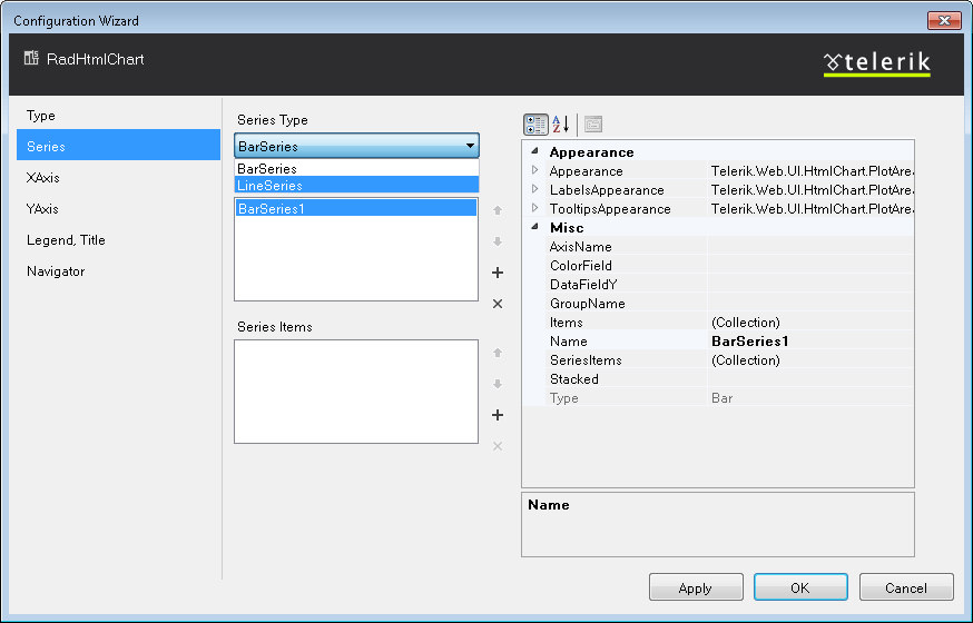
Series
The Series tab is where you modify the series collection. In Figure 3, a Bar chart has been selected in the Type tab, so only the BarSeries and LineSeries can be added. Also, onlythe properties that are applicable for the series' type are displayed.
Figure 3: Selecting a Bar chart will limit the series properties and series items that the Configuration Wizard displays to just the properties that are available for that type of chart.
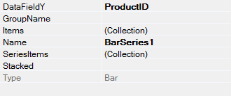
As Figure 4 shows, you can set the desired column from the data source using the DataField textbox.
Figure 4: Setting a desired column from the data source to the BarSeries.
If you want to build a simple or static chart, you can choose to not set a data source and simply add items to the series in the Series Item collection editor below. Once again, the Configuration Wizard only shows properties that are relevant to the type of chart you selected.
The Configuration Wizard doesn't override already defined series. That being said, in order to switch to a different chart type, you must initially remove the inconsistent series and then add the new one. This is done to prevent data loss. Having a Configuration Wizard does not mean that everything will be set (or modified) by it, because this would make it very restrictive and unusable.
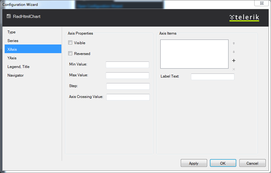
X-Axis
You can configure the x-axis of the chart on the next tab - XAxis (Figure 5).The Configuration Wizard exposes the most common properties of the axis (even though setting them is not necessary in most cases - the chart will adjust itself to the data). The right side of the XAxis tab features an Axis Items collection editor that lets you add static x-axis items.
Figure 5: The XAxis tab of the Configuration Wizard lets you set common x-axis properties or add static axis items.
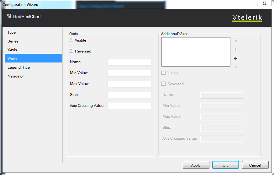
Y-Axis
The YAxis tab of the Configuration Wizard (Figure 6) exposes the Y-Axis configuration.On the left is a set of common properties for the main y-axis. On the right, you'll see an AdditionalYAxes collection editor that lets a developer add additional Y-axes and set their basic settings.
Figure 6: The YAxis tab lets you set y-axis properties or add additional Y-axes.
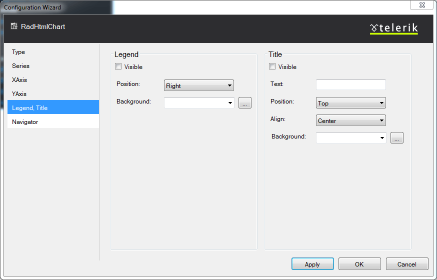
Legend and Title
The Legend, Title tab (Figure 7) allows you to set the global properties of the chart related to the legend and the title. The available positions and alignments are provided in dropdowns and the color fill uses a color picker for fine-tuning without using additional color converters. The Text property is, of course, a textbox into which you can enter a custom string.
Figure 7: Use the Legend, Title tab of the Configuration Wizard to set properties for the legend and title of the chart you selected on the Type tab.
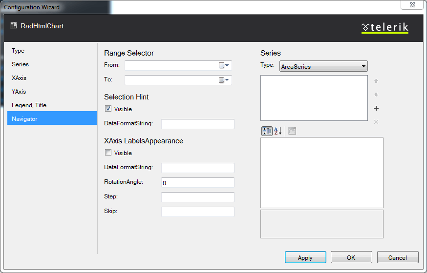
Navigator
If you want to take advantage of the Data Navigation functionality, you can create and customize a Navigator pane from the Navigator tab (Figure 8).
This functionality is available only for a Stock layout.
On the left is a set of properties for modifying the hint, x-axis appearance and the date ranges of the selector use calenders for easing the input of DateTime values. On the right, you'll see the availableSeries collection editor that lets a developer add an appropriate series and adjust their corresponding settings.
Figure 8: Use the Navigator tab of the Configuration Wizard to create and customize a Navigator pane, used for Data Navigation functionality of the Stock layout charts.