Grouping Overview
RadGrid supports grouping of items based on the value of a particular column. You can even have multilevel grouping based on different criteria.
To group the data in a grid, specify grouping criteria by setting the GroupByExpressions property of a table view in the grid. You can set the group-by expressions declaratively at design time, or programmatically in the code-behind.
GridGroupPanel
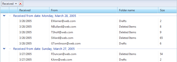
To facilitate grouping, a special area called the GridGroupPanel can be displayed at the top of the grid to display grouping options. To display the group panel, set the grid's ShowGroupPanel property to True. When a table view is grouped, all group fields appear in this group panel as elements along with an icon that indicates the sort order:
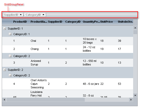
You can access the group panel using the grid's GroupPanel property. You can use PanelStyle and PanelItemsStyle to control the style of the group panel and its items.
You can also specify the position of the GroupPanel by setting the GroupPanelPosition property of the grid. The available options for the GroupPanel positions are: Top, BeforeHeader and Bottom. The following screenshots illustrate the different rendering with those options:
GroupPanelPosition - Top
GroupPanelPosition - BeforeHeader
GroupPanelPosition - Bottom
Users can use the sort indicator of the items in the group panel to specify the sort order of the grouping field.
Optionally, you can let users add sorting fields and rearrange the existing ones by dragging and dropping column headers onto the group panel or allow ungroup option for group panel items by setting the GroupingSettings -> ShowUnGroupButton property of the grid to true:

To allow users to change the grouping by dragging column headers, set the ClientSettings.AllowDragToGroup property to True. You can set this property at design time:
<telerik:RadGrid RenderMode="Lightweight" runat="server" ... />
   <ClientSettings AllowDragToGroup="True"/>
   ...
</telerik:RadGrid>
Alternatively, you can set the AllowDragToGroup property at runtime in the code-behind:
RadGrid RadGrid1 = new RadGrid();
RadGrid1.ClientSettings.AllowDragToGroup = true;
Dim RadGrid1 As RadGrid = New RadGrid
RadGrid1.ClientSettings.AllowDragToGroup = true
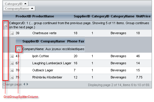
GridGroupSplitterColumn
When a table view is grouped, RadGrid automatically adds a special column (GridGroupSplitterColumn) that holds the buttons which let users expand and collapse groups of items:
You can expand all groups on grid load by setting the GroupsDefaultExpanded property of the MasterTableView to True (this is the default value).
Expand/Collapse all
RadGrid’s grouping structure has been extended with buttons in the group expand column headers that allow all group headerson a given level to be expanded/collapsed.The buttons in question are switched on through the EnableGroupsExpandAll property exposedboth on the level of the grid and the table views.
The new expand-all functionality supports all group load modes.
It is important to note that in the case of grouping for a given table view, the header expand-all buttons’ visibility dependson whether their preceding counterparts are visible and expanded. In other words, if, for example, the expand-all button for grouplevel 2 is collapsed/hidden then all expand-all buttons for the following group levels will be hidden.
When you have grouping and hierarchy combined in a common table view, the visibility of the hierarchy expand-all button depends on whether the expand-all button for the last group level is expanded/visible.