Paging Overview
RadGrid natively supports table paging, which lets users view large sets of data in small chunks for faster loading and easier navigation. It also provides a set of events, helper methods and properties if the paging operation requires custom intervention.
To see the paging functionality in action, check out the Paging Demo.
Set the AllowPaging property to True to have RadGrid handle paging. By default, the AllowPaging property is False. You can set the AllowPaging property for the entire grid or individually for each GridTableView. The AllowPaging setting for a GridTableView control overrides the setting specified for RadGrid.
If you want to handle paging in a custom manner, set the grid's AllowCustomPaging property to True as well.
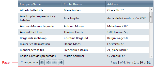
Set the PageSize property on the grid or table view to specify the number of records that should appear in each chunk. When paging is enabled, RadGrid renders a pager item (GridPagerItem) on the bottom and/or top of each GridTableView displayed in the hierarchy. The pager item appears when the number of records in the table view exceeds the page size.

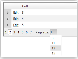
You can also set the PageSizes property, which determines the values that will be displayed in the PageSize combo box in the RadGrid pager item. The default value of this property is int[] { 10,20,50 }.

There are several different pager types that you can use. The template support allows you to design your own pager.
RadGrid exposes the PageSizeControlType property in its PagerStyle property collection, which is an enum of type PagerDropDownControlType. It has three available values:
None
RadComboBox (default)
RadDropDownList
As its name implies, the property specifies what type of page size drop-down control will be rendered. The property provides an easy way to switch off the page size combo or replace it with its lightweight counterpart RadDropDownList.