Icons Overview
This help article showcases how to setup RadButton's icons for its different states and fine tune their position.
Configure RadButton With Icons
You can make your button more intuitive by showing an icon on the left-hand and/or right-hand side of the control (Example 1 and Figure 1). All the Icon-related properties are controlled through the RadButton.Icon inner property. To display an icon on the button, you need to set either the Icon.PrimaryIconCssClass (SecondaryIconCssClass) property, or the Icon.PrimaryIconUrl (SecondaryIconUrl) property.
Figure 1: A RadButton with a primary and a secondary icon.

Example 1: Configure a RadButton with two icons through the Icon.PrimaryIconUrl, Icon.PrimaryIconCssClass and Icon.SecondaryIconCssClass properties.
<style type="text/css">
    .classNextArrow, classPreviousArrow{
        background-image: url('https://demos.telerik.com/aspnet-ajax/button/examples/embeddedicons/images/rbPredefinedIcons.png');
    }

    .classNextArrow {
        background-position: -168px 0;
    }

    .classPreviousArrow {
        background-position: -144px 0;
    }
</style>

<telerik:RadButton RenderMode="Lightweight" ID="RadButton1" runat="server" Text="Button With Two Icons">
    <Icon PrimaryIconUrl="https://demos.telerik.com/aspnet-ajax/button/examples/embeddedicons/images/rbPredefinedIcons.png"
        PrimaryIconCssClass="classNextArrow"
        SecondaryIconCssClass="classPreviousArrow" />
</telerik:RadButton>
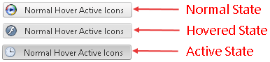
RadButton provides an easy way to show different icon when the mouse is over the control, or the button is pressed (Figure 2 and Example 2). This is achieved through the properties shown in Table 1.
Table 1: RadButton properties that control the primary and secondary icon for the hovered and/or active state.
| Button State | Primary Icon Property | Secondary Icon Property |
|---|---|---|
| Hovered | Icon.PrimaryHoveredIconUrl | Icon.SecondaryHoveredIconUrl |
| Active(Pressed) | Icon.PrimaryPressedIconUrl | Icon.SecondaryPressedIconUrl |
Figure 2: A RadButton can have different icons for its normal, hovered and active state.
Example 2: Setup unique icons for the normal, hovered and active state of a RadButton.
<style>
    .classNextArrow, .classPreviousArrow {
        background-image: url('https://demos.telerik.com/aspnet-ajax/button/examples/embeddedicons/images/rbPredefinedIcons.png');
    }

    .classNextArrow {
        background-position: -168px 0;
    }

    .classPreviousArrow {
        background-position: -144px 0;
    }
</style>

<telerik:RadButton RenderMode="Lightweight" ID="RadButton1" runat="server" Text="Button With Two Icons">
    <Icon PrimaryIconUrl="https://demos.telerik.com/aspnet-ajax/button/examples/embeddedicons/images/rbPredefinedIcons.png" PrimaryIconCssClass="classNextArrow"
        SecondaryIconCssClass="classPreviousArrow" />
</telerik:RadButton>
Fine-tuning RadButton's Icon Position
At first the Icons might not be positioned exactly the way we want, but this can be easily changed by directly setting the properties that control the top, bottom, left or right offset of the respective icon (Table 2):
Table 2: RadButton properties that control the offset of the primary and secondary icon.
| Offset | Primary Icon Property | Secondary Icon Property |
|---|---|---|
| Top | Icon.PrimaryIconTop | Icon.SecondaryIconTop |
| Bottom | Icon.PrimaryIconBottom | Icon.SecondaryIconBottom |
| Left | Icon.PrimaryIconLeft | Icon.SecondaryIconLeft |
| PrimaryIconRight | Icon.PrimaryIconRight | Icon.SecondaryIconRight |
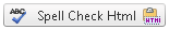
Alternatively, a CSS class can be set to the icon, and the position configured using CSS.
-
Properties:
ASP.NET
<telerik:RadButton RenderMode="Lightweight" ID="RadButton2" runat="server" Text="Spell Check Html"> <Icon PrimaryIconUrl="https://demos.telerik.com/aspnet-ajax/button/examples/customicons/images/eSpellCheck.png" PrimaryIconTop="4px" PrimaryIconLeft="5px" SecondaryIconUrl="https://demos.telerik.com/aspnet-ajax/button/examples/customicons/images/eHtml.png" SecondaryIconTop="4px" SecondaryIconRight="5px" /> </telerik:RadButton> -
Or the same configuration using CSS classes:
CSS
<style type="text/css">
    .classSpellCheck {
        top: 4px;
        left: 5px;
    }

    .classHtml {
        top: 4px;
        right: 5px;
    }
</style>
ASP.NET
<telerik:RadButton RenderMode="Lightweight" ID="RadButton3" runat="server" Text="Spell Check Html">
    <Icon PrimaryIconUrl="https://demos.telerik.com/aspnet-ajax/button/examples/customicons/images/eSpellCheck.png" PrimaryIconCssClass="classSpellCheck"
        SecondaryIconUrl="https://demos.telerik.com/aspnet-ajax/button/examples/customicons/images/eHtml.png" SecondaryIconCssClass="classHtml" />
</telerik:RadButton>
Figure 3: Primary and Secondary icons in RadButton can be offset.