Toggle button
The RadButton control can be easily configured to behave as a toggle button. Simply set the ToggleType property to a value different than ButtonToggleType.None, and the button is transformed into a check box, a radio button or a completely customized toggle button. Since the ButtonType property controls how the component looks like, the user can have his/her buttons look like standard buttons or even <input type="submit|button" /> elements, and behave like check boxes or radio buttons. Here are some code samples showing how this is achieved:
Configure RadButton Controls as CheckBoxes
In order to configure the RadButton as a checkbox you must do the following steps:
Set the ToggleType property of the button to "CheckBox".
-
Choose the desired button type through the ButtonType property:
- StandardButton - For a standard button layout.
- LinkButton - For link button layout.
- ToggleButton - For a native checkbox layout.
Define whether the checkbox is checked or not through the Checked property.
You can make a further customization to both toggle states through the correspondingproperties (e.g., Text, Value,Selected, CssClass, etc.) of the RadButtonToggleState class.
Example 1: Configuring RadButton as a checkbox with a StandardButton,LinkButton and ToggleButton button type.
<telerik:RadButton RenderMode="Lightweight" ID="btnToggle1" runat="server" Text="Checkbox 1" ToggleType="CheckBox"
    ButtonType="StandardButton"></telerik:RadButton>

<telerik:RadButton RenderMode="Lightweight" ID="btnToggle2" runat="server" Text="Checkbox 2" ToggleType="CheckBox"
    ButtonType="LinkButton"></telerik:RadButton>

<telerik:RadButton RenderMode="Lightweight" ID="btnToggle2" runat="server" Text="Checkbox 3" ToggleType="CheckBox"
    ButtonType="ToggleButton"></telerik:RadButton>
Figure 1: RadButton's checkbox functionality is relevant not only for a native checkbox appearance but also fora StandardButton and LinkButton button types.

Configure RadButton Controls as Radio Buttons
In order to configure the RadButton as a radio button you must do the following steps:
Set the ToggleType property of the button to "Radio".
-
Choose the desired button type through the ButtonType property:
- StandardButton - For a standard button layout.
- LinkButton - For link button layout.
- ToggleButton - For a native radio button layout.
Define whether the radio button is checked or not through the Checked property.
Set a common value for the GroupName property of the radio buttons that are within the same group.
You can make a further customization to both toggle states through the corresponding properties (e.g., Text, Value, Selected, CssClass, etc.) of the RadButtonToggleState class.
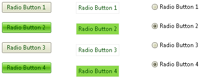
Example 2: Configuring RadButton as a radio button with a StandardButton, LinkButton and ToggleButton button type.
<telerik:RadButton RenderMode="Lightweight" ID="btnToggle1" runat="server" Text="Radio Button 1" ToggleType="Radio"
    ButtonType="StandardButton"></telerik:RadButton>

<telerik:RadButton RenderMode="Lightweight" ID="btnToggle2" runat="server" Text="Radio Button 2" ToggleType="Radio"
    ButtonType="LinkButton"></telerik:RadButton>

<telerik:RadButton RenderMode="Lightweight" ID="btnToggle3" runat="server" Text="Radio BUtton 3" ToggleType="Radio"
    ButtonType="ToggleButton"></telerik:RadButton>
Figure 2: RadButton's radio button functionality is relevant not only for a native radio button's appearance but also for a StandardButton and LinkButton button types.
Configure a RadButton Control with Custom Toggle States
In order to configure a RadButton with custom toggle states you must do the following steps:
Set the ToggleType property of the button to "CustomToggle".
-
Choose the desired button type through the ButtonType property:
- StandardButton - For a standard button layout.
- LinkButton - For link button layout.
- ToggleButton - For a native layout.
Add as many RadButtonToggleState instances as you like to the ToggleStates collection. Make a further customization to each toggle state through the corresponding properties (e.g., Text, Value, Selected, CssClass, etc.) of the RadButtonToggleState class.
Example 3: Configuring RadButton with custom toggles states with a StandardButton, LinkButton and ToggleButton button type.
<telerik:RadButton RenderMode="Lightweight" ID="btnToggle1" runat="server" ToggleType="CustomToggle" ButtonType="StandardButton">
    <ToggleStates>
     <telerik:RadButtonToggleState Text="UnChecked" PrimaryIconCssClass="rbToggleCheckbox" />
     <telerik:RadButtonToggleState Text="Filled" PrimaryIconCssClass="rbToggleCheckboxFilled" />
     <telerik:RadButtonToggleState Text="Checked" PrimaryIconCssClass="rbToggleCheckboxChecked" />
    </ToggleStates>
</telerik:RadButton>

<telerik:RadButton RenderMode="Lightweight" ID="btnToggle1" runat="server" ToggleType="CustomToggle" ButtonType="LinkButton">
    <ToggleStates>
     <telerik:RadButtonToggleState Text="UnChecked" PrimaryIconCssClass="rbToggleCheckbox" />
     <telerik:RadButtonToggleState Text="Filled" PrimaryIconCssClass="rbToggleCheckboxFilled" />
     <telerik:RadButtonToggleState Text="Checked" PrimaryIconCssClass="rbToggleCheckboxChecked" />
    </ToggleStates>
</telerik:RadButton>

<telerik:RadButton RenderMode="Lightweight" ID="btnToggle1" runat="server" ToggleType="CustomToggle" ButtonType="ToggleButton">
    <ToggleStates>
     <telerik:RadButtonToggleState Text="UnChecked" PrimaryIconCssClass="rbToggleCheckbox" />
     <telerik:RadButtonToggleState Text="Filled" PrimaryIconCssClass="rbToggleCheckboxFilled" />
     <telerik:RadButtonToggleState Text="Checked" PrimaryIconCssClass="rbToggleCheckboxChecked" />
    </ToggleStates>
</telerik:RadButton>
Figure 3: RadButton's custom toggle state functionality is relevant also for a StandardButton and LinkButton button types.

In the code above, the PrimaryIconCssClassproperty is used to specify a three-state (3-state) checkbox, and the Text property to have different text depending on the currently selected state.
To take a closer look at RadButton's "toggle button" functionality please visit our online demos.