Getting Started with the BottomNavigation
This tutorial explains how to set up a basic Telerik UI for ASP.NET Core BottomNavigation and highlights the major steps in the configuration of the component.
You will initialize a BottomNavigation control and configure two items. Next, you will handle the Select() event and allow the user to switch between the content of the items. Finally, you can run the sample code in Telerik REPL and continue exploring the components.
Prerequisites
To successfully complete the tutorial, you need a project that is already configured to use the Telerik UI for ASP.NET Core components:
You can use the Telerik REPL playground and skip installing the components on your system and configuring a project.
-
You can prepare a Visual Studio project by following the following guide:
- Creating a new pre-configured project for the Telerik UI for ASP.NET Core components from a project template.
1. Prepare the CSHTML File
The first step is to add the required directives at the top of the .cshtml document:
-
To use the Telerik UI for ASP.NET Core HtmlHelpers:
@using Kendo.Mvc.UI -
To use the Telerik UI for ASP.NET Core TagHelpers:
@addTagHelper *, Kendo.Mvc
Optionally, you can structure the document by adding the desired HTML elements like headings, divs, paragraphs, and apply some basic styles.
    @using Kendo.Mvc.UI

    <div class="demo-app" style="position:relative">

    </div>

    <style>
        .demo-app {
            margin: auto;
            width: 234px;
            height: 400px;
        }
    </style>
    @addTagHelper *, Kendo.Mvc

    <div class="demo-app" style="position:relative">

    </div>

    <style>
        .demo-app {
            margin: auto;
            width: 234px;
            height: 400px;
        }
    </style>
2. Initialize the BottomNavigation
Use the BottomNavigation HtmlHelper or TagHelper to add the component to a page:
- The
Name()configuration method is mandatory as its value is used for theidand the name attributes of the BottomNavigation element. - The
PositionModedefines the position of the BottomNavigation component. - The
Items()configuration specifies the items that will be rendered in the BottomNavigation and allows you to:- Set their
TextandIconattributes. - Add classes for the individual items.
- Set the
SelectedandEnabledstate of the items.
- Set their
    @using Kendo.Mvc.UI

    <div class="demo-app" style="position:relative">
        @(Html.Kendo().BottomNavigation()
            .Name("bottomNavigation")
            .PositionMode(BottomNavigationPositionMode.Absolute)
            .Items(i=> {
                i.Add().Text("Profile").Icon("user").Selected(true);
                i.Add().Text("Calendar").Icon("calendar-date");
            })
        )
    </div>

    <style>
        .demo-app {
            margin: auto;
            width: 234px;
            height: 400px;
        }
    </style>
    @addTagHelper *, Kendo.Mvc
    @{
        var calendar = new { view = "calendar" }; // Declare the variables for the BottomNavigation items.
        var profile = new { view = "profile" };
    }

    <div class="demo-app" style="position:relative">
        <kendo-bottomnavigation name="bottomNavigation" position-mode="BottomNavigationPositionMode.Absolute">
            <bottomnavigation-items>
                <bottomnavigation-item context-data="@profile" text="Profile" icon="user" selected="true"></bottomnavigation-item>
                <bottomnavigation-item context-data="@calendar" text="Calendar" icon="calendar-date"></bottomnavigation-item>
            </bottomnavigation-items>
        </kendo-bottomnavigation>
    </div>

    <style>
        .demo-app {
            margin: auto;
            width: 234px;
            height: 400px;
        }
    </style>
3. Configure the Appearance
To alter the appearance of the component, use the ThemeColor and fill options. Additionally, you can set the desired HTML attributes.
    @using Kendo.Mvc.UI

    <div class="demo-app" style="position:relative">
        @(Html.Kendo().BottomNavigation()
            .Name("bottomNavigation")
            .PositionMode(BottomNavigationPositionMode.Absolute)
            .HtmlAttributes( new { style="bottom:0;"})
            .Fill(BottomNavigationFill.Solid)
            .ThemeColor( BottomNavigationThemeColor.Primary)
            .Items(i=> {
                i.Add().Text("Profile").Icon("user").Selected(true);
                i.Add().Text("Calendar").Icon("calendar-date");
            })
        )
    </div>

    <style>
        .demo-app {
            margin: auto;
            width: 234px;
            height: 400px;
        }
    </style>
    @addTagHelper *, Kendo.Mvc
    @{
        var calendar = new { view = "calendar" }; // Declare the variables for the BottomNavigation items.
        var profile = new { view = "profile" };
    }

    <div class="demo-app" style="position:relative">
        <kendo-bottomnavigation name="bottomNavigation" position-mode="BottomNavigationPositionMode.Absolute" style="bottom:0;"
            fill="BottomNavigationFill.Solid"
            theme-color="BottomNavigationThemeColor.Primary">
            <bottomnavigation-items>
                <bottomnavigation-item context-data="@profile" text="Profile" icon="user" selected="true"></bottomnavigation-item>
                <bottomnavigation-item context-data="@calendar" text="Calendar" icon="calendar-date"></bottomnavigation-item>
            </bottomnavigation-items>
        </kendo-bottomnavigation>
    </div>

    <style>
        .demo-app {
            margin: auto;
            width: 234px;
            height: 400px;
        }
    </style>
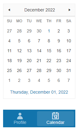
4. Add Content to the BottomNavigation Items
The next step is to add some basic content that will be displayed when the user selects each item:
- Add an avatar that will appear when the user selects the Profile BottomNavigation item.
- Initialize a Calendar component that will appear when the user selects the Calendar BottomNavigation item.
To navigate between the content of the two items, you must configure the event handling as described in the next step.
    @using Kendo.Mvc.UI

    <div class="demo-app" style="position:relative">
        @(Html.Kendo().BottomNavigation()
            .Name("bottomNavigation")
            .PositionMode(BottomNavigationPositionMode.Absolute)
            .HtmlAttributes( new { style="bottom:0;"})
            .Fill(BottomNavigationFill.Solid)
            .ThemeColor( BottomNavigationThemeColor.Primary)
            .Items(i=> {
                i.Add().Text("Profile").Icon("user").Selected(true);
                i.Add().Text("Calendar").Icon("calendar-date");
            })
        )
        <div id="profile" class="demo-view" style="display: initial;position:absolute;">
            <img src=@Url.Content("https://demos.telerik.com/aspnet-core/shared/web/avatar.png") width="128" height="128" />
        </div>
        <div id="calendar" style="display: none;position:absolute" class="demo-view">
            @(Html.Kendo().Calendar().Name("calendar-widget"))
        </div>
    </div>

    <style>
        .demo-app {
            margin: auto;
            width: 234px;
            height: 400px;
        }
    </style>
    @addTagHelper *, Kendo.Mvc
    @{
        var calendar = new { view = "calendar" }; // Declare the variables for the BottomNavigation items.
        var profile = new { view = "profile" };
    }

    <div class="demo-app" style="position:relative">
        <kendo-bottomnavigation name="bottomNavigation" position-mode="BottomNavigationPositionMode.Absolute" style="bottom:0;"
            fill="BottomNavigationFill.Solid"
            theme-color="BottomNavigationThemeColor.Primary">
            <bottomnavigation-items>
                <bottomnavigation-item context-data="@profile" text="Profile" icon="user" selected="true"></bottomnavigation-item>
                <bottomnavigation-item context-data="@calendar" text="Calendar" icon="calendar-date"></bottomnavigation-item>
            </bottomnavigation-items>
        </kendo-bottomnavigation>
        <div id="profile" class="demo-view" style="display: initial;position:absolute;">
            <img src=@Url.Content("https://demos.telerik.com/aspnet-core/shared/web/avatar.png") width="128" height="128" />
        </div>
        <div id="calendar" style="display: none;position:absolute" class="demo-view">
            @(Html.Kendo().Calendar().Name("calendar-widget"))
        </div>
    </div>

    <style>
        .demo-app {
            margin: auto;
            width: 234px;
            height: 400px;
        }
    </style>
5. Handle BottomNavigation Events
The BottomNavigation component exposes the Select() event that you can handle and further customize the functionality of the component.
    @using Kendo.Mvc.UI

    <div class="demo-app" style="position:relative">
        @(Html.Kendo().BottomNavigation()
            .Name("bottomNavigation")
            .PositionMode(BottomNavigationPositionMode.Absolute)
            .HtmlAttributes( new { style="bottom:0;"})
            .Fill(BottomNavigationFill.Solid)
            .ThemeColor( BottomNavigationThemeColor.Primary)
            .Items(i=> {
                i.Add().Text("Profile").Data(new { view = "profile" }).Icon("user").Selected(true);
                i.Add().Text("Calendar").Data(new { view = "calendar" }).Icon("calendar-date");
            })
            .Events(e => e.Select("onSelect"))
        )
        <div id="profile" class="demo-view" style="display: initial;position:absolute;">
            <img src=@Url.Content("https://demos.telerik.com/aspnet-core/shared/web/avatar.png") width="128" height="128" />
        </div>
        <div id="calendar" style="display: none;position:absolute" class="demo-view">
            @(Html.Kendo().Calendar().Name("calendar-widget"))
        </div>
    </div>
    <script>
        function onSelect(e) {
            var id = e.data.view
            $(".demo-view").hide();
            $("#" + id).show();
        }
    </script>
    <style>
        .demo-app {
            margin: auto;
            width: 234px;
            height: 400px;
        }
    </style>
    @addTagHelper *, Kendo.Mvc
    @{
        var calendar = new { view = "calendar" };
        var profile = new { view = "profile" };
    }

    <div class="demo-app" style="position:relative">

        <kendo-bottomnavigation name="bottomNavigation" on-select="onSelect"position-mode="BottomNavigationPositionMode.Absolute" style="bottom:0;"
            fill="BottomNavigationFill.Solid"
            theme-color="BottomNavigationThemeColor.Primary">
            <bottomnavigation-items>
                <bottomnavigation-item context-data="@profile" text="Profile" icon="user" selected="true"></bottomnavigation-item>
                <bottomnavigation-item context-data="@calendar" text="Calendar" icon="calendar-date"></bottomnavigation-item>
            </bottomnavigation-items>
        </kendo-bottomnavigation>

        <div id="profile" class="demo-view" style="display: initial;position:absolute;">
            <img src=@Url.Content("https://demos.telerik.com/aspnet-core/shared/web/avatar.png") width="128" height="128" />
        </div>
        <div id="calendar" style="display: none;position:absolute" class="demo-view">
            <kendo-calendar name="calendar-widget"></kendo-calendar>
        </div>

    </div>

    <script>
    function onSelect(e) {
        var id = e.data.view
        $(".demo-view").hide();
        $("#" + id).show();
    }
    </script>
    <style>
    .demo-app {
        margin: auto;
        width: 234px;
        height: 400px;
    }
    </style>
For more examples, refer to the demo on using the events of the BottomNavigation.
6. (Optional) Reference Existing BottomNavigation Instances
You can reference the BottomNavigation instances that you have created and build on top of their existing configuration:
-
Use the
idattribute of the component instance to establish a reference.<script> var bottomNavigationReference = $("#bottomNavigation").data("kendoBottomNavigation"); // bottomNavigationReference is a reference to the existing instance of the helper. </script> -
Use the BottomNavigation client-side API to control the behavior of the widget. In this example, you will use the
enablemethod to control the state of the BottomNavigation items.<script> var bottomNavigationReference = $("#bottomNavigation").data("kendoBottomNavigation"); // bottomNavigationReference is a reference to the existing instance of the helper. bottomNavigationReference.enable($("#calendar"), false); // Disable the calendar item. </script>
For more information on referencing specific helper instances, see the Methods and Events article.
Explore this Tutorial in REPL
You can continue experimenting with the code sample above by running it in the Telerik REPL server playground:
Next Steps
- Using the BottomNavigation Templates
- Configuring the Items of the BottomNavigation
- Configuring BottomNavigation Appearance