Getting Started with the DateInput
This tutorial explains how to set up a basic Telerik UI for ASP.NET Core DateInput and highlights the major steps in the configuration of the component.
You will initialize a DateInput component and set a default value. Finally, you can run the sample code in Telerik REPL and continue experimenting with different configurations.
Prerequisites
To successfully complete the tutorial, you need a project that is already configured to use the Telerik UI for ASP.NET Core components:
You can use the Telerik REPL playground and skip installing the components on your system and configuring a project.
-
You can prepare a Visual Studio project by following the following guide:
- Creating a new pre-configured project for the Telerik UI for ASP.NET Core components from a project template.
1. Prepare the CSHTML File
The first step is to add the required directives at the top of the .cshtml document:
-
To use the Telerik UI for ASP.NET Core HtmlHelpers:
@using Kendo.Mvc.UI -
To use the Telerik UI for ASP.NET Core TagHelpers:
@addTagHelper *, Kendo.Mvc
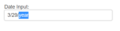
2. Initialize the DateInput
Use the DateInput HtmlHelper or TagHelper to add the component to the page:
- The
Name()configuration method is mandatory as its value is used for theidand thenameattributes of the DateInput element. - The
Label()configuration specifies the label text of the DateInput. Optionally, you can enable theFloatingfeature of the label.
Do not set the
Name()option when usingDateInputFor. The[ComponentName]Formethod automatically sets the control'sName()to the field it is bound to. For more information, see the Fundamentals article.
    @(Html.Kendo().DateInput()
        .Name("dateinput")
        .Label(label=>{
            label.Content("DateInput:")
        })
    )
    @addTagHelper *, Kendo.Mvc

    <kendo-dateinput name="dateinput">
        <label content="DateInput:" />
    </kendo-dateinput>
3. Set a Default Value
The next step is to set a default value. The following example shows how to use the .Value() method of the DateInput, to set the current date as a value of the component.
    @{
       var defaultDateInput = DateTime.Now;
    }

    @(Html.Kendo().DateInput()
        .Name("dateinput")
        .Label(label=>{
            label.Content("DateInput:")
        })
        .Value(defaultDateInput)
    )
    @addTagHelper *, Kendo.Mvc
    @{
         var defaultDateInput = DateTime.Now;
    }

    <kendo-dateinput name="dateinput" value="defaultDateInput">
        <label content="DateInput:" />
    </kendo-dateinput>
4. (Optional) Reference Existing DateInput Instances
To use the client-side API of the DateInput and build on top of its initial configuration, create a reference to the DateInput instance. Once you get a valid reference, you can call the respective API methods:
-
Use the
.Name()(idattribute) of the component instance to get a reference.<script> $(document).ready(function() { var dateinputReference = $("#dateinput").data("kendoDateInput"); // dateinputReference is a reference to the existing DateInput instance of the helper. }) </script> -
Use the DateInput client-side API to control the behavior of the control. In this example, you will use the
enablemethod to disable the input.<script> $(document).ready(function() { var dateinputReference = $("#dateinput").data("kendoDateInput"); // dateinputReference is a reference to the existing DateInput instance of the helper. dateinputReference.enable(false); // enable or disable the input }) </script>
Explore this Tutorial in REPL
You can continue experimenting with the code sample above by running it in the Telerik REPL server playground: