Adding Choropleth Maps to Reports with the Choropleth Wizard
This article demonstrates how to add a Choropleth map to your report by using the Map Wizard of the Standalone Report Designer.
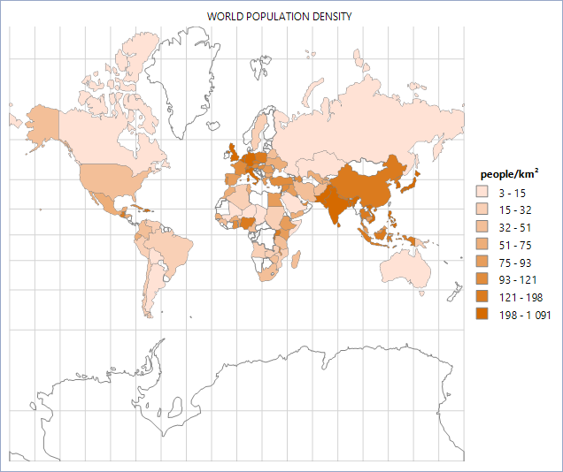
The suggested approach will create and set up a Choropleth map that will show the world population for each country and coloring its area depending on the population density value.
You will use a CSV Data Source for the analytical data and an ESRI Shapefile for the spatial data.
The analytical data will be obtained from the List of sovereign states and dependent territories by population density Wikipedia article.
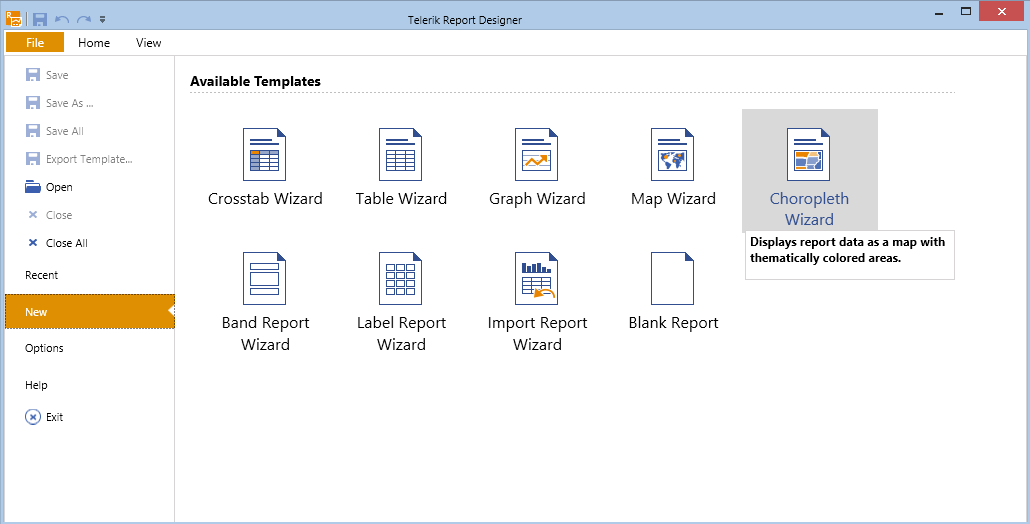
1. Start the Map Wizard
-
(For new reports) From the Available Templates page, select the Choropleth Wizard icon.
(For existing reports) From the
Insertmenu, select theChoroplethitem. As a result, the Choropleth Wizard will start and guide you through the creation process.
2. Add the Data Source
Now, you will add a new CSV Data Source and name it populationData. This data source will hold the information about the countries, their area, population, and density along with some additional data.
Although you can copy the data directly from the Wikipedia page mentioned above, for your convenience pass the ready-to-use CSV file and pass it to the CSV data source.
- Download the
PopulationData.zipfile, save it locally, and extract its contents in a folder. - Navigate to that folder, locate the
PopulationDensity.csvfile, and copy its location path. - Back in the Wizard, insert the path to the
CSVfile into the Select a file to import textbox or paste its contents in the Enter CSV as text tab. - The file uses semicolon (;) as a separator and comma (,) for the thousands separator. On the Configure the separators page, tick the semicolon checkbox and untick the comma checkbox.
- Click Next until you get to the CSV Headers page. Note that the
CSVfile has headers and you have to check the The CSV has headers checkbox. -
On the Map columns to type page, set the column types to match the actual data they represent.
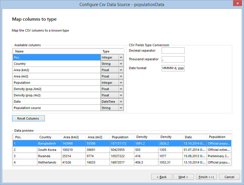
When you click Parse CSV... on the next page, you will see the result of the parsed file. Click Finish when you are ready.
- In the Available data sources list, you can see the datasource you've already created. Select it and click Next.
3. Provide the Spatial Data
On the next page, you have to select the source that will provide the spatial data to your choropleth. In this example, you will use a Shapefile bundle which consists of the world.shp and world.dbf files. The files are located in the \Resources subfolder of the directory where the PopulationDensity.zip file is extracted.
- Select the Binary file in ESRI Shapefile format radio button.
- Browse to the directory where your Shapefile is placed or paste the path to the file in the textbox.
-
When the path to the Shapefile is set, create the relations between the fields in the analytical (
CSV) data set and the fields from theworld.dbffile, which is part of the Shapefile bundle.Click the New button on the relations control. A new row will appear. From the Analytical Field column, select Fields.Country. Match it with the Fields.CNTRY_NAME field from the Shapefile Field column.
Your Choose a spatial data source page will look like the following:
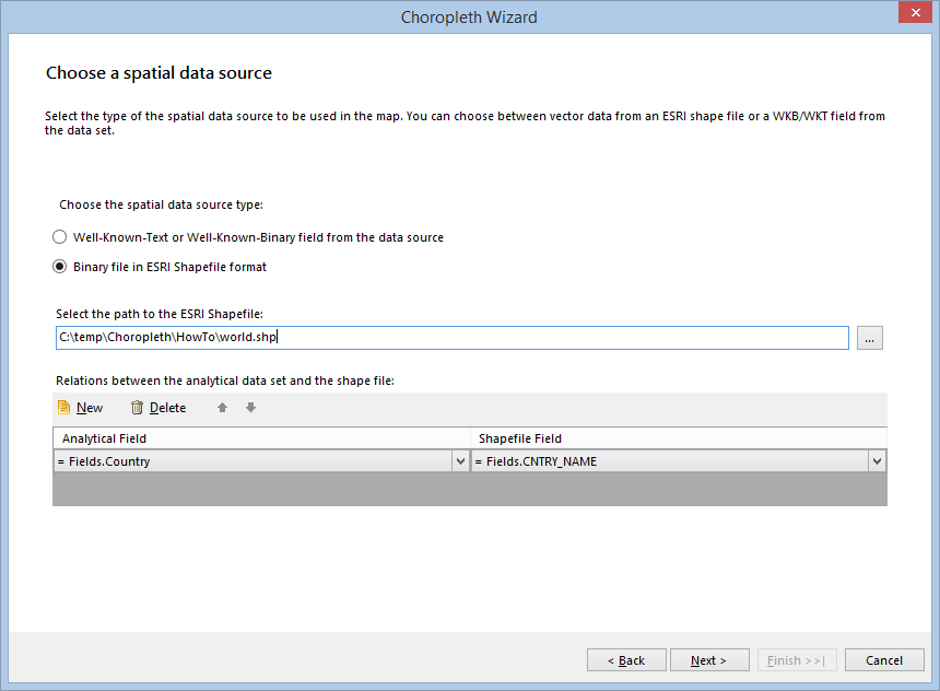
When the mandatory fields are set up, the Next button will be activated. Click Next and you will be able to go to the next page.
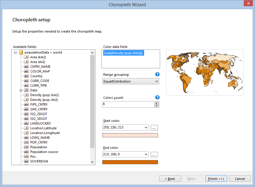
4. Set the Specific Fields
On the following page, you will set the fields that are specific to the Choropleth map. Note that in the Available fields you will see the fields from both the analytical and spatial data sets.
- Select the Density (pop./km2) field and drag it to Color data field: box, where it will be transformed to Sum([Density (pop./km2)]). You can omit the aggregate operator, since every country is on a separate row in the data set, and the Sum operator will aggregate only one row.
- Select EqualDistribution as a Range grouping method, which will distribute the data points evenly in groups or clusters.
- Set a proper value to the Colors count property, which will define the number of clusters in which the color data values will be distributed. For the purposes of this example, choose 8.
-
Set appropriate colors for the Start color and End color properties. They will be used to create a
GradientPalette, which will distribute graded colors among the data points.The data points that have lower color values will receive colors from the start of the palette and the data points with the higher color values will receive colors from the end of the palette.
-
Check the appearance of the Choropleth setup page which will look similar to the following image:
-
When you click the Finish button, the Map will display the Choropleth map. Add some formatting to its title and legend and will look similar to the following image:
Considerations
Some areas (countries) on the Map are transparent. These areas represent shapes that have no match with the analytical data set fields.
The Choropleth displays all the shapes that are available in the spatial data set, but the data points are created only when the field from the analytical data set is matched with a field from the spatial data by using the MapRelationPairCollection.
The suggested approach uses a Shapefile for all the countries in the world, but you have analytical data for the 100 most populated countries. This means that some of the shapes will never be matched with the analytical data set and, therefore, will not be colored, because they don't have a valid population value.
Another reason for having transparent areas is the mismatch of the fields that are used in the Relation Pairs. Take a look at the following screenshot showing a part of Africa:
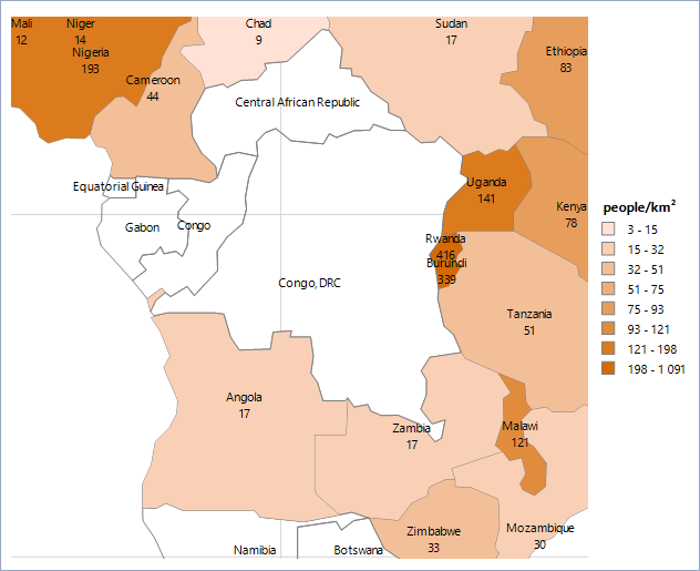
For this screenshot, the data point labels are visible and have the following expression set to them: = Format('{0} {1}', Fields.CNTRY_NAME, Sum(Fields.[Density (pop./km2)])). Note that the expression uses the fields from both the spatial and the analytical data set. As a result, the Choropleth displays Congo, DRC as a country name but does not display a valid population value for it. Since the countries are bound by name, the engine tries to find a country named Congo, DRC in the analytical data set, but fails, because in the CSV data source this country is named Democratic Republic of the Congo (Pos. 79). If you edit the CSV data and rename the country to Congo, DRC, you will see that the both records are matched, the country area is now colored, and a valid population value (29.6) is displayed.
This example demonstrated how to create a simple Choropleth map by using data from analytical and spatial data sources without writing a single line of code. You can find the PopulationDensity.trdx actual report definition in the contents of the PopulationDensity.zip archive that was used earlier.