Setting the Flat Button Color
Environment
| Product Version | 1.5.0 |
| Product | Unite UX |
Description
How can I set the color of a flat Button in its hover and focus states?
Solution
To achieve their distinct and yet consistent look, the hover and focus states of the flat Kendo and Telerik UI Button component take advantage of CSS pseudo-elements:
The
::beforepseudo-element defines the background color of the flat Button in a hover state.The
::afterpseudo-element defines the shadow color of the flat Button in a focus state (the Default and Bootstrap themes have no background).
The hover and focus states derive their color from the color of the Button text by applying opacity in the corresponding pseudo-element properties.
Setting the Flat Button Background in Hover State
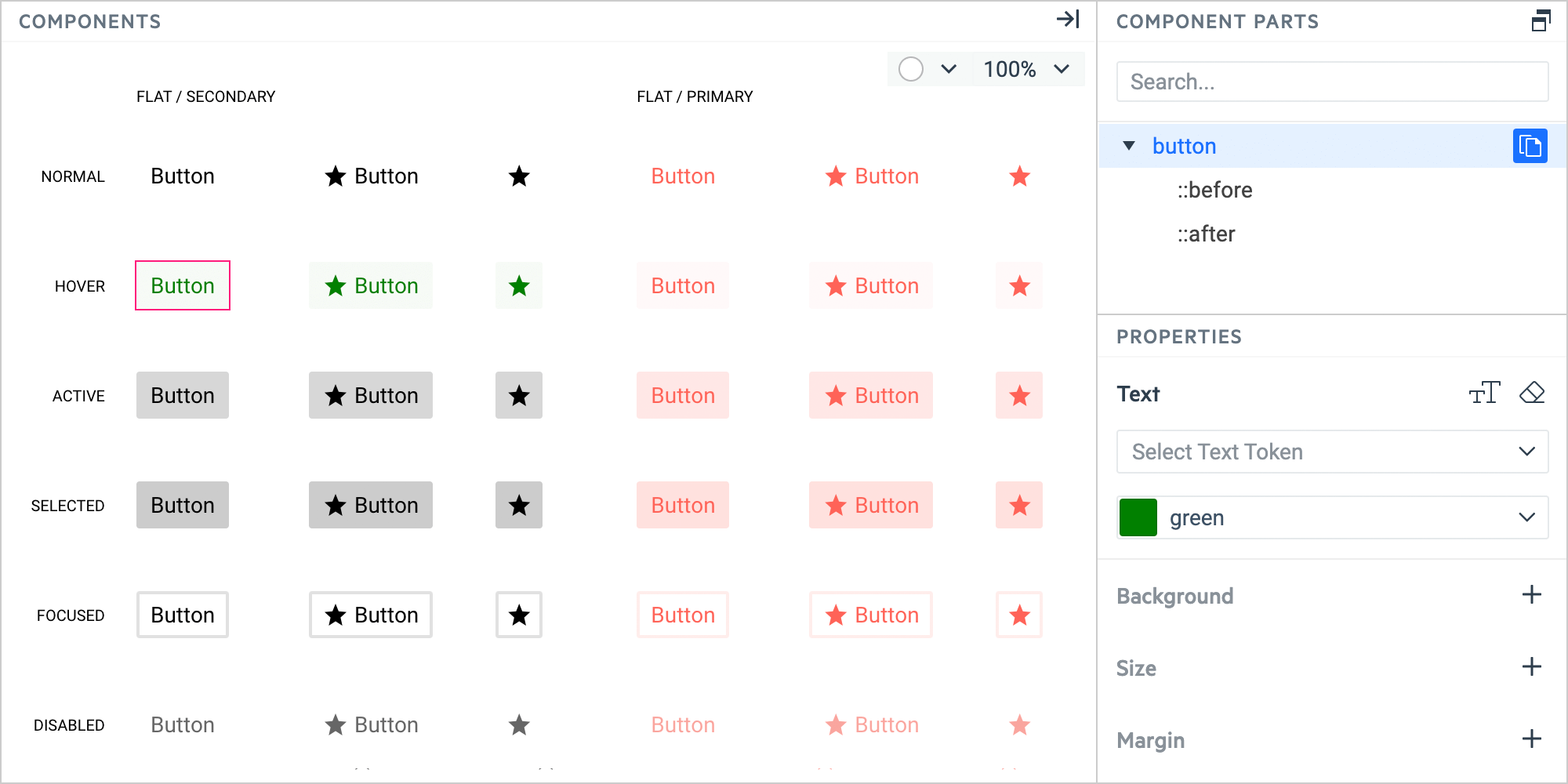
In the COMPONENTS pane, select the flat Button in HOVER state.
In the COMPONENT PARTS pane, select the button part.
In the PROPERTIES pane, select the Text property.
Set a color by entering the color name in the dropdown, for example,
green.In the COMPONENT PARTS pane, select the ::before part.
In the PROPERTIES pane, select the Opacity & Visibility property and enter the desired value in the input field, for example,
20%.
Setting the Flat Button Background in Focus State
In the COMPONENTS pane, select the flat Button in FOCUS state.
In the COMPONENT PARTS pane, select the button part.
In the PROPERTIES pane, select the Text property.
Set a color by entering the color name in the dropdown, for example,
green.In the COMPONENT PARTS pane, select the ::before part.
In the PROPERTIES pane, select the Opacity & Visibility property and enter the desired value in the input field, for example,
20%.
If you need to apply additional effects, use the ::after component part and set its Effects properties.