Customizing Components
To help you make your first steps with Unite UX and lay the foundation of your new design system, this tutorial demonstrates how to match the Kendo UI Button component styles with a button design that was created by a UI or UX designer.
Unite UX allows you to compare the design that is exported by a designer and the design of the Kendo UI components side by side. To increase your productivity, you can directly transfer styles from the design to the Kendo UI components. You can inspect the values of every design property, for example, borders, colors, background effects. With a single click, you can apply these values to the UI components and achieve a perfect match.
To customize a component in Unite UX:
Prerequisites
Logging into Unite UX
Navigate to uniteux.telerik.com.
In the Unite UX authentication window, enter the login credentials for your Telerik account. Click LOG IN.
Creating a Unite UX Project
In this tutorial, you create a new project from a template. The template behaves like a design that has been exported and shared by a designer - it includes all required assets like component designs and icons.
To create the project:
- Navigate to the Unite UX dashboard.
- Enter your credentials, and then select LOG IN.
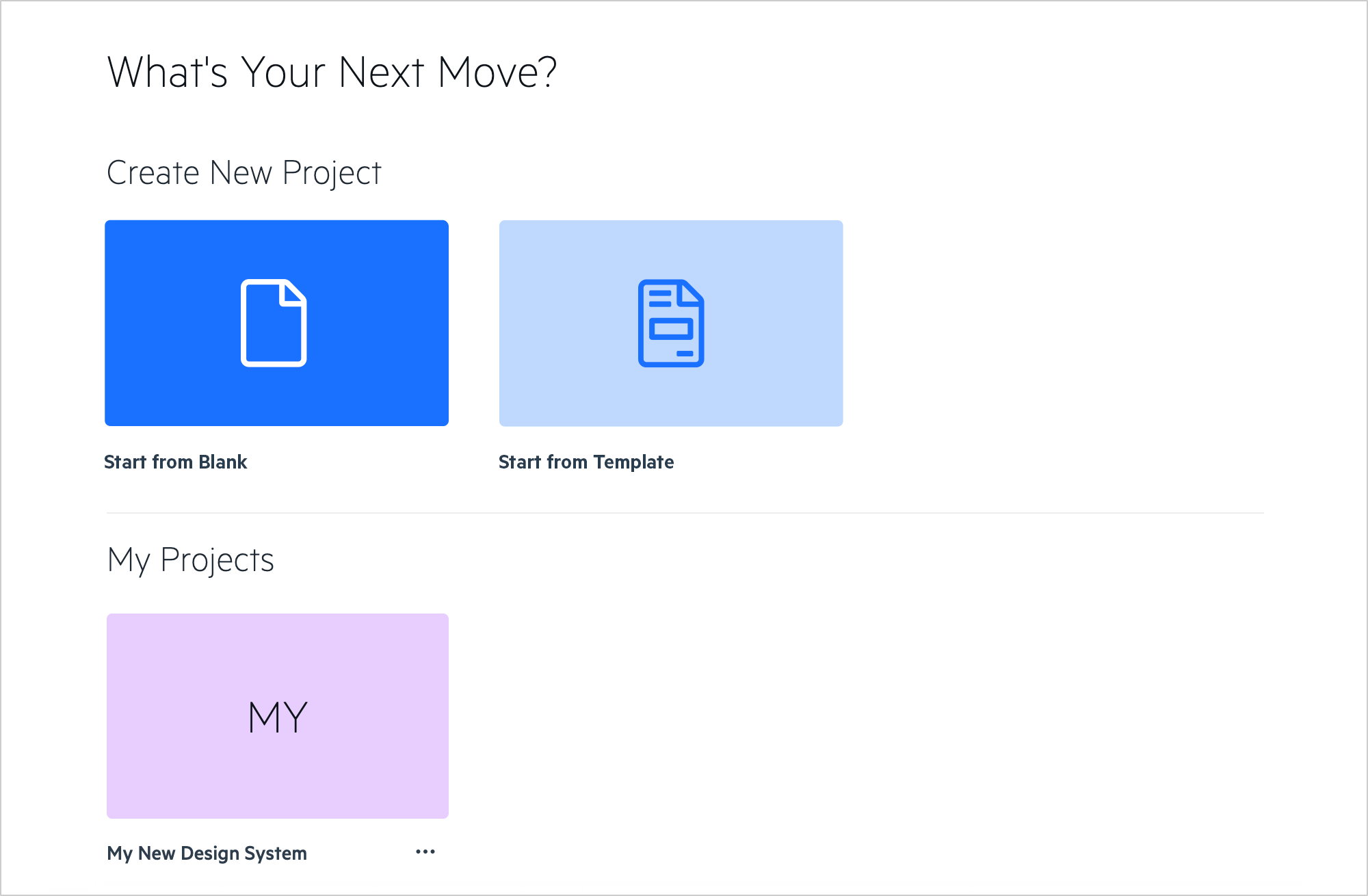
- Under Create New Project, select Start From Template
- Enter a name for the project, and then select CREATE.
When you work with a designer on your UI component library or design system, use the Start from Blank option.
Applying Design Styles to UI Components
Before you start with the customization of the UI components, inspect the Unite UX screen. By default, you will see the following panes:
DESIGN—Shows the design that has been created in Figma and then exported by a designer.
COMPONENTS—Shows the Kendo UI components.
DESIGN PARTS—Allows you to inspect the components from the design and their layers. This pane appears when you select a component from the design.
COMPONENT PARTS—Allows you to select and customize the parts that comprise a UI component. This pane appears when you select a UI component.
PROPERTIES—Allows you to modify the individual properties of the UI components. This pane appears when you select a UI component.
DESIGN STYLES—Allows you to inspect the styles in the design. This pane appears when you select a component from the design.
COMPARISON pane—Allows you to compare the design with the styles of the UI components.
To apply the styles from the design to the Kendo UI components:
In the DESIGN pane, zoom in to see more details in the Button frame. Do the same for the Button frame in the COMPONENTS pane.
-
Transfer the solid primary button styles from the design to the components:
- In the DESIGN pane, select the solid primary button in its NORMAL state.
- In the COMPONENTS pane, select the solid primary button in its NORMAL state.
- In the DESIGN STYLES pane, select Copy Styles.
- In the COMPONENT PARTS pane, select the Paste icon.
In the COMPARISON pane, use the slider to compare the design of the component with its current style.
-
Transfer the solid primary button typography styles from the design to the components:
- In the DESIGN PARTS pane, select the
Labellayer. - In the DESIGN STYLES pane, select Copy Styles.
- In the COMPONENT PARTS pane, select the Paste icon.
- In the DESIGN PARTS pane, select the
-
Transfer the hovered solid primary button styles from the design to the components:
- In the DESIGN pane, select the solid primary button in its HOVER state.
- In the COMPONENTS pane, select the solid primary button in its HOVER state.
- In the COMPONENT PARTS pane, select the Paste icon.
Repeat the copy-paste steps for the remaining solid primary button states—ACTIVE, SELECTED, FOCUSED, and DISABLED.
Repeat the copy-paste steps for all states of the solid secondary button.
Use the COMPARISON pane to confirm that the solid primary and secondary button UI component on the right matches the design on the left.
The solid primary and secondary buttons look just like required by the design. You can continue styling the components by adjusting more properties.