Editing Telerik and Kendo Themes
For Telerik and Kendo UI based projects, the STYLES pane contains pre-defined variables that the selected Kendo theme uses. In addition, you can select a number of color variations that alter the Kendo theme. These color variations are called swatches and they are unique for each of the Kendo themes.
-
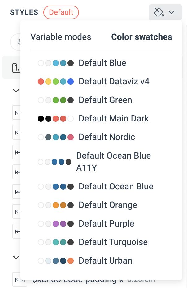
To select a color swatch, use the dedicated DropDown Button in the THEME STYLES pane.
To further customize the appearance of the UI components by using the THEME STYLES pane:
- Add new variables by using the + button.
- Edit the values of the variables.
As each Kendo theme requires a different type (SASS or CSS) and number of pre-defined variables, the default variables in the THEME STYLES pane will vary depending on the selected base theme.
ThemeBuilder gives you the flexibility to use the SASS or CSS variables in the THEME STYLES pane to change the appearance of the UI components by applying advanced styling strategies. To enable this functionality, use the Advanced Edit button.
Editing the Kendo Default, Bootstrap, and Classic Themes
The Kendo Default, Bootstrap and Classic themes expose a number of pre-defined SASS variables that are grouped by type:
| Variable Type | Description |
|---|---|
| Font Families | You can add your custom font families by using the + button. Each theme contains several exposed Kendo font family variables |
| Metrics | You can add your custom metrics by using the + button. The $kendo-border-radius variable is included by default and allows you to change the rounding of the elements. |
| Typography | The typography SASS variables allow you to change the font and its properties, for example, font-weight, font-size, font-height, and letter-spacing. You can add multiple typography styles by using the + button. |
| Colors | The various color-related variables allow you to edit the colors in the visual theme. For easier navigation, the colors are grouped by type and usage, for example:
|
Editing the Kendo Material Theme
The Kendo Material theme exposes the following types of pre-defined SASS variables:
| Variable Type | Description |
|---|---|
| Font Families | You can add your custom font families by using the + button. |
| Metrics | You can add your custom metrics by using the + button. The $kendo-border-radius variable is included by default and allows you to change the rounding of the elements. |
| Typography | The typography SASS variables allow you to change the font and its properties, for example, font-weight, font-size, font-height, and letter-spacing. You can add multiple typography styles by using the + button. |
| Colors | The Material theme has predefined data visualization colors for the Chart component. You can add your own colors by using the + button. |
| Effects | The effects SASS variables allow you to add your custom values for box-shadow, filter or backdrop-filter properties by using the + button. The Material theme has predefined box-shadow variables used in the Button, Card, Window and other components. |
Editing the Kendo Fluent Theme
The Kendo Fluent theme exposes the following types of pre-defined CSS variables:
| Variable Type | Description |
|---|---|
| Font Families | You can add your custom font families by using the + button. The $kendo-font-family-sans, $kendo-font-family-serif, $kendo-font-family-sans-serif, and $kendo-font-family-monospace variables are included by default |
| Metrics | You can add your custom metrics by using the + button. The $kendo-border-radius variable is included by default and allows you to change the rounding of the elements. |
| Typography | The typography CSS property allow you to change the font and its properties, for example, font-weight, font-size, font-height, and letter-spacing. You can add multiple typography styles by using the + button. |
| Colors | The various color-related properties allow you to edit the colors in the visual theme. For easier navigation, the colors are grouped by type and usage, for example:
|
| Effects | The effects CSS variables allow you to add your custom values for box-shadow, filter or backdrop-filter properties by using the + button. The Fluent theme has predefined box-shadow variables. |
Unlike the Kendo Default, Kendo Bootstrap, and Kendo Material themes, the Kendo Fluent theme uses CSS variables to enable the customization.
Editing Blank Project Theme
When starting from scratch with a blank project, the THEME STYLES pane has no pre-defined variables. Create new variables by using the + button to foster reusability and rapid development.
Use these variables to style your custom components as any other Telerik and Kendo UI component by applying advanced styling customizations.