Kendo UI for jQuery ToolBar Overview

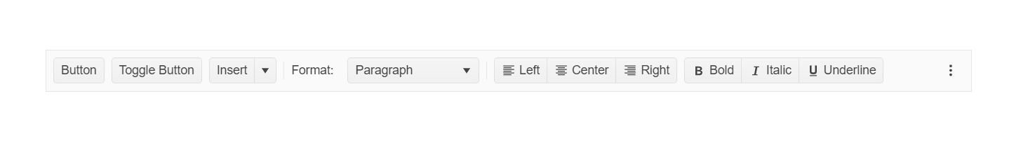
The ToolBar is designed to hold different types of controls such as buttons, button groups, toggle buttons, split buttons, and other customized elements.

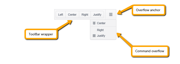
The ToolBar consists of the ToolBar wrapper, overflow anchor, and command overflow popup main areas. The wrapper holds all commands that can be placed within the available container width. The ones that have no space to fit are moved to the command overflow popup.

Kendo UI for jQuery Kendoka image

The ToolBar is part of Kendo UI for jQuery, a professional grade UI library with 110+ components for building modern and feature-rich applications. To try it out sign up for a free 30-day trial.

The following image demonstrates a Kendo UI ToolBar.

Kendo UI for jQuery ToolBar areas

Initializing the ToolBar

The following example demonstrates how to initialize the ToolBar and apply its basic functionalities.

<div id="toolbar"></div>

<script>
    $("#toolbar").kendoToolBar({
        items: [
            // A regular button.
            {
                type: "button",
                text: "Button",
                icon: "info-circle",
                showIcon: "toolbar"
            },

            // A toggle button.
            {
                type: "button",
                togglable: true,
                text: "Toggle Button",
                icon: "check",
                selected: true
            },

            // A split button.
            {
                type: "splitButton",
                text: "Split Button",
                menuButtons: [
                    { id: "option1", text: "Option 1" },
                    { id: "option2", text: "Option 2" },
                    { id: "option3", text: "Option 3" }
                ]
            },

            // A button group.
            {
                type: "buttonGroup",
                buttons: [
                    { text: "left",   showText: "overflow", icon: "justifyLeft",   showIcon: "toolbar" },
                    { text: "center", showText: "overflow", icon: "justifyCenter", showIcon: "toolbar" },
                    { text: "right",  showText: "overflow", icon: "justifyRight",  showIcon: "toolbar" }
                ]
            },

            // A separator.
            {
                type: "separator"
            },

            // A custom template.
            {
                template: "<label>Custom template: <input type='text' id='textbox' /></label>",
                overflowTemplate: "<span></span>"
            }
        ]
    });
</script>

Functionality and Features

Events

The ToolBar component exposes a set of events. For a runnable example, refer to the demo on using the event of the ToolBar.

<div id="toolbar"></div>

<script>
    $("#toolbar").kendoToolBar({
        items: [
            {
                type: "button",
                text: "Button 1",
                click: function(e) {
                    // This click event handler will fire first.
                }
            },
            {
                type: "button",
                togglable: true,
                text: "Toggle Button",
                toggle: function(e) {
                    // This toggle event handler will fire first.
                }
            }
        ],
        click: function(e) {
            // This click event handler will fire second.
        },
        toggle: function(e) {
            // This toggle event handler will fire second.
        }
    });
</script>

See Also

In this article