Kendo UI for jQuery Popover Overview
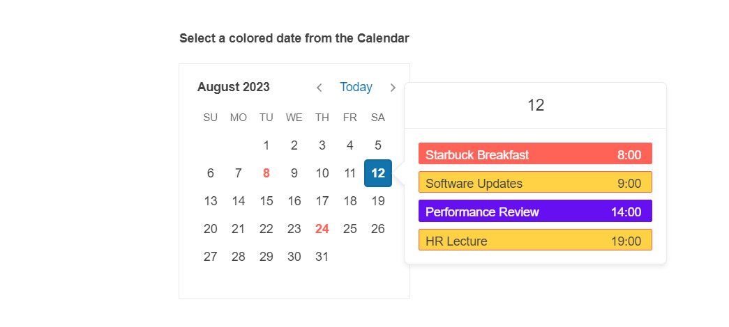
The Kendo UI Popover widget for jQuery provides a simple way to display additional content next to a specific anchor element that appears when users perform actions on that anchor element such as click or hover.
The Popover is part of Kendo UI for jQuery, a
professional grade UI library with 110+ components for building modern and feature-rich applications. To try it out sign up for a free 30-day trial.
Initializing the Popover
You can initialize the Popover either for a single element or for a container where the Popover targets are represented by the child elements.
The following example demonstrates how to create a Popover for a single target and initialize it.
<span id="target">
Some Content
</span>
<script>
$(document).ready(function() {
$("#target").kendoPopover({
showOn: "click",
body: "Content description",
actionsPosition: "center",
actions: [{ text: "update", click: function() { console.log("update"); }}, { text: "create", click: function() { console.log("create"); }}]
});
});
</script>
The following example demonstrates how to create a Popover for multiple targets within a container, initialize it by using a jQuery selector, and specify the filter to match the target elements.
<div id="container">
I'm a <strong>target</strong>. I'm also a
<strong>target</strong>.
</div>
<script>
$(document).ready(function() {
$("#container").kendoPopover({
template: "Target Popover",
filter: "strong"
});
});
</script>
Basic Configuration
The following example demonstrates how to initialize a Popover and configure its main properties.
<span id="target">
Some Content
</span>
<script>
$(document).ready(function() {
$("#target").kendoPopover({
showOn: "click",
header: "Header text",
body: "Content description",
actionsPosition: "center",
actions: [{ text: "update", click: function() { console.log("update"); }}, { text: "create", click: function() { console.log("create"); }}]
});
});
</script>
Accessibility Behavior
Screen readers behave differently depending on the content of the Popover:
Dialog behavior—When the Popover is displayed on click and it has form elements that can be focused, it matches the dialog aria behavior. When shown, the focus will be moved to the first focusable element inside the Popover.
Tooltip behavior—Screen readers will read the Popover's content, however the focus will remain on the element that triggers the Popover.
Functionality and Features
Referencing Existing Instances
To refer to an existing Popover instance, use the jQuery.data()
. Once a reference is established, use the Popover API to control its behavior.
The following example demonstrates how to access an existing Popover instance.
var popover = $("#target").data("kendoPopover");