NavBar Overview
Starting with the R2 2023 release, Kendo UI will no longer ship Hybrid UI components. This means that the R2 2023 will be the last release to include Kendo Hybrid in the Kendo UI package. See full announcement in Kendo jQuery blog post. The last stable version that we recommend to use for Kendo Hybrid components is R3 2022 SP1.
The Hybrid UI NavBar widget is used inside a mobile View or Layout header element to display an application navigation bar. The mobile NavBar may display the current view title in the center, and optionally some additional left- and right-aligned widgets—a back button, settings button, etc.
Getting Started
The Kendo UI mobile Application automatically initializes a mobile NavBar for every element with the role data attribute set to navbar and present in the views/layouts markup. Alternatively, it can be initialized using jQuery plugin syntax in the containing mobile View init event handler.
Initialize from Markup
The example below demonstrates how to initialize the Hybrid UI NavBar from markup.
    <div data-role="view" data-title="Hello world">
        <div data-role="header">
            <div data-role="navbar">
                <span data-role="view-title"></span>
            </div>
        </div>
    </div>
    <script>
        new kendo.mobile.Application();
    </script>
Initialize Using jQuery
The example below demonstrates how to initialize the Hybrid UI by using jQuery plugin syntax.
var navbar = $("#navbar").kendoMobileNavBar();
Layout and Appearance
Customize Background Colors
The Hybrid UI NavBar background color can be customized by setting its background-color CSS property either inline or using a CSS selector with specificity of 20+. Different platforms can be styled separately with their respective root classes.
The example below demonstrates how to create a green Hybrid UI NavBar.
<div data-role="navbar" style="background-color: green">My View Title</div>
The example below demonstrates how to create a green Hybrid UI NavBar in iOS and a red one in Android.
<style>
    .km-ios .checkout { background-color: green; }
    .km-android .checkout { background-color: red; }
</style>

<div data-role="navbar" class="checkout">My View Title</div>
Align Widgets inside NavBar
After initialization, the mobile NavBar positions its child elements based on the specified align data attribute—either left or right. By default, elements without any align parameter are centered.
The example below demonstrates how to use the align data attribute to specify the elements position inside the NavBar.
<div data-role="navbar">
    <a data-role="backbutton" data-align="left">Back</a>
    My View Title
    <a data-role="button" data-align="right">About</a>
</div>
Show Hidden View Titles
By default, the NavBar view title is visible only in iOS and is hidden in the rest of the platforms. Apply the CSS demonstrated in the example below to make it visible on a specific platform such as Android.
.km-android .km-navbar .km-view-title /* Before Q2 2012 SP1 */
{
    display: inline-block;
}
  .km-android .km-navbar .km-view-title /* After Q2 2012 SP1 */
{
    visibility: visible;
}
Update NavBar Titles from Current View Titles Automatically
If an element with the role data attribute set to view-title is present inside the mobile NavBar, the mobile Kendo UI Application instance updates its text to the current View's title when changing views. Note that the element itself should not contain any text—it is going to be removed automatically. The View title is specified by setting the title data attribute of the View element.
This feature is particularly useful if the NavBar is inside a layout.
Important
The NavBar automatically hides itself if the containing view does not have a view title and the NavBar hosts a span with the
data-role=view-titleattribute.
Update NavBar Titles from Data Attributes Automatically
The example below demonstrates how to use the view-title data attribute to auto-update the NavBar title.
<div data-role="layout" data-id="foo">
    <div data-role="header">
        <div data-role="navbar">
           <span data-role="view-title">My View Title</span>
        </div>
    </div>
</div>

<div data-role="view" data-layout="foo" data-title="bar"> ... </div>
<div data-role="view" data-layout="foo" data-title="baz"> ... </div>
Nova Theme Features
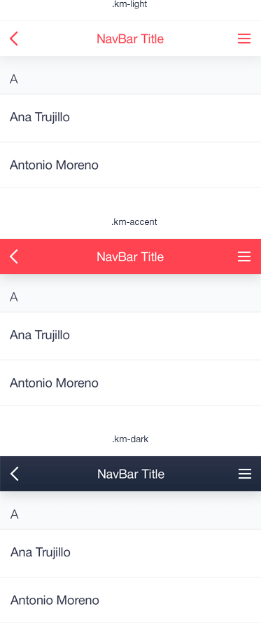
Color Schemes
Figure 1: Different color schemes of the NavBar

There are three predefined color schemes—light, dark (default), and accent. To apply color schemes different than the default one, set the km-light or the km-accent class.
The example below demonstrates how to set the km-light class in the NavBar.
 <header data-role="header">
    <div data-role="navbar" class="km-light">
        <!-- ... -->
    </div>
</header>
The example below demonstrates how to set the km-accent class in the NavBar.
 <header data-role="header">
    <div data-role="navbar" class="km-accent">
        <!-- ... -->
    </div>
</header>
Subtitles
To activate the subtitles, add a span element with the km-view-subtitle class to the NavBar, as demonstrated in the example below.
 <header data-role="header">
    <div data-role="navbar">
        <!-- ... -->
        <span class="km-view-subtitle">Subtitle</span>
        <!-- ... -->
    </div>
</header>
Nested ButtonGroup
To nest a ButtonGroup, set the km-navbar-buttongroup class and add the ButtonGroup component to the NavBar, as demonstrated in the example below.
 <div data-role="navbar" class="km-navbar-buttongroup">
       <!-- ... -->
       <ul data-role="buttongroup" data-index="0">
           <li>
               By Name
           </li>
           <li>
               By Family
           </li>
       </ul>
  </div>