Kendo UI for jQuery DropDownList Overview
The DropDownList displays a list of values allowing for a single selection from the list, and supports key features like filtering, item templating, virtualization, and cascading.
The user input is restricted within the predefined options. To apply a keyboard input, use the Kendo UI ComboBox.
The DropDownList is part of Kendo UI for jQuery, a professional grade UI library with 110+ components for building modern and feature-rich applications. To try it out sign up for a free 30-day trial.
Functionality and Features
| Feature | Definition |
|---|---|
| Data binding | You can bind the DropDownList to local data arrays or remote data services. |
| Grouping | The DropDownList enables you to display data items that are categorized by a specific model field. |
| Server filtering | You can also filter the data of the DropDownList on the server and display only a subset of data. |
| Virtualization | With the DropDownList, you can display large datasets by using an alternative for paging that data. |
| Templates | The DropDownList enables you to fully control the rendering of its items, selected values, and popup headers. |
| Adding new items | Also, you can enable users to add a new item when the search results do not match their filtering conditions. |
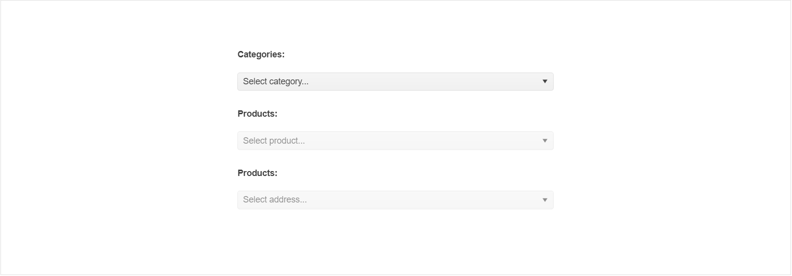
| Cascading DropDownLists | The cascading functionality of the DropDownList enables you to implement a series of two or more DropDownLists in which each DropDownList is filtered according to the selected options in the previous DropDownList. |
| Rendering and dimensions | The DropDownList component provides a set of options for controlling its overall size, the border radius for its tags, and the way its color is applied. |
| Globalization | The DropDownList supports globalization to ensure that it can fit well in any application, no matter what languages and locales need to be supported. Additionally, the DropDownList supports rendering in a right-to-left (RTL) direction. |
| Accessibility | The DropDownList is accessible for screen readers, supports WAI-ARIA attributes, and delivers keyboard shortcuts for faster navigation. |
To learn more about the appearance, anatomy, and accessibility of the DropDownList, visit the Progress Design System documentation—an information portal offering rich component usage guidelines, descriptions of the available style variables, and globalization support details.