Grouping Overview
By default, the grouping functionality of the Grid is disabled.
For more information on displaying aggregate results, refer to the article on grouping with aggregates.
The Grouping is part of Kendo UI for jQuery, a professional grade UI library with 110+ components for building modern and feature-rich applications. To try it out sign up for a free 30-day trial.
Getting Started
To enable grouping, set the groupable option to true. As a result, the Grid exposes a new area in its header which enables the user to group the Grid data by a column. To group the data by multiple columns, users can drag the desired columns to the grouping header.
$("#grid").kendoGrid({
groupable: true
// Other configuration.
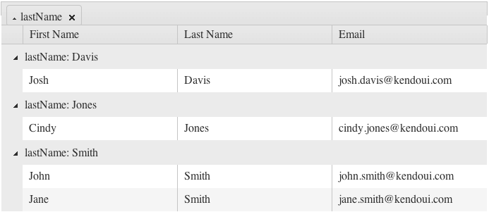
});To sort the grouped content, click the grouping tab. To toggle the sort order of the grouped data from the previous example, click Last Name. Each individual group can also be toggled from their expanded to collapsed state by clicking the arrow next to the respective header grouping.
Figure 1: A Grid with its grouping functionality enabled
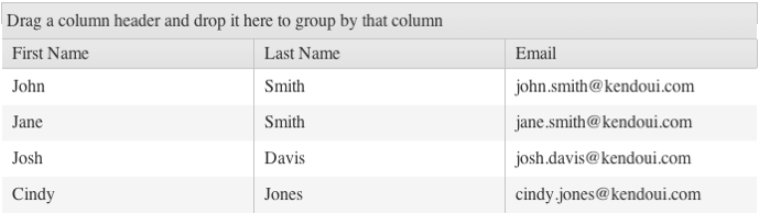
Figure 2: A Grid with its data grouped by last name
Only columns that are bound to a field can be groupable. To enable grouping on a column bound to an object, bind the column to a field of that object.
Using with Row Templates
A row template explicitly defines the row markup while grouping requires you to change the row markup. To use the two features simultaneously, include a script in the row template which adds additional cells depending on the number of the existing groups.
$(document).ready(function () {
// window. can be omitted if the function is defined outside the document.ready closure.
window.getGridGroupCells = function(id) {
var cnt = $("#" + id).data("kendoGrid").dataSource.group().length,
result = "";
for (var j = 0; j < cnt; j++) {
result += "<td class='k-group-cell'> </td>";
}
return result;
}
$("#GridID").kendoGrid({
groupable: true,
rowTemplate: "<tr>" +
"#= getGridGroupCells('GridID') #" +
"<td>...</td><td>...</td><td>...</td></tr>",
altRowTemplate: "<tr class='k-alt'>" +
"#= getGridGroupCells('GridID') #" +
"<td>...</td><td>...</td><td>...</td></tr>"
});
});Using with Paging
When you use grouping with paging, paging occurs before grouping. As a result:
- The
dataSourceinstance is not aware if items from the displayed groups are available on other pages. - If the groups are collapsed, you cannot display additional items and groups from other pages after the rendered items and groups. To work around this issue, increase the page size.
To enable the Grid to execute grouping before paging, group the whole data source. In this case, however, the performance of the Grid will be reduced.
Hiding Grouped Columns
As of R3 2022, the Kendo UI Grid enables the developer to hide grouped columns from the Grid. This feature prevents the duplication of data in both the Grid and the group header.
To allow automatic hiding of a grouped column, set the [columns.hideOnGroup](/api/javascript/ui/grid/configuration/columns.hideongroup property to true.
Note: This functionality of the Grid works when the user applies grouping. The hideOnGroup property will not have any effect if the grouping is applied directly to the dataSource configuration.
For a runnable example, visit the Hiding Grouped Columns demo.