Kendo UI for jQuery CirularProgressbar Overview
The CircularProgressBar delivers functionality for displaying and tracking the progress of a task.
The CircularProgressBar is part of Kendo UI for jQuery, a professional grade UI library with 110+ components for building modern and feature-rich applications. To try it out sign up for a free 30-day trial.
Functionality and Features
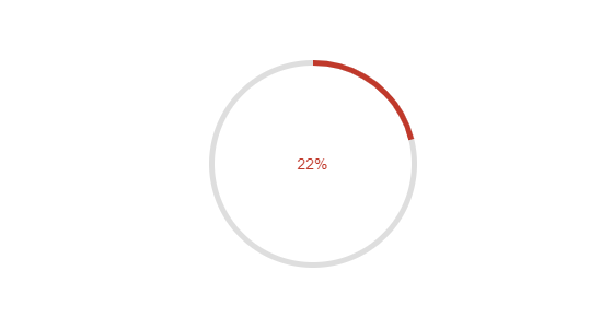
- Colors—You can change the colors based on the component's current value.
- Modes—The CircularProgressBar exposes finite and infinite modes.