ListView for Xamarin.Android: Overview
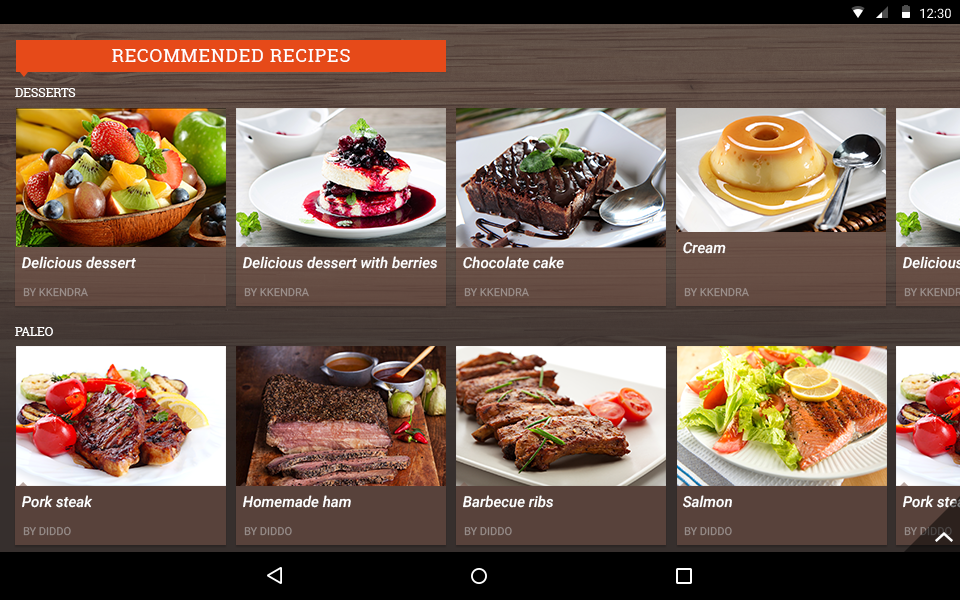
RadListView for Android is a virtualizing list component that provides the most popular features associated with scenarios where a list of items is used. All these features are embedded in one control with the idea to save developer time and provide better experience.
The control's features include item animations, different layouts and orientations, smart defaults for many gestures - select on long press, execution of special action on swipe, reorder of items on long press and drag, refreshing the list on swipe or loading more items only when need. The control can also be used to easily visualize your items in groups, sorted and filtered in accordance with your criteria.

On Getting Started article you can see how to get started using the control.
Behaviors
RadListView control provides various behaviors. Each of them is configurable to perform a specific action when a user gesture occurs.
You are free to add one or more behaviors to your list view instance according to your requirements and preferences. You can also extend an existing behavior to tweak it in order to suit your needs or start from scratch and write a completely new behavior.
This is the list of the currently available behaviors:
- Overview: This is the overview page for the list view behaviors which explains their common features.
- Selection: The selection behavior provides single and multiple selection modes for your list and allows you to easily show your custom action bar while the selection is active.
- Item Reorder: The item reorder behavior allows the end user to change the initial order of the items by performing a long press on an item and then drag freely to the desired destination position.
- Load on Demand: The load on demand behavior allows you to load a few items at the start and when (and only if) the user scrolls down to a certain position or presses a dedicated button at the bottom, you can load more items.
- Swipe to Refresh: The Swipe to refresh behavior allows the end user to request a refresh of the list for scenarios where the items in the list can change after the initial load.
- Swipe to Execute: The Swipe to execute behavior can be used to allow the end users to dismiss an item with swipe gesture or to reveal a custom functionality button hidden behind an item.
- Sticky Headers: The Sticky header behavior can be used when grouping is enabled to force the header of the first item to remain visible after it is scrolled away.
- Collapsible Groups: The Collapsible Groups behavior can be used when grouping is enabled to allow the users to collapse or expand the groups by tapping on their header.
Layouts
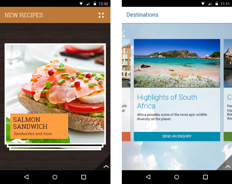
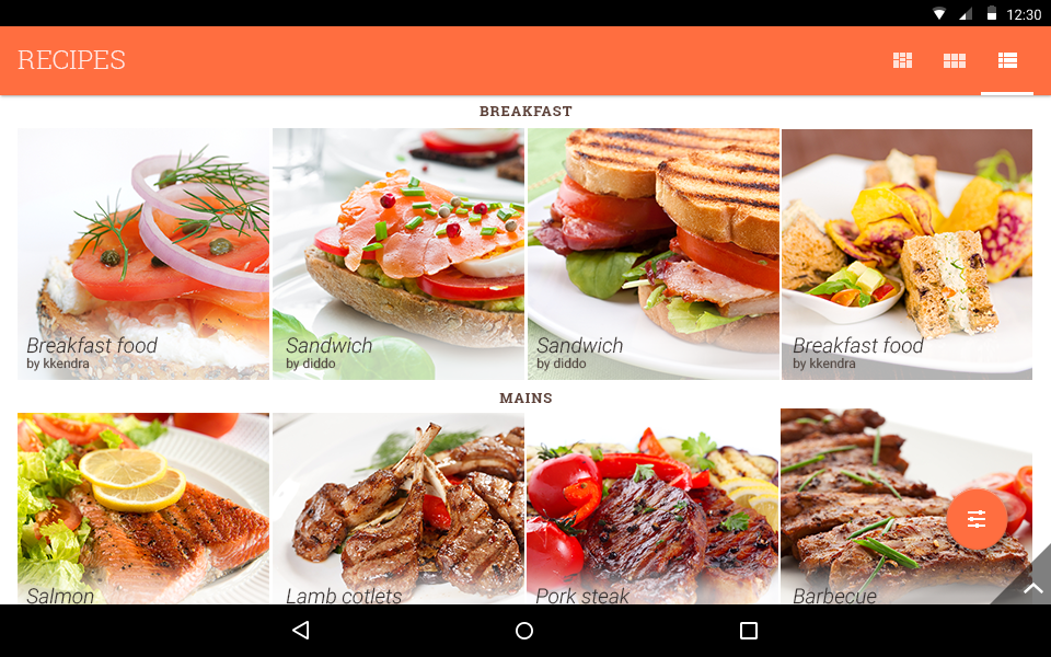
RadListView extends the native RecyclerView control, so you can use the same layout modes for your list: Linear, Grid and Staggered Grid. We have also provided three additional layouts: Deck of Cards, Slide and Wrap. More information is available in the Layouts topic.

Group, Sort, Filter
RadListView is integrated with RadDataSource which brings you the power to provide rules for filtering, sorting or grouping with a single line of code. You can combine an indefinite number of rules of all three types to receive the desired manipulation on the original list.
Group, Sort and Filter topic provides more information about these operations and the type of the rules that are used to define each of them.

Item Animations
You can define your own item animations that will play when performing add/remove operations on the list or use the item animators that we have provided. The types of animations that are currently available are fade, slide and scale. Go to Item Animations topic to find out more information about the animations: how to add them and how to set up their properties.
Other Features
RadListView also supports the concept of header and footer — custom view which are visualized in the start and the end of the list. You can also add item click listeners to get notified when an item is tapped. Another feature is to scroll to certain position of the list or to its start or end. More information on these features is available on Other Features topic.