Configuration
This article will explain all configuration options that ProgressBar control provides.
Value and Progress
The ProgressBar exposes Value and Progress properties which are used to set and report, respectively, the progress of a task inside the ProgressBar control.
-
Value—Sets the value of the ProgressBar. WhenValueproperty is updated, this initiates the progress animation of the progress bar. -
Progress—Reports the current progress of the ProgressBar.Progressproperty is updated internally afterValueis updated and progress animation is complete.
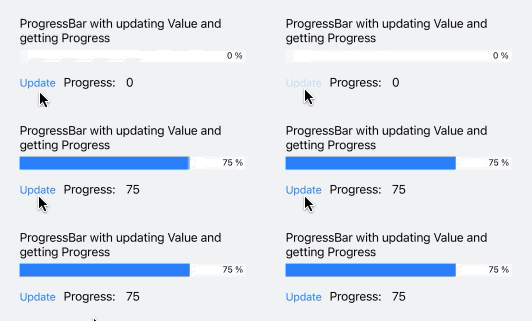
Here is a quick example showing how you can update Value and get the Progress:
<telerikPrimitives:RadLinearProgressBar x:Name="progressBar"/>
<StackLayout Orientation="Horizontal" Spacing="10">
    <Button Text="Update" Clicked="ProgressBarUpdateClicked"/>
    <Label Text="Progress: " VerticalOptions="Center"/>
    <Label Text="{Binding Progress, Source={x:Reference progressBar}}" VerticalOptions="Center"/>
</StackLayout>
And the Update button click event handler:
private void ProgressBarUpdateClicked(object sender, EventArgs e)
{
    this.progressBar.Value = 75;
}
Check the result in the gif below:

Value Range
Minimum and Minimum properties are used to set the minimum and maximum values that the ProgressBar can display.
-
Minimum—Specifies the lower limit of theValueproperty, by default its value is 0. -
Maximum—Defines the upper limit of theValueproperty, default value is 100.
You can define Minimum and Maximum properties of the ProgressBar as shown below:
<telerikPrimitives:RadLinearProgressBar Value="30"
                                        Minimum="0"
                                        Maximum="60"/>
String Format
The StringFormat(string) specifies the string format applied to the numeric value showing the progress. You can find detailed information about the supported numeric formats in the Standard Numeric Format Strings Microsoft documentation.
<telerikPrimitives:RadLinearProgressBar Value="25"
                                        StringFormat="N2"/>
Value DisplayMode
ValueDisplayMode property of enum type Telerik.XamarinForms.Primitives.ProgressBar.ValueDisplayMode can be set to any of the following values:
- (default) Percent—Displays the progress as percent from the range from minimum to maximum;
- Value—Displays the Progress value.
- Text—Shows custom text inside the progress bar label. You would need to combine it with
CustomTextproperty of the ProgressBar. - None— No text is shown inside the progress bar.
Here is a quick example with ValueDisplayMode set to Value:
<telerikPrimitives:RadLinearProgressBar Value="35"
                                        ValueDisplayMode="Value"/>
You can also use ValueDisplayMode set to Text together with CustomText:
<telerikPrimitives:RadLinearProgressBar Value="45"
                                        ValueDisplayMode="Text"
                                        CustomText="loading..."/>
Segments
Divide the ProgressBar in segments using the SegmentCount(int) property.
<telerikPrimitives:RadLinearProgressBar Value="45"
                                        ValueDisplayMode="Value"
                                        SegmentCount="8"/>
Label Alignment
The ProgressBar exposes LabelHorizontalOptions property of type Xamarin.Forms.LayoutOptions which defines the horizontal alignment of the label showing the progress. By default LabelHorizontalOptions is LayoutOptions.End.
<telerikPrimitives:RadLinearProgressBar Value="55"
                                        LabelHorizontalOptions="Center"/>
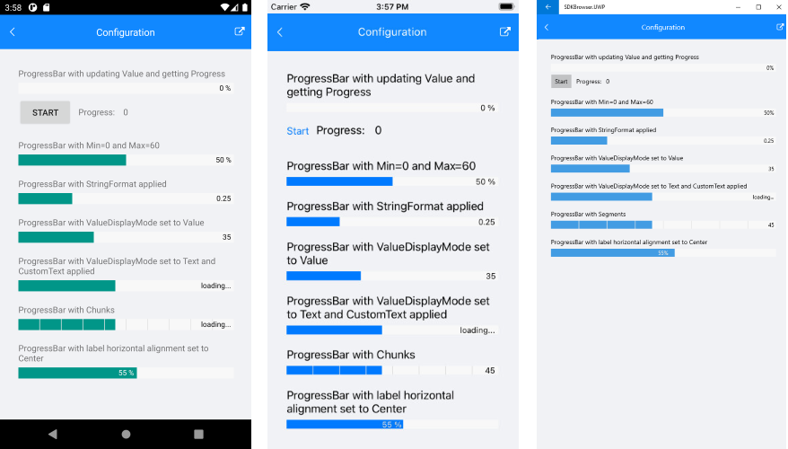
A sample Configuration example can be found in the ProgressBar/Features folder of the SDK Samples Browser application.
Here is how the Configuration example looks:
