Styling
The ProgressBar control for Xamarin provides styling options for customizing its appearance.
The control supports the following styling properties:
-
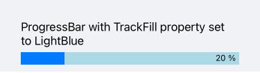
TrackFill(Brush): Specifies the fill of the track.
<telerikPrimitives:RadLinearProgressBar Value="20"
                                        TrackFill="LightBlue"/>
-
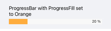
ProgressFill(Brush): Specifies the fill of the progress indicator.
<telerikPrimitives:RadLinearProgressBar Value="20"
                                        ProgressFill="#FFAC3E"/>
-
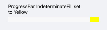
IndeterminateFill(Brush): Defines the fill of the indeterminate indicator.
<telerikPrimitives:RadLinearProgressBar Value="25"
                                        IsIndeterminate="True"
                                        IndeterminateFill="Yellow"/>
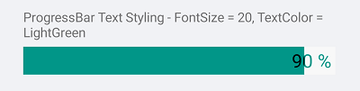
The following Style properties are related to the text displayed in the ProgressBar:
-
TextColor(Color): Defines the color of the Text which displays the progress value. -
AlternateTextColor(Color): Defines the text color when the progress indicator overlaps the label which displays the current progress. -
FontSize(double): Defines the font size of the Text which displays the progress value
<telerikPrimitives:RadLinearProgressBar Value="90"
                                        AlternateTextColor="Black"
                                        TextColor="#019688"
                                        FontSize="20"
                                        HeightRequest="30"/>
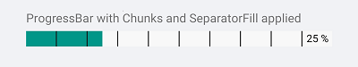
Style the ProgressBar segments using the following properties:
-
SegmentSeparatorFill(Brush): Specifies the fill of the segments separators. -
SegmentSeparatorThickness(double): Sets the thickness of the segments separators.
<telerikPrimitives:RadLinearProgressBar Value="25"
                                        SegmentCount="10"
                                        SegmentSeparatorFill="Black"
                                        SegmentSeparatorThickness="2"/>
A sample Styling example can be found in the ProgressBar/Styling folder of the SDK Samples Browser application.