Item Styles
The RadListView component provides styling mechanism for customizing the look of its items. This mechanism consists of the following properties of type "ListViewItemStyle":
- ItemStyle
- SelectedItemStyle
- PressedItemStyle
- ReorderItemStyle
ListViewItemStyle
The properties of this object are respectively applied to the native components. The supported ones are the following:
- BackgroundColor (Color): sets the background of the item(s).
- BorderColor (Color): sets the color of the border.
- BorderWidth (double): defines the width of the borer.
- BorderLocation (Location): describes an enumeration describing where the border should be visible.
- TextCellTextColor (Color): defines the text color of the ListView TextCell.
Location
This enumeration contains the following members:
- None - the border should not be visualized.
- Top - the border should be visualized only at the top side.
- Bottom -the border should be visualized only at the bottom side.
- Left - the border should be visualized only at the left side.
- Right - the border should be visualized only at the right side.
- All (default value) - the border should be visualized all around the item.
Example
<telerikDataControls:RadListView x:Name="listView" ItemsSource="{Binding Source}" IsItemsReorderEnabled="True">
    <telerikDataControls:RadListView.BindingContext>
        <local:ViewModel />
    </telerikDataControls:RadListView.BindingContext>
    <telerikDataControls:RadListView.ItemTemplate>
        <DataTemplate>
            <telerikListView:ListViewTextCell Text="{Binding Name}" />
        </DataTemplate>
    </telerikDataControls:RadListView.ItemTemplate>
    <telerikDataControls:RadListView.ItemStyle>
        <telerikListView:ListViewItemStyle BackgroundColor="#1263E5"
                                        TextCellTextColor="#AAC7F6"
                                        BorderColor="#0A3A82"
                                        BorderWidth="2"
                                        BorderLocation="All" />
    </telerikDataControls:RadListView.ItemStyle>
    <telerikDataControls:RadListView.SelectedItemStyle>
        <telerikListView:ListViewItemStyle BackgroundColor="#83A9E2"
                                        TextCellTextColor="#AAC7F6"
                                        BorderColor="#0A3A82"
                                        BorderWidth="2"
                                        BorderLocation="Bottom"/>
    </telerikDataControls:RadListView.SelectedItemStyle>
    <telerikDataControls:RadListView.PressedItemStyle>
        <telerikListView:ListViewItemStyle BackgroundColor="#C1C1C1"
                                        TextCellTextColor="#AAC7F6"
                                        BorderColor="#0B3D89"
                                        BorderWidth="2"
                                        BorderLocation="Bottom"/>
    </telerikDataControls:RadListView.PressedItemStyle>
    <telerikDataControls:RadListView.ReorderItemStyle>
        <telerikListView:ListViewItemStyle BackgroundColor="#0B3D89"
                                        TextCellTextColor="#AAC7F6"
                                        BorderColor="Black"
                                        BorderWidth="2"
                                        BorderLocation="All" />
    </telerikDataControls:RadListView.ReorderItemStyle>
</telerikDataControls:RadListView>
var listView = new RadListView
{
    ItemsSource = new ViewModel().Source,
    ItemTemplate = new DataTemplate(() =>
    {
        var label = new Label { Margin = new Thickness(10) };
        var content = new Grid();
        content.Children.Add(label);
        label.SetBinding(Label.TextProperty, new Binding(nameof(SourceItem.Name)));

        return new ListViewTemplateCell
        {
            View = content
        };
    })
};
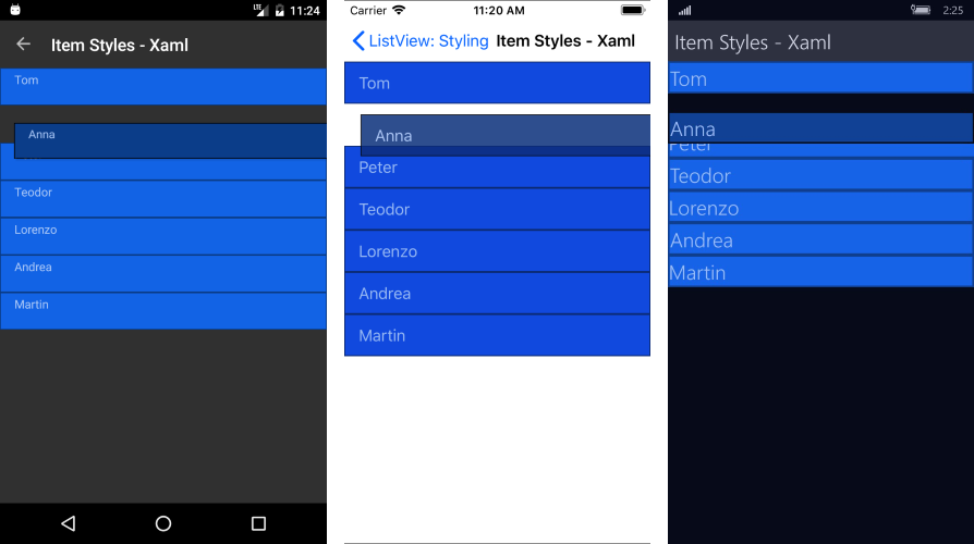
And here is the end result:
Figure 1: ListView with ItemStyle and SelectedItemStyle

Figure 2: ListView with ReorderItemStyle
You can find a working demo labeled ItemStyles in the ListView/Styling folder of the SDK Samples Browser application.
ListViewItemStyle with Bindable Properties
Additionally, the styling properties of ListViewItemStyle could be used as bindable properties in order to allow you even more flexibility in customizing the visual appearance of RadListiView.
Example
Here is a quick example on how you could bind ListViewItemStyle's properties to corresponding properties of type Color/Location inside the ViewModel:
<telerikDataControls:RadListView.ItemStyle>
    <telerikListView:ListViewItemStyle BackgroundColor="{Binding Background}"
                                       BorderColor="{Binding BorderColor}"
                                       BorderLocation="{Binding BorderLocation}"
                                       BorderWidth="{Binding BorderWidth}" />
</telerikDataControls:RadListView.ItemStyle>
Here is how the ItemStyle bindable property looks:
Figure 3: ListView with Bindable ItemStyle

There are examples in the ListView/Styling folder of the SDK Samples Browser application, how you can use those properties as a bindable.