Templates
If the default templates of the control do not suit your needs, you can easily define custom ones. The available templates for customizing are:
-
PlaceholderTemplate(ControlTemplate): Defines the template visualized for the placeholder.
- DisplayTemplate(ControlTemplate): Defines the template visualized when the picked date/time is displayed.
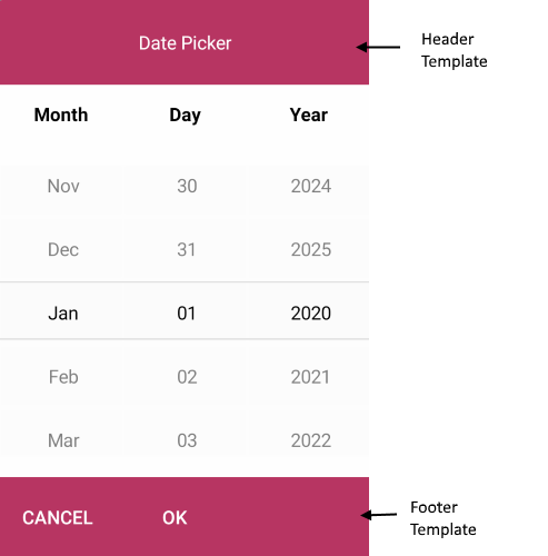
- HeaderTemplate(ControlTemplate): Defines what will be displayed inside the dialog(popup) header.
- FooterTemplate(ControlTemplate): Defines what will be displayed inside the dialog(popup) footer.
PlaceholderTemplate
<ControlTemplate x:Key="Picker_PlaceholderView_ControlTemplate">
    <Grid>
        <Grid.GestureRecognizers>
            <TapGestureRecognizer Command="{TemplateBinding ToggleCommand}" />
        </Grid.GestureRecognizers>
        <Label Text="{TemplateBinding Placeholder}"
               Style="{TemplateBinding PlaceholderLabelStyle}"
               AutomationId="PickerPlaceholderLabel"/>
    </Grid>
</ControlTemplate>
DisplayTemplate
<ControlTemplate x:Key="Picker_DisplayView_ControlTemplate">
    <Grid>
        <Grid.GestureRecognizers>
            <TapGestureRecognizer Command="{TemplateBinding ToggleCommand}" />
        </Grid.GestureRecognizers>
        <Label Text="{TemplateBinding DisplayString}"
               Style="{TemplateBinding DisplayLabelStyle}"
               AutomationId="PickerDisplayLabel"/>
    </Grid>
</ControlTemplate>
HeaderTemplate
<ControlTemplate x:Key="PopupView_Header_ControlTemplate">
    <telerikPrimitives:RadBorder BackgroundColor="{TemplateBinding BackgroundColor}"
                                 BorderColor="{TemplateBinding BorderColor}"
                                 BorderThickness="{TemplateBinding BorderThickness}"
                                 CornerRadius="{TemplateBinding CornerRadius}">
        <Label Text="{TemplateBinding HeaderLabelText}"
               Style="{TemplateBinding HeaderLabelStyle}"
               AutomationId="PickerPopupHeaderLabel"/>
    </telerikPrimitives:RadBorder>
</ControlTemplate>
FooterTemplate
<ControlTemplate x:Key="PopupView_Footer_ControlTemplate">
    <telerikPrimitives:RadBorder BackgroundColor="{TemplateBinding BackgroundColor}"
                                 BorderColor="{TemplateBinding BorderColor}"
                                 BorderThickness="{TemplateBinding BorderThickness}"
                                 CornerRadius="{TemplateBinding CornerRadius}">
        <OnPlatform x:TypeArguments="View">
            <On Platform="Android, iOS">
                <StackLayout Orientation="Horizontal" Spacing="0" HorizontalOptions="End">
                    <Button Text="{TemplateBinding CancelButtonText}"
                            Style="{TemplateBinding CancelButtonStyle}"
                            Command="{TemplateBinding CancelCommand}"
                            AutomationId="PickerPopupCancelButton"/>
                    <Button Text="{TemplateBinding AcceptButtonText}"
                            Style="{TemplateBinding AcceptButtonStyle}"
                            Command="{TemplateBinding AcceptCommand}"
                            AutomationId="PickerPopupOkButton"/>
                </StackLayout>
            </On>
            <On Platform="UWP">
                <StackLayout Orientation="Horizontal" Spacing="0" HorizontalOptions="End">
                    <Button Text="{TemplateBinding AcceptButtonText}"
                            Style="{TemplateBinding AcceptButtonStyle}"
                            Command="{TemplateBinding AcceptCommand}"
                            AutomationId="PickerPopupOkButton"/>
                    <Button Text="{TemplateBinding CancelButtonText}"
                            Style="{TemplateBinding CancelButtonStyle}"
                            Command="{TemplateBinding CancelCommand}"
                            AutomationId="PickerPopupCancelButton"/>
                </StackLayout>
            </On>
        </OnPlatform>
    </telerikPrimitives:RadBorder>
</ControlTemplate>
and the Date Picker definition:
<telerikInput:RadDatePicker MinimumDate="2020,01,1"
                            MaximumDate="2025,12,31"
                            SpinnerFormat="MMM/dd/yyyy"
                            PlaceholderTemplate="{StaticResource Picker_PlaceholderView_ControlTemplate}"
                            DisplayTemplate="{StaticResource Picker_DisplayView_ControlTemplate}">
    <telerikInput:RadDatePicker.SelectorSettings>
        <telerikInput:PickerPopupSelectorSettings HeaderTemplate="{StaticResource PopupView_Header_ControlTemplate}"
                                                  HeaderLabelText="Date Picker"
                                                  FooterTemplate="{StaticResource PopupView_Footer_ControlTemplate}"/>
    </telerikInput:RadDatePicker.SelectorSettings>
</telerikInput:RadDatePicker>
A sample Default Templates example can be found in the DatePicker/Features folder of the SDK Samples Browser application.
Example How to Customize the Default Look
The snippet below shows a simple Date Picker definition:
<telerikInput:RadDatePicker MinimumDate="2020,01,1"
                            MaximumDate="2025,12,31"
                            SpinnerFormat="MMM/dd/yyyy"
                            PlaceholderTemplate="{StaticResource placeholderTemplate}"
                            DisplayTemplate="{StaticResource displayTemplate}">
    <telerikInput:RadDatePicker.SelectorSettings>
        <telerikInput:PickerPopupSelectorSettings HeaderTemplate="{StaticResource headerTemplate}"
                                                  HeaderLabelText="This is the Header Template"
                                                  FooterTemplate="{StaticResource footerTemplate}"/>
    </telerikInput:RadDatePicker.SelectorSettings>
</telerikInput:RadDatePicker>
Now lets add the templates definition to the page resources:
Custom PlaceholderTemplate
<ControlTemplate x:Key="placeholderTemplate">
    <Button Text="{TemplateBinding Placeholder}"
            FontAttributes="Bold"
            TextColor="White"
            BackgroundColor="#B73562"
            HeightRequest="50" Command="{TemplateBinding ToggleCommand}" />
</ControlTemplate>

Custom DisplayTemplate
<ControlTemplate x:Key="displayTemplate">
    <Button Text="{TemplateBinding DisplayString}"
            TextColor="White"
            BackgroundColor="#7BAEFF"
            HeightRequest="50"
            Command="{TemplateBinding ToggleCommand}" />
</ControlTemplate>

Custom HeaderTemplate
<ControlTemplate x:Key="headerTemplate">
    <Label Text="Date Picker"
           TextColor="White"
           VerticalTextAlignment="Center"
           HorizontalTextAlignment="Center"
           BackgroundColor="#B73562"/>
</ControlTemplate>
Custom FooterTemplate
<ControlTemplate x:Key="footerTemplate">
    <StackLayout Orientation="Horizontal" Spacing="0" HorizontalOptions="FillAndExpand" BackgroundColor="#B73562">
        <Button Text="Cancel"
                TextColor="White"
                BackgroundColor="Transparent"
                Command="{TemplateBinding CancelCommand}" />
        <Button Text="OK"
                TextColor="White"
                BackgroundColor="Transparent"
                Command="{TemplateBinding AcceptCommand}" />
    </StackLayout>
</ControlTemplate>
In addition to this, you need to add the following namespace:
xmlns:telerikInput="clr-namespace:Telerik.XamarinForms.Input;assembly=Telerik.XamarinForms.Input"
A sample Custom Templates example can be found in the DatePicker/Features folder of the SDK Samples Browser application.