Styling Scrollbars
Each of the themes from the UI for WPF provides a custom default style for the ScrollBars in your application.
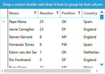
Figure 1: Scrollbar in Windows8 theme
The article will show you how to modify these styles to suit your requirements.
The templates provided in this article are extracted from the Windows8 theme and if you extract the templates from another theme there might be slight differences. The approach for updating the templates, however, is similar for all themes.
Get Default Style
You can get the default style of the ScrollBar element as explained in the Modifying Default Styles article.
For the purposes of this article, we will assume that you're using the implicit styles mechanism for theming the controls and that you've manually extracted the default styles from the System.Windows.xaml file of the Themes.Implicit folder of your UI for WPF installation. You can, however, achieve the same result using the StyleManager approach and extracting the styles with Blend for Visual Studio, for example.
Default Control Template
Before we modify the appearance of the control, let's first extract its default templates - ScrollBarVerticalControlTemplate and ScrollBarHorizontalControlTemplate - one for each Orientation of the control. You can place these templates in the App.xaml file of your application, for example.
Example 1: Default ScrollBarVerticalControlTemplate
The template above depends on the following 2 namespace declarations:
- xmlns:telerik="http://schemas.telerik.com/2008/xaml/presentation"
- xmlns:sys="clr-namespace:System;assembly=mscorlib"
The ScrollBarHorizontalControlTemplate has similar content.
Example 3 demonstrates the updated style with the two templates set which you can also place in your App.xaml file so that it affects all scrollbars in your application.
Example 2: Apply the templates
If you're using the StyleManager approach for theming the controls, you will also need to extract the default ScrollBarStyle.
Increase the Width
Now that you've extracted the default style and templates, let's first increase the Width and Height of the scrollbars in the extracted style.
Example 3: Increase scrollbar width
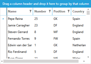
Figure 2: Scrollbars with increased size
Styling the Arrows
Now let us increase the size of the arrows of the scrollbars as well as change their color. To do this, you need to set the Width, Height, Data and Fill of the Arrow path inside the RepeatButtonLineDownTemplate and RepeatButtonLineUpTemplate.
You then need to set these templates in the respective styles for the RepeatButtons - RepeatButtonLineDownStyle and RepeatButtonLineUpStyle. Note that you need to define these resources before your new custom scrollbar style.
Example 4: Apply the templates
If you're using the StyleManager approach for theming the controls, you will also need to extract the RepeatButtonLineBaseStyle.
You now need to do the same for the RepeatButtonLineUpTemplate and RepeatButtonLineUpStyle to style the other arrow.
Figure 3: Scrollbars with increased arrow size
Styling the Thumbs
Finally, to modify the background of the scrollbar's thumb, for example, you need to extract and edit the respective Thumb style - ThumbVerticalStyle or ThumbHorizontalStyle. Let's use the Accent brush instead of the Basic one for the thumbs Track element.
Example 5: Change thumb color
Figure 4: Scrollbars with colored thumb