Label
The label feature allows you to display additional information about the text.
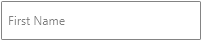
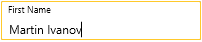
The label displays as a watermark content (placeholder) when the RadWatermarkTextBox control is unfocused and the text is empty. When the control gets focused or any text is entered, the label is positioned on top (floating) of the text input area.
Setting the Label property
<telerik:RadWatermarkTextBox Label="First Name" />
Label default visualization
Label visualization when floated
To keep the label always positioned on top of the text input area, set the KeepLabelFloated property of RadWatermarkTextBox to True.
Setting the KeepLabelFloated property
<telerik:RadWatermarkTextBox KeepLabelFloated="True" />
Getting the state of the label
bool isLabelFloated = this.watermarkTextBox.IsLabelFloated;
Customizing Appearance
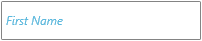
The label visual element is of type Label. To customize its appearance, use the LabelStyle property of RadWatermarkTextBox.
Customizing the label
<telerik:RadWatermarkTextBox Label="First Name">
    <telerik:RadWatermarkTextBox.LabelStyle>
        <Style TargetType="Label">
            <Setter Property="Foreground" Value="#5CB9DE" />
            <Setter Property="FontStyle" Value="Italic" />
        </Style>
    </telerik:RadWatermarkTextBox.LabelStyle>
</telerik:RadWatermarkTextBox>
Customized label
Animation
The label comes with a built-in animation that moves the label on top of the input text and then return it back to the center when necessary. This feature is enabled using Telerik's AnimationManager class. To change the animation, set the attached AnimationManager.AnimationSelector property on the RadWatermarkTextBox control. The property allows you to define an AnimationSelector with two groups describing the two animations that appear - make the label floating and return it to the text input area (the center).
The following example shows the default AnimationSelector used with the control but with slightly changed Duration of the animations.
Customizing the label
<telerik:RadWatermarkTextBox Label="First Name">
    <telerik:AnimationManager.AnimationSelector>
        <telerik:AnimationSelector>
            <telerik:AnimationGroup AnimationName="LabelFloatAnimation">
                <telerik:LabelPositionAnimation TargetElementName="PART_LabelVisualElement" Duration="00:00:00.500" Direction="Out"  />
                <telerik:FontSizeAnimation TargetElementName="PART_LabelVisualElement" Duration="00:00:00.500" Direction="Out" />
            </telerik:AnimationGroup>
            <telerik:AnimationGroup AnimationName="LabelCenterAnimation">
                <telerik:LabelPositionAnimation TargetElementName="PART_LabelVisualElement" Duration="00:00:00.500" Direction="In"  />
                <telerik:FontSizeAnimation TargetElementName="PART_LabelVisualElement" Duration="00:00:00.500" Direction="In" />
            </telerik:AnimationGroup>
        </telerik:AnimationSelector>
    </telerik:AnimationManager.AnimationSelector>
</telerik:RadWatermarkTextBox>