Getting Started with WPF TabbedWindow
This tutorial will walk you through the creation of a sample application that contains a RadTabbedWindow control.
Adding Telerik Assemblies Using NuGet
To use RadTabbedWindow when working with NuGet packages, install the Telerik.Windows.Controls.Navigation.for.Wpf.Xaml package. The package name may vary slightly based on the Telerik dlls set - Xaml or NoXaml
Read more about NuGet installation in the Installing UI for WPF from NuGet Package article.
With the 2025 Q1 release, the Telerik UI for WPF has a new licensing mechanism. You can learn more about it here.
Adding Assembly References Manually
If you are not using NuGet packages, you can add a reference to the following assemblies:
- Telerik.Licensing.Runtime
- Telerik.Windows.Controls
- Telerik.Windows.Controls.Navigation
- Telerik.Windows.Controls.Data
Adding RadTabbedWindow to the Project
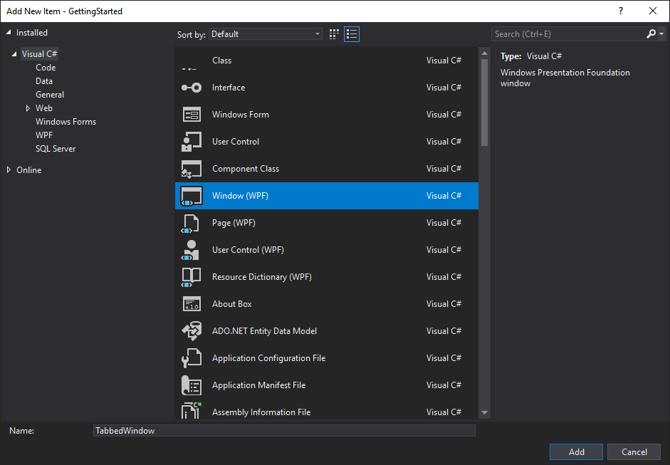
Start by creating a new WPF window using Visual Studio's item template.
Figure 1: Add new WPF Window
After this, replace the generated Window declaration with the following XAML code:
Example 1: Defining a RadTabbedWindow in XAML
<telerik:RadTabbedWindow x:Class="GettingStarted.TabbedWindow"
            xmlns="http://schemas.microsoft.com/winfx/2006/xaml/presentation"
            xmlns:x="http://schemas.microsoft.com/winfx/2006/xaml"
            xmlns:telerik="http://schemas.telerik.com/2008/xaml/presentation">
</telerik:RadTabbedWindow>
Please note that you need to replace the GettingStarted namespace with your namespace.
Also in the code-behind file you should inherit the RadTabbedWindow instead of the standard MS Window.
Example 2: Inherit from RadTabbedWindow
public partial class TabbedWindow : RadTabbedWindow
{
    public TabbedWindow()
    {
        InitializeComponent();
    }
}
Partial Public Class TabbedWindow
    Inherits RadTabbedWindow

    Public Sub New()
        InitializeComponent()
    End Sub
End Class
Finally, you can remove the StartupUri property from the App.xaml file and replace the code-behind with the following:
Example 3: Open RadTabbedWindow on application startup
public partial class App : Application
{
    public App()
    {
        var tabbedWindow = new TabbedWindow();
        tabbedWindow.Header = "My Tabbed Window";
        tabbedWindow.Height = 400;
        tabbedWindow.Width = 600;
        tabbedWindow.Show();
    }
}
Partial Public Class App
    Inherits Application

    Public Sub New()
        Dim tabbedWindow = New TabbedWindow()
        tabbedWindow.Header = "My Tabbed Window"
        tabbedWindow.Height = 400
        tabbedWindow.Width = 600
        tabbedWindow.Show()
    End Sub
End Class
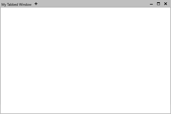
If you run the application, you will see the RadTabbedWindow control illustrated in Figure 2.
Figure 2: Empty RadTabbedWindow
If you're using the implicit styles theming mechanism with the NoXaml binaries, note that the newly created window will not automatically receive the default style. In order for this to happen, you should add the following style after the merged dictionaries:
Example 4: Adding the style for the new TabbedWindow
<Application.Resources>
    <ResourceDictionary>
        <ResourceDictionary.MergedDictionaries>
            <ResourceDictionary Source="Themes/System.Windows.xaml" />
            <ResourceDictionary Source="Themes/Telerik.Windows.Controls.xaml" />
            <ResourceDictionary Source="Themes/Telerik.Windows.Controls.Navigation.xaml" />
        </ResourceDictionary.MergedDictionaries>
        <Style TargetType="local:TabbedWindow" BasedOn="{StaticResource RadTabbedWindowStyle}" />
    </ResourceDictionary>
</Application.Resources>
Add Tabs
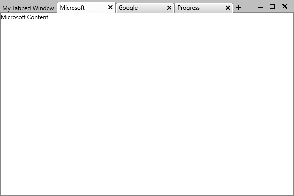
You can add tabs to the window by directly defining them as its content.
Example 5: Adding Tabs to RadTabbedWindow in XAML
<telerik:RadTabbedWindow x:Class="GettingStarted.TabbedWindow"
            xmlns="http://schemas.microsoft.com/winfx/2006/xaml/presentation"
            xmlns:x="http://schemas.microsoft.com/winfx/2006/xaml"
            xmlns:telerik="http://schemas.telerik.com/2008/xaml/presentation">
    <telerik:RadTabItem Header="Microsoft">
        <TextBlock Text="Microsoft Content" />
    </telerik:RadTabItem>
    <telerik:RadTabItem Header="Google">
        <TextBlock Text="Google Content" />
    </telerik:RadTabItem>
    <telerik:RadTabItem Header="Progress">
        <TextBlock Text="Progress Content" />
    </telerik:RadTabItem>
</telerik:RadTabbedWindow>
Figure 3: RadTabbedWindow with tabs
Alternatively, you can set the ItemsSource property of the control or bind it to a collection in your viewmodel. You can find an example of how to do this in the Data Binding article.
Setting a Theme
The controls from our suite support different themes. You can see how to apply a theme different than the default one in the Setting a Theme help article.
Changing the theme using implicit styles will affect all controls that have styles defined in the merged resource dictionaries. This is applicable only for the controls in the scope in which the resources are merged.
To change the theme, you can follow the steps below:
Choose between the themes and add reference to the corresponding theme assembly (ex: Telerik.Windows.Themes.Windows8.dll). You can see the different themes applied in the Theming examples from our WPF Controls Examples application.
-
Merge the resource dictionaries with the namespace required for the controls that you are using from the theme assembly. For RadTabbedWindow, you will need to merge the following resource dictionaries:
- System.Windows.xaml
- Telerik.Windows.Controls.xaml
- Telerik.Windows.Controls.Navigation.xaml
Example 6 demonstrates how to merge the resource dictionaries so that they are applied globally for the entire application.
Example 6: Merge the ResourceDictionaries
    <Application.Resources>
        <ResourceDictionary>
            <ResourceDictionary.MergedDictionaries>
                <ResourceDictionary Source="/Telerik.Windows.Themes.Windows8;component/Themes/System.Windows.xaml"/>
                <ResourceDictionary Source="/Telerik.Windows.Themes.Windows8;component/Themes/Telerik.Windows.Controls.xaml"/>
                <ResourceDictionary Source="/Telerik.Windows.Themes.Windows8;component/Themes/Telerik.Windows.Controls.Navigation.xaml"/>
            </ResourceDictionary.MergedDictionaries>
                <Style TargetType="local:TabbedWindow" BasedOn="{StaticResource RadTabbedWindowStyle}" />
        </ResourceDictionary>
    </Application.Resources>
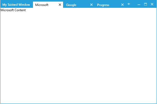
Figure 4: RadTabbedWindow with the Windows8 theme
Telerik UI for WPF Learning Resources
- Telerik UI for WPF TabbedWindow Component
- Getting Started with Telerik UI for WPF Components
- Telerik UI for WPF Installation
- Telerik UI for WPF and WinForms Integration
- Telerik UI for WPF Visual Studio Templates
- Setting a Theme with Telerik UI for WPF
- Telerik UI for WPF Virtual Classroom (Training Courses for Registered Users)
- Telerik UI for WPF License Agreement