Templating Headers and Cells
RadPivotGrid provides few options to template its cells and headers out of the box. You can either apply one template to all of them using the CellTemplate, RowHeaderTemplate and ColumnHeaderTemplate properties of RadPivotGrid. Or you can use the CellTemplateSelector, RowHeaderTemplateSelector and ColumnHeaderTemplateSelector properties in order to implement custom TemplateSelector and template the headers and cells per condition. This article will show you how to improve the RadPivotGrid appearance by applying custom Templates and implementing custom TemplateSelectors.
Using Custom Cell and Header Templates
The CellTemplate, RowHeaderTemplate and ColumnHeaderTemplate properties of RadPivotGrid will help you to easily apply a custom template to all of the cells or to all of the column and row headers. You would simply need to define the needed DataTemplates and apply them to RadPivotGrid. For example if you need to have green cells and headers with Italic FontStyle you will need to define the following templates:
<UserControl.Resources>
    <DataTemplate x:Key="CellTemplate">
        <Border BorderThickness="1 1 0 0" BorderBrush="LightGray">
            <Grid Background="LightGreen">
                <TextBlock Text="{Binding Data, Mode=OneWay}" Margin="4" VerticalAlignment="Center" HorizontalAlignment="Right"/>
            </Grid>
        </Border>
    </DataTemplate>
    <DataTemplate x:Key="HeaderTemplate">
        <TextBlock Text="{Binding Data, Mode=OneWay}" FontStyle="Italic" Margin="4 0 0 0"  VerticalAlignment="Center" />
    </DataTemplate>
</UserControl.Resources>
And apply them as shown below:
<pivot:RadPivotGrid CellTemplate="{StaticResource CellTemplate}"
                    RowHeaderTemplate="{StaticResource HeaderTemplate}"
                    ColumnHeaderTemplate="{StaticResource HeaderTemplate}" />
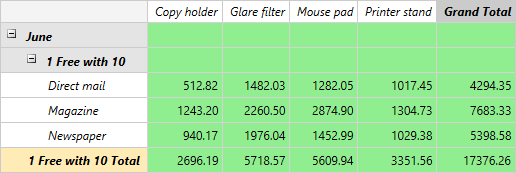
Figure 1 demonstrates the final result.
Figure 1: Custom cell and header templates.
Using Custom CellTemplateSelector
Implementing a custom CellTemplateSelector allows you to apply different templates per a condition. For example depending on the cell value you can change its Background in order to indicate lower or higher value than a certain one. To get it started you would need to create a new class inheriting from the DataTemplateSelector class and define the two Templates - one for the lower values and one for the higher ones. Afterwards you have to override the SelectTemplate and implement the needed custom logic. So finally the custom CellTemplateSelector should look the following way:
public class CellTemplateSelector : DataTemplateSelector
{
    public DataTemplate RedTemplate { get; set; }
    public DataTemplate GreenTemplate { get; set; }

    public override DataTemplate SelectTemplate(object item, DependencyObject container)
    {
        var cellAggregate = item as CellAggregateValue;

        if (cellAggregate != null)
        {
            var description = cellAggregate.Description as PropertyAggregateDescription;

            if (description.PropertyName == "Net" && cellAggregate.RowGroup.Type == GroupType.BottomLevel && cellAggregate.ColumnGroup.Type == GroupType.BottomLevel)
            {
                if (Convert.ToDouble(cellAggregate.Value) > 1000d)
                {
                    return this.GreenTemplate;
                }
                else
                {
                    return this.RedTemplate;
                }
            }
        }

        return base.SelectTemplate(item, container);
    }
}
Public Class CellTemplateSelector
    Inherits DataTemplateSelector

    Public Property RedTemplate() As DataTemplate
    Public Property GreenTemplate() As DataTemplate

    Public Overrides Function SelectTemplate(ByVal item As Object, ByVal container As DependencyObject) As DataTemplate
        Dim cellAggregate = TryCast(item, CellAggregateValue)

        If cellAggregate IsNot Nothing Then
            Dim description = TryCast(cellAggregate.Description, PropertyAggregateDescription)

            If description.PropertyName = "Net" AndAlso cellAggregate.RowGroup.Type = GroupType.BottomLevel AndAlso cellAggregate.ColumnGroup.Type = GroupType.BottomLevel Then
                If Convert.ToDouble(cellAggregate.Value) > 1000.0R Then
                    Return Me.GreenTemplate
                Else
                    Return Me.RedTemplate
                End If
            End If
        End If

        Return MyBase.SelectTemplate(item, container)
    End Function
End Class
Next thing to do is to define the required templates in the XAML as shown below:
<UserControl.Resources>
    <local:CellTemplateSelector x:Key="CellTemplateSelector">
        <local:CellTemplateSelector.GreenTemplate>
            <DataTemplate>
                <Border BorderThickness="1 1 0 0" BorderBrush="LightGray">
                    <Grid Background="LightGreen">
                        <TextBlock Text="{Binding Data, Mode=OneWay}" Margin="4" VerticalAlignment="Center" HorizontalAlignment="Right"/>
                    </Grid>
                </Border>
            </DataTemplate>
        </local:CellTemplateSelector.GreenTemplate>
        <local:CellTemplateSelector.RedTemplate>
            <DataTemplate>
                <Border BorderThickness="1 1 0 0" BorderBrush="LightGray">
                    <Grid Background="Red">
                        <TextBlock Text="{Binding Data, Mode=OneWay}" Margin="4" VerticalAlignment="Center" HorizontalAlignment="Right"/>
                    </Grid>
                </Border>
            </DataTemplate>
        </local:CellTemplateSelector.RedTemplate>
    </local:CellTemplateSelector>
</UserControl.Resources>
And the last step would be to assign the CellTemplateSelector to RadPivotGrid:
<pivot:RadPivotGrid x:Name="pivotGrid" CellTemplateSelector="{StaticResource CellTemplateSelector}"/>
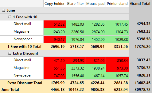
You can see the final result on Figure 2.
Figure 2: Cells with values below 1000 are colored in red and the other cells in green using CellTemplateSelector.
Find a runnable project of the previous example in the WPF Samples GitHub repository.
Using Custom HeaderTemplateSelectors
By implementing a custom HeaderTemplateSelector you are able to modify the templates only of the column header cells or row header cells. In this section you will see how to add images in the different header cells. Firstly you will need to create custom HeaderTemplateSelector that inherits from DataTemplateSelector and define a DataTemplate which will be used for the Product header cells. The selector should look as shown below:
public class HeaderTemplateSelector : DataTemplateSelector
{
    public DataTemplate ProductTemplate { get; set; }

    public override DataTemplate SelectTemplate(object item, System.Windows.DependencyObject container)
    {
        FrameworkElement element = container as FrameworkElement;
        GroupData data = element.DataContext as GroupData;
        PropertyGroupDescriptionBase pgd = data.GroupDescription as PropertyGroupDescriptionBase;

        if (pgd != null && pgd.PropertyName == "Product")
        {
            return this.ProductTemplate;
        }

        return base.SelectTemplate(item, container);
    }
}
Public Class HeaderTemplateSelector
    Inherits DataTemplateSelector

    Public Property ProductTemplate() As DataTemplate

    Public Overrides Function SelectTemplate(ByVal item As Object, ByVal container As System.Windows.DependencyObject) As DataTemplate
        Dim element As FrameworkElement = TryCast(container, FrameworkElement)
        Dim data As GroupData = TryCast(element.DataContext, GroupData)
        Dim pgd As PropertyGroupDescriptionBase = TryCast(data.GroupDescription, PropertyGroupDescriptionBase)

        If pgd IsNot Nothing AndAlso pgd.PropertyName = "Product" Then
            Return Me.ProductTemplate
        End If

        Return MyBase.SelectTemplate(item, container)
    End Function
End Class
Next thing to do is to define the required templates in the XAML the following way:
<local:ProductToImageConverter x:Key="ProductToImageConverter"/>
<local:HeaderTemplateSelector x:Key="HeaderTemplateSelector">
    <local:HeaderTemplateSelector.ProductTemplate>
        <DataTemplate>
            <Grid Height="80">
                <Grid.ColumnDefinitions>
                    <ColumnDefinition Width="64"/>
                    <ColumnDefinition Width="85"/>
                </Grid.ColumnDefinitions>
                <Image Source="{Binding Data, Converter={StaticResource ProductToImageConverter}}"  Stretch="None"/>
                <TextBlock Grid.Column="1" Text="{Binding Data, Mode=OneWay}" Margin="4 0 0 0"  VerticalAlignment="Center"/>
            </Grid>
        </DataTemplate>
    </local:HeaderTemplateSelector.ProductTemplate>
</local:HeaderTemplateSelector>
Using an IValueConverter you will be able to return the path for the needed image depending content of the header cell:
public class ProductToImageConverter : IValueConverter
{
    public object Convert(object value, Type targetType, object parameter, System.Globalization.CultureInfo culture)
    {
        string product = System.Convert.ToString(value);
        return string.Format("/CustomHeaderTemplate;component/ProductImages/{0}.png", product);
    }

    public object ConvertBack(object value, Type targetType, object parameter, System.Globalization.CultureInfo culture)
    {
        throw new NotImplementedException();
    }
}
Public Class ProductToImageConverter
    Implements IValueConverter

    Public Function Convert(ByVal value As Object, ByVal targetType As Type, ByVal parameter As Object, ByVal culture As System.Globalization.CultureInfo) As Object
        Dim product As String = System.Convert.ToString(value)
        Return String.Format("/CustomHeaderTemplate;component/ProductImages/{0}.png", product)
    End Function

    Public Function ConvertBack(ByVal value As Object, ByVal targetType As Type, ByVal parameter As Object, ByVal culture As System.Globalization.CultureInfo) As Object
        Throw New NotImplementedException()
    End Function
End Class
Finaly you will have to assing the HeaderTemplateSelector to the RowHeaderTemplateSelector and ColumnHeaderTemplateSelector properties of RadPivotGrid.
<pivot:RadPivotGrid RowHeaderTemplateSelector="{StaticResource HeaderTemplateSelector}"
                    ColumnHeaderTemplateSelector="{StaticResource HeaderTemplateSelector}"/>
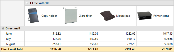
You can see the final result on Figure 3.
Figure 3: Header cells with different images.
Find a runnable project of the previous example in the WPF Samples GitHub repository.