Getting Started with WPF DataBar
This tutorial will walk you through the required steps for using RadDataBar.
- Adding Telerik Assemblies Using NuGet
- Adding Assembly References Manually
- Adding RadDataBar to the Project
- Displaying collection of Bars
Adding Telerik Assemblies Using NuGet
To use RadDataBar when working with NuGet packages, install the Telerik.Windows.Controls.DataVisualization.for.Wpf.Xaml package. The package name may vary slightly based on the Telerik dlls set - Xaml or NoXaml
Read more about NuGet installation in the Installing UI for WPF from NuGet Package article.
With the 2025 Q1 release, the Telerik UI for WPF has a new licensing mechanism. You can learn more about it here.
Adding Assembly References Manually
If you are not using NuGet packages, you can add a reference to the following assemblies:
- Telerik.Licensing.Runtime
- Telerik.Windows.Controls
- Telerik.Windows.Controls.DataVisualization
- Telerik.Windows.Data
Visualization Types
The RadDataBar suite contains the following controls representing the different visualizations.
-
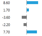
RadDataBar: Displays a single data bar representing a value. It is useful for comparing quantitative values of data. You can easily highlight negative values.
-
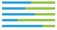
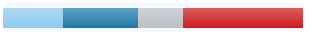
RadStackedDataBar: Displays a set of stacked bars where each bar represents a value. The size of each bar is calculated in accordance to the set Minimum and Maximum properties.

-
RadStacked100DataBar: Displays a set of stacked bars where each value represents a percentage of the value. The percent is calculated based on the bar's value and the sum of all values in the stack.
Using RadDataBar
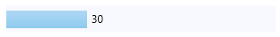
To display a data bar visualization, you can just add a RadDataBar control in the view and set its Value property. This will create a horizontal bar measured according to the Value. The value range of the bar is defined by its Minimum and Maximum properties, which default values are 0 an 100 respectively.
Example 1: Defining RadDataBar
<telerik:RadDataBar Value="30" Width="300" Height="30" Background="#F7F9FE" />
Using RadStackedDataBar and RadStacked100DataBar
To display a stacked data bar visualization, you can add a RadStackedDataBar control in the view and set its ItemsSource property. This will create a set of stacked horizontal bars measured according to the values in the ItemsSource. The value range of the bar is defined by its Minimum and Maximum properties, which default values are 0 an 100 respectively.
Example 2: Defining RadStackedDataBar
<telerik:RadStackedDataBar x:Name="stackedDataBar" Height="30" Width="300" Background="#F7F9FE"/>
Example 3: Setting RadStackedDataBar ItemsSource
public MyUserControl()
{
    InitializeComponent();
    this.stackedDataBar.ItemsSource = new List<double>() { 16, 20, 12, 32 };
}
The RadStacked100DataBar works very similar to the RadStackedDataBar, but instead of using absolute values and relying on the predefined minimum and maximum values, it displays the bars as a percetange of the whole stack. For example, the sum of the values from Example 3 is 16 + 20 + 12 + 32 = 80 which will be the range's maximum. Then each value in the ItemsSource is turned to a value relative to the range and based on this information its bar's width is calculated. For example, 20 will be 0.25 which is 25% of the 80's range. This means that the bar for the value 20 will take 25% of the whole data bar.
To define RadStacked100DataBar, use Example 2 and 3, but replace the RadStackedDataBar with RadStacked100DataBar.
Example 4: Defining RadStacked100DataBar
<telerik:RadStacked100DataBar x:Name="stackedDataBar" Height="30" Width="300" Background="#F7F9FE"/>
Telerik UI for WPF Learning Resources
- Telerik UI for WPF DataBar Component
- Getting Started with Telerik UI for WPF Components
- Telerik UI for WPF Installation
- Telerik UI for WPF and WinForms Integration
- Telerik UI for WPF Visual Studio Templates
- Setting a Theme with Telerik UI for WPF
- Telerik UI for WPF Virtual Classroom (Training Courses for Registered Users)
- Telerik UI for WPF License Agreement