Template Structure
Like most WPF controls, the RadCloudUpload also allows you to customize it in order to change the control from the inside. Except for templating the control itself, you can template parts of it or even independent controls related to it.
RadCloudUpload Template structure
This section will explain the structure of the RadUpload's template. Here is a snapshot of the template generated in Expression Blend.
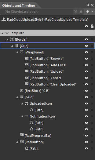
It contains the following parts:
[Border] - represents the outer border of the RadCloudUpload.
[Grid] - hosts the template elements.
[WrapPanel] - hosts the buttons used in the control.
[RadButton] - Browse represents the Browse button used to open a file dialog.(This buttons clears the selected items)
[RadButton] - Add Files represents the Add Files button used to open a file dialog.(This buttons adds files to the selected items)
[RadButton] - Upload represents the Upload button used to start the upload session.
[RadButton] - Cancel represents the Cancel button used to request a cancel.
[RadButton] - ClearUpload represents the ClearUpload button used to request a cancel.
[TextBlock] - represents the TotalSize (bytes) of the items size in the current upload session.
[Grid] - hosts the notification and uploaded Paths.
[Border] - hosts the upload path.
[Path] - represents the shape of the uploaded icon.
[Grid] - hosts the error path
[Path] - represents the shape of the error icon.
[Path] - represents the shape of the error icon.
[ProgressBar] - indicates the total progress of the upload.
[RadButton] - Clear represents the Clear button which hosts the clear path.
Styling the RadCloudUpload
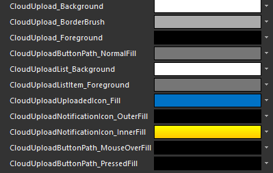
CloudUpload_Background - a brush that represents the background of the RadCloudUpload control.
CloudUpload_BorderBrush - a brush that represents the border color of the RadCloudUpload control
CloudUpload_Foregound - a brush that represents the foreground color of the TextBlock element in the RadCloudUpload.
CloudUploadButtonPath_NormalFill - a brush that represents the color of the Path’s located in the buttons in the RadCloudUpload.
CloudUploadUploadedIcon_Fill - a brush that represents the color of the UploadedPath element in the RadCloudUpload.
CloudUploadList_Background - a brush that represents the background of the RadCloudUploadList control.
CloudUploadListItem_Foregound - a brush that represents the foreground of the RadCloudUploadListItem control.
CloudUploadNotificationIcon_OuterFill - a brush that represents the outer fill color of the RadCloudUpload notification icon.
CloudUploadNotificationIcon_InnerFill - a brush that represents the inner fill color of the RadCloudUpload notification icon.