Tooltip Behavior
The tooltip behavior visualizes arbitrary information related to a data point. When the behavior is enabled, a tooltip is displayed on mouse over a data point. The tooltip contains information about the hovered data point.
To enable the tooltip behavior you can add a Chart3DTooltipBehavior object in the Behaviors collection of the RadCartesianChart3D control.
Example 1: Defining tooltip behavior
<telerik:RadCartesianChart3D>
    <telerik:RadCartesianChart3D.Behaviors>
        <telerik:Chart3DTooltipBehavior/>
    </telerik:RadCartesianChart3D.Behaviors>
</telerik:RadCartesianChart3D>
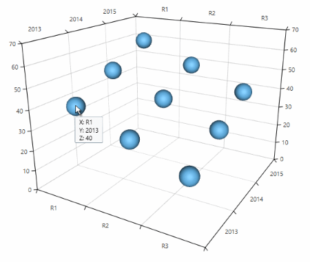
Figure 1: Tooltip
Customizing the tooltip
You can customize the appearance of the tooltip via the ToolTipTemplate property. Both the chart and the series have this property.
You can use the ToolTipTemplate property of the chart to define a global template for all series. To define a template specific for a series you can use the series' ToolTipTemplate property.
In the context of the series the ToolTipTemplate property of the series has bigger priority than the chart’s ToolTipTemplate.
Example 2: Defining tooltip template
<telerik:PointSeries3D>
    <telerik:PointSeries3D.TooltipTemplate>
        <DataTemplate>
            <Border Background="#5A000000" Padding="5" TextElement.Foreground="White">
                <StackPanel>
                    <StackPanel Orientation="Horizontal">
                        <TextBlock Text="X - " FontWeight="Bold" />
                        <TextBlock Text="{Binding XValue}"  />
                    </StackPanel>
                    <StackPanel Orientation="Horizontal">
                        <TextBlock Text="Y - " FontWeight="Bold" />
                        <TextBlock Text="{Binding YValue}"  />
                    </StackPanel>
                    <StackPanel Orientation="Horizontal">
                        <TextBlock Text="Z - " FontWeight="Bold" />
                        <TextBlock Text="{Binding ZValue}"  />
                    </StackPanel>
                </StackPanel>
            </Border>
        </DataTemplate>
    </telerik:PointSeries3D.TooltipTemplate>
</telerik:PointSeries3D>
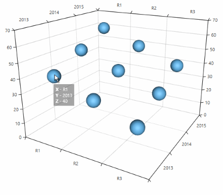
Figure 2: Tooltip template
The data context passed in the template is an object of type XyzDataPoint3D. The object contains information about the data point positioned under the mouse. You can use the XyzDataPoint3D's DataItem property to get the view model of the data point and display custom information about it.
The behavior gives you additional control over the displayed tooltip via several properties:
- ShowDuration
- InitialShowDelay
- Placement
- PlacementRectangle
- PlacementTarget
- HorizontalOffset
- VerticalOffset