Visual Structure
This section defines terms and concepts used in the scope of RadChart you have to get familiar with prior to continue reading this help.
Default layout
The structure of the RadChart control is based on three major elements: ChartTitle, ChartArea and ChartLegend. These elements are common for all chart types. The illustration below shows the default chart layout and the positions of the chart’s elements:
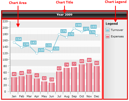
Chart Title
Usually the ChartTitle is used to display a simple text about the chart displayed. However, as a ContentControl, you are able to customize the title and add whatever controls you need. Read more
Chart Area
The ChartArea is where your graphics is drawn. Unlike the ChartTitle, ChartArea consists of other elements:
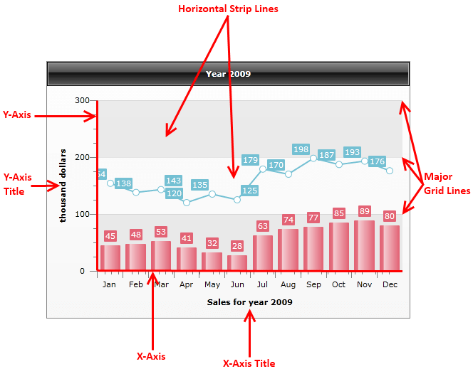
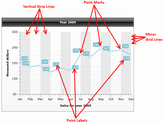
In most cases a chart area has the following structure:
Axes titles - axes description text.
Horizontal and vertical strip lines - for better readability.
Major grid lines - grid lines for the major ticks.
Minor grid lines - grid lines for the minor ticks. Valid for X-axis only.
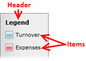
Chart Legend
The ChartLegend element contains a header, where explanation text is shown and a list of legend items - one for each data series displayed on a ChartArea associated with the ChartLegend. Read more