UI Structure
Knowing the visual structure of a control is fundamental for creating new custom themes and custom styles. This topic will present the building blocks of the RadCarousel, thus help you to better understand its UI structure.
RadCarousel

The RadCarousel is primarily composed of four elements - CarouselItemsControl, RadCarouselPanel, CarouselItem, and a ScrollViewer. We will take a closer look at each of those elements and briefly explain their purpose.
CarouselItemsControl
Although it is not directly accessible and you should not worry about styling this class it is crucial for the functioning of the RadCarousel.
RadCarouselPanel

The RadCarouselPanel is the most important element in the visual tree of the RadCarousel since it is the actual workhorse - it hosts the carousel items, runs all animations, and computes all effects like scaling and opacity.
The RadCarouselPanel is used as ItemsPanel for the CarouselItemsControl
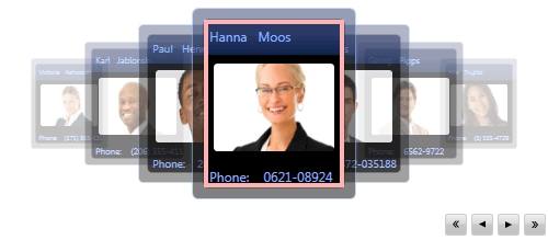
CarouselItem

The CarouselItem represents a selectable item in a RadCarousel and also contains the visual representation of a data element. Usually, container items such as the CarouselItem display the selection state of the element that they contain.
CarouselDataRecordPresenter
If the AutoGenerateRecordPresenters property is set to true RadCarousel will inspect the data source and it will create a special CarouselDataRecordPresenter for each data item. This object defines the visual representation of the data items, thus you can change the appearance of the data by providing a new style for the CarouselDataRecordPresenter.
CarouselDataFieldPresenter
The CarouselDataFieldPresenter is used to display a single field (or a column) of a data item and you can use it to change the appearance of all fields as a whole.