Styling Visual States
This article will show you how to change the default colors applied when you enter the different visual states of RadButton - MouseOver, Pressed, Disabled, etc.
The article is created with RadButton in mind, but the same guidelines can be used with any other control from the RadButton suite. In few words, you need to find the corresponding Trigger, VisualState object or a visual element, and change a property (Background, BorderBrush, etc.).
The Material, Fluent, Crystal themes expose an easy mechanism to style most visual states without the need of the following steps. Read more about this in the Material Theme, the Fluent Theme and the Crystal Theme articles.
Step 1: Extracting the Default Template
The first thing to do would be to define a RadButton in XAML and extract its default Style. Read how to do this in the Editing ControlTemplates article. Basically, you will need to use the Visual Studio designer or copy the XAML manually in your project.
This article will demonstrate how to modify the visual states in the Office2016 and the Office_Black themes as they show the two main template structures used accross the Telerik themes.
Step 2: Applying Changes in the ControlTemplate of the Button
The next code snippets show runnable XAML with the default Style (for the Office_Black and Office2016 themes) of RadButton customized.
Note the following:
The Office_Black theme uses VisualState objects to animate its visual states.
The Office2016 theme uses Trigger objects to animate its visual states.
In the next snippets the ControlTemplate of each Style will be modified in such a manner that it will change colors in the following visual states - Pressed, MouseOver and Focused. To change the colors of any other visual state like Disabled, find the corresponding VisualState, Trigger or a visual element in the ControlTemplate and set the corresponding property - for example: Background, Fill, BorderBrush, etc.
The changes applied in the ControlTemplate (in the following code) are marked with comments using the pattern "Changed OldValue to NewValue". For example: "Changed Background from "{StaticResource ControlBackground_MouseOver}" to "#FF8080:" ".
Example 1: Customized RadButton Style - based on the Office_Black Theme
<Grid>
<Grid.Resources>
<SolidColorBrush x:Key="ControlForeground_Normal" Color="#FF000000"/>
<LinearGradientBrush x:Key="ControlBackground_Normal" EndPoint="0.5,1" StartPoint="0.5,0">
<GradientStop Color="#FFFFFFFF" Offset="0"/>
<GradientStop Color="#FFDCDCDC" Offset="0.50"/>
<GradientStop Color="#FFADADAD" Offset="0.50"/>
<GradientStop Color="#FFD4D4D4" Offset="1"/>
</LinearGradientBrush>
<SolidColorBrush x:Key="ControlOuterBorder_Normal" Color="#FF848484"/>
<CornerRadius x:Key="ControlOuterBorder_CornerRadius">1</CornerRadius>
<SolidColorBrush x:Key="ControlInnerBorder_Normal" Color="#FFFFFFFF"/>
<LinearGradientBrush x:Key="ControlBackground_MouseOver" EndPoint="0.5,1" StartPoint="0.5,0">
<GradientStop Color="#FFFFFBDA" Offset="0"/>
<GradientStop Color="#FFFEEBAE" Offset="0.50"/>
<GradientStop Color="#FFFFD25A" Offset="0.50"/>
<GradientStop Color="#FFFFFBA3" Offset="1"/>
</LinearGradientBrush>
<SolidColorBrush x:Key="ControlOuterBorder_MouseOver" Color="#FFFFC92B"/>
<SolidColorBrush x:Key="ControlInnerBorder_MouseOver" Color="#FFFFFFFF"/>
<LinearGradientBrush x:Key="ControlBackground_Pressed" EndPoint="0.5,1" StartPoint="0.5,0">
<GradientStop Color="#FFFFDCAB" Offset="0"/>
<GradientStop Color="#FFFFD18F" Offset="0.5"/>
<GradientStop Color="#FFFE9227" Offset="0.5"/>
<GradientStop Color="#FFFFBA74" Offset="0"/>
</LinearGradientBrush>
<LinearGradientBrush x:Key="ControlOuterBorder_Pressed" EndPoint="0.5,1" StartPoint="0.5,0">
<GradientStop Color="#FF282828"/>
<GradientStop Color="#FF5F5F5F" Offset="1"/>
</LinearGradientBrush>
<LinearGradientBrush x:Key="ControlInnerBorder_Pressed" EndPoint="0.5,1" StartPoint="0.5,0">
<GradientStop Color="#FFB69A78"/>
<GradientStop Color="#FFFFE17A" Offset="0.126"/>
</LinearGradientBrush>
<SolidColorBrush x:Key="ControlBackground_Disabled" Color="#FFE0E0E0"/>
<SolidColorBrush x:Key="ControlOuterBorder_Focused" Color="#FFFFC92B"/>
<SolidColorBrush x:Key="ControlBackground_Focused" Color="Transparent"/>
<SolidColorBrush x:Key="ControlInnerBorder_Disabled" Color="Transparent"/>
<SolidColorBrush x:Key="ControlInnerBorder_Focused" Color="Transparent"/>
<Style TargetType="telerik:RadButton">
<Setter Property="BorderThickness" Value="1"/>
<Setter Property="Foreground" Value="{StaticResource ControlForeground_Normal}"/>
<Setter Property="Background" Value="{StaticResource ControlBackground_Normal}"/>
<Setter Property="BorderBrush" Value="{StaticResource ControlOuterBorder_Normal}"/>
<Setter Property="CornerRadius" Value="{StaticResource ControlOuterBorder_CornerRadius}"/>
<Setter Property="Padding" Value="3"/>
<Setter Property="FocusVisualStyle" Value="{x:Null}"/>
<Setter Property="HorizontalContentAlignment" Value="Center"/>
<Setter Property="VerticalContentAlignment" Value="Center"/>
<Setter Property="Template">
<Setter.Value>
<ControlTemplate TargetType="telerik:RadButton">
<Grid SnapsToDevicePixels="True">
<VisualStateManager.VisualStateGroups>
<VisualStateGroup x:Name="CommonStates">
<VisualState x:Name="Normal"/>
<VisualState x:Name="MouseOver">
<Storyboard>
<DoubleAnimation Duration="0" To="1" Storyboard.TargetProperty="(UIElement.Opacity)" Storyboard.TargetName="OuterMouseOverBorder"/>
</Storyboard>
</VisualState>
<VisualState x:Name="Pressed">
<Storyboard>
<ObjectAnimationUsingKeyFrames Storyboard.TargetName="OuterPressedBorder" Storyboard.TargetProperty="Visibility">
<DiscreteObjectKeyFrame KeyTime="0">
<DiscreteObjectKeyFrame.Value>
<Visibility>Visible</Visibility>
</DiscreteObjectKeyFrame.Value>
</DiscreteObjectKeyFrame>
</ObjectAnimationUsingKeyFrames>
<DoubleAnimation Duration="0" Storyboard.TargetName="CommonStatesWrapper" Storyboard.TargetProperty="Opacity" To="0"/>
<DoubleAnimation Duration="0" Storyboard.TargetName="FocusVisual" Storyboard.TargetProperty="Opacity" To="0"/>
</Storyboard>
</VisualState>
<VisualState x:Name="Disabled">
<Storyboard>
<ObjectAnimationUsingKeyFrames Storyboard.TargetName="DisabledVisual" Storyboard.TargetProperty="Visibility">
<DiscreteObjectKeyFrame KeyTime="0">
<DiscreteObjectKeyFrame.Value>
<Visibility>Visible</Visibility>
</DiscreteObjectKeyFrame.Value>
</DiscreteObjectKeyFrame>
</ObjectAnimationUsingKeyFrames>
<DoubleAnimation Duration="0" Storyboard.TargetName="Content" Storyboard.TargetProperty="Opacity" To="0.5"/>
</Storyboard>
</VisualState>
</VisualStateGroup>
<VisualStateGroup x:Name="BackgroundVisibility">
<VisualState x:Name="BackgroundIsHidden">
<Storyboard>
<ObjectAnimationUsingKeyFrames Storyboard.TargetName="OuterBorder" Storyboard.TargetProperty="Visibility">
<DiscreteObjectKeyFrame KeyTime="0">
<DiscreteObjectKeyFrame.Value>
<Visibility>Collapsed</Visibility>
</DiscreteObjectKeyFrame.Value>
</DiscreteObjectKeyFrame>
</ObjectAnimationUsingKeyFrames>
<DoubleAnimation Duration="0" Storyboard.TargetName="DisabledVisual" Storyboard.TargetProperty="Opacity" To="0"/>
</Storyboard>
</VisualState>
<VisualState x:Name="BackgroundIsVisible"/>
</VisualStateGroup>
<VisualStateGroup x:Name="FocusStatesGroup">
<VisualState x:Name="Unfocused">
<Storyboard>
<ObjectAnimationUsingKeyFrames Storyboard.TargetName="FocusVisual" Storyboard.TargetProperty="Visibility">
<DiscreteObjectKeyFrame KeyTime="00:00:00.150">
<DiscreteObjectKeyFrame.Value>
<Visibility>Collapsed</Visibility>
</DiscreteObjectKeyFrame.Value>
</DiscreteObjectKeyFrame>
</ObjectAnimationUsingKeyFrames>
</Storyboard>
</VisualState>
<VisualState x:Name="Focused">
<Storyboard>
<ObjectAnimationUsingKeyFrames Storyboard.TargetName="FocusVisual" Storyboard.TargetProperty="Visibility">
<DiscreteObjectKeyFrame KeyTime="00:00:00.115">
<DiscreteObjectKeyFrame.Value>
<Visibility>Visible</Visibility>
</DiscreteObjectKeyFrame.Value>
</DiscreteObjectKeyFrame>
</ObjectAnimationUsingKeyFrames>
</Storyboard>
</VisualState>
</VisualStateGroup>
</VisualStateManager.VisualStateGroups>
<Border x:Name="OuterBorder"
BorderThickness="{TemplateBinding BorderThickness}"
BorderBrush="{TemplateBinding BorderBrush}"
Background="{TemplateBinding Background}"
CornerRadius="{TemplateBinding CornerRadius}">
<Border BorderThickness="{TemplateBinding BorderThickness}"
Background="{x:Null}"
CornerRadius="{TemplateBinding InnerCornerRadius}"
BorderBrush="{StaticResource ControlInnerBorder_Normal}"/>
</Border>
<!--Changed Background from "{StaticResource ControlBackground_MouseOver}" to "#FF8080"-->
<Border x:Name="OuterMouseOverBorder"
Opacity="0"
CornerRadius="{TemplateBinding CornerRadius}"
BorderThickness="{TemplateBinding BorderThickness}"
Background="#FF8080"
BorderBrush="{StaticResource ControlOuterBorder_MouseOver}">
<Border BorderThickness="{TemplateBinding BorderThickness}"
Background="{x:Null}"
CornerRadius="{TemplateBinding InnerCornerRadius}"
BorderBrush="{StaticResource ControlInnerBorder_MouseOver}"/>
</Border>
<!--Changed Background from "{StaticResource ControlBackground_Pressed}" to "#FFE680"-->
<Border x:Name="OuterPressedBorder"
Visibility="Collapsed"
BorderThickness="{TemplateBinding BorderThickness}"
CornerRadius="{TemplateBinding CornerRadius}"
Background="#FFE680"
BorderBrush="{StaticResource ControlOuterBorder_Pressed}">
<Border BorderThickness="{TemplateBinding BorderThickness}"
Background="{x:Null}"
CornerRadius="{TemplateBinding InnerCornerRadius}"
BorderBrush="{StaticResource ControlInnerBorder_Pressed}"/>
</Border>
<Border x:Name="DisabledVisual"
BorderThickness="{TemplateBinding BorderThickness}"
CornerRadius="{TemplateBinding CornerRadius}"
Visibility="Collapsed"
BorderBrush="{StaticResource ControlInnerBorder_Disabled}"
Background="{StaticResource ControlBackground_Disabled}"/>
<ContentPresenter x:Name="Content"
TextBlock.Foreground="{TemplateBinding Foreground}"
Margin="{TemplateBinding Padding}"
Content="{TemplateBinding Content}"
ContentTemplate="{TemplateBinding ContentTemplate}"
VerticalAlignment="{TemplateBinding VerticalContentAlignment}"
HorizontalAlignment="{TemplateBinding HorizontalContentAlignment}"
ContentTemplateSelector="{TemplateBinding ContentTemplateSelector}"
ContentStringFormat="{TemplateBinding ContentStringFormat}"
RecognizesAccessKey="True"/>
<Border x:Name="CommonStatesWrapper">
<!--Changed BorderBrush from "{StaticResource ControlOuterBorder_Focused}" to "#FF8080"-->
<Border x:Name="FocusVisual"
BorderThickness="{TemplateBinding BorderThickness}"
CornerRadius="{TemplateBinding CornerRadius}"
Visibility="Collapsed"
Background="{StaticResource ControlBackground_Focused}"
BorderBrush="#FF8080">
<Border BorderThickness="1" BorderBrush="{StaticResource ControlInnerBorder_Focused}" CornerRadius="{TemplateBinding InnerCornerRadius}"/>
</Border>
</Border>
</Grid>
</ControlTemplate>
</Setter.Value>
</Setter>
</Style>
</Grid.Resources>
<telerik:RadButton Content="RadButton" Padding="20"/>
</Grid>
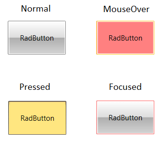
Figure 1: Office_Black RadButton with customized visual states
Example 2: Customized RadButton Style - based on the Office2016 Theme
<Grid>
    <Grid.Resources>
        <Style TargetType="telerik:RadButton">
            <Setter Property="BorderThickness" Value="1"/>
            <Setter Property="FontFamily" Value="{telerik:Office2016Resource ResourceKey=FontFamily}"/>
            <Setter Property="FontSize" Value="{telerik:Office2016Resource ResourceKey=FontSize}"/>
            <Setter Property="Foreground" Value="{telerik:Office2016Resource ResourceKey=MarkerBrush}"/>
            <Setter Property="Background" Value="{telerik:Office2016Resource ResourceKey=MainBrush}"/>
            <Setter Property="BorderBrush" Value="{telerik:Office2016Resource ResourceKey=BasicBrush}"/>
            <Setter Property="Padding" Value="4"/>
            <Setter Property="CornerRadius" Value="{telerik:Office2016Resource ResourceKey=CornerRadius}"/>
            <Setter Property="FocusVisualStyle" Value="{x:Null}"/>
            <Setter Property="HorizontalContentAlignment" Value="Center"/>
            <Setter Property="VerticalContentAlignment" Value="Center"/>
            <Setter Property="Template">
                <Setter.Value>
                    <ControlTemplate TargetType="telerik:RadButton">
                        <Grid>
                            <Border x:Name="BorderVisual"
                                    SnapsToDevicePixels="True"
                                    BorderThickness="{TemplateBinding BorderThickness}"
                                    BorderBrush="{TemplateBinding BorderBrush}"
                                    Background="{TemplateBinding Background}"
                                    CornerRadius="{TemplateBinding CornerRadius}">
                                <ContentPresenter x:Name="Content"
                                                  TextBlock.Foreground="{TemplateBinding Foreground}"
                                                  Margin="{TemplateBinding Padding}"
                                                  Content="{TemplateBinding Content}"
                                                  ContentTemplate="{TemplateBinding ContentTemplate}"
                                                  VerticalAlignment="{TemplateBinding VerticalContentAlignment}"
                                                  HorizontalAlignment="{TemplateBinding HorizontalContentAlignment}"
                                                  ContentTemplateSelector="{TemplateBinding ContentTemplateSelector}"
                                                  ContentStringFormat="{TemplateBinding ContentStringFormat}"
                                                  RecognizesAccessKey="True"/>
                            </Border>

                            <!--Changed BorderBrush from "{telerik:Office2016Resource ResourceKey=AccentFocusedBrush}" to "#FF8080" -->
                            <Border x:Name="FocusVisual"
                                    Opacity="0"
                                    BorderThickness="{telerik:Office2016Resource ResourceKey=FocusThickness}"
                                    BorderBrush="#FF8080"
                                    SnapsToDevicePixels="True"
                                    CornerRadius="{TemplateBinding CornerRadius}"/>
                        </Grid>
                        <ControlTemplate.Triggers>

                            <!-- background is hidden -->
                            <MultiTrigger>
                                <MultiTrigger.Conditions>
                                    <Condition Property="IsEnabled" Value="True"/>
                                    <Condition Property="IsBackgroundVisible" Value="False"/>
                                </MultiTrigger.Conditions>
                                <Setter TargetName="BorderVisual" Property="Background" Value="Transparent"/>
                                <Setter TargetName="BorderVisual" Property="BorderBrush" Value="Transparent"/>
                            </MultiTrigger>
                            <Trigger Property="IsKeyboardFocused" Value="True">
                                <Setter TargetName="FocusVisual" Property="Opacity" Value="1"/>
                            </Trigger>
                            <Trigger Property="IsMouseOver" Value="True">
                                <!--Changed Value from "{telerik:Office2016Resource ResourceKey=AccentMouseOverBrush}" to "#FF8080"-->
                                <Setter TargetName="BorderVisual" Property="Background" Value="#FF8080"/>
                                <Setter TargetName="BorderVisual" Property="BorderBrush" Value="{telerik:Office2016Resource ResourceKey=AccentMouseOverBrush}"/>
                                <Setter TargetName="Content" Property="TextElement.Foreground" Value="{telerik:Office2016Resource ResourceKey=MarkerInvertedBrush}"/>
                            </Trigger>
                            <Trigger Property="IsPressed" Value="True">
                                <!--Changed Value from "{telerik:Office2016Resource ResourceKey=AccentPressedBrush}" to "#FFE680"-->
                                <Setter TargetName="BorderVisual" Property="Background" Value="#FFE680"/>
                                <Setter TargetName="BorderVisual" Property="BorderBrush" Value="{telerik:Office2016Resource ResourceKey=AccentPressedBrush}"/>
                                <!--Changed Value from "{telerik:Office2016Resource ResourceKey=MarkerInvertedBrush}" to "#12100C"-->
                                <Setter TargetName="Content" Property="TextElement.Foreground" Value="#12100C"/>
                            </Trigger>

                            <!-- hovered and focused -->
                            <MultiTrigger>
                                <MultiTrigger.Conditions>
                                    <Condition Property="IsMouseOver" Value="True"/>
                                    <Condition Property="IsFocused" Value="True"/>
                                </MultiTrigger.Conditions>
                                <Setter TargetName="FocusVisual" Property="Opacity" Value="0"/>
                            </MultiTrigger>

                            <!-- pressed and focused -->
                            <MultiTrigger>
                                <MultiTrigger.Conditions>
                                    <Condition Property="IsFocused" Value="True"/>
                                    <Condition Property="IsPressed" Value="True"/>
                                </MultiTrigger.Conditions>
                                <Setter TargetName="FocusVisual" Property="Opacity" Value="0"/>
                            </MultiTrigger>

                            <!-- disabled -->
                            <MultiTrigger>
                                <MultiTrigger.Conditions>
                                    <Condition Property="IsEnabled" Value="False"/>
                                    <Condition Property="IsBackgroundVisible" Value="True"/>
                                </MultiTrigger.Conditions>
                                <Setter TargetName="Content" Property="Opacity" Value="{telerik:Office2016Resource ResourceKey=DisabledOpacity}"/>
                                <Setter TargetName="BorderVisual" Property="Background" Value="{telerik:Office2016Resource ResourceKey=PrimaryBrush}"/>
                                <Setter TargetName="BorderVisual" Property="BorderBrush" Value="{telerik:Office2016Resource ResourceKey=BasicBrush}"/>
                            </MultiTrigger>

                            <!-- disabled and focused -->
                            <MultiTrigger>
                                <MultiTrigger.Conditions>
                                    <Condition Property="IsEnabled" Value="False"/>
                                    <Condition Property="IsFocused" Value="True"/>
                                </MultiTrigger.Conditions>
                                <Setter TargetName="FocusVisual" Property="Opacity" Value="0"/>
                            </MultiTrigger>

                            <!-- disabled & background is hidden -->
                            <MultiTrigger>
                                <MultiTrigger.Conditions>
                                    <Condition Property="IsEnabled" Value="False"/>
                                    <Condition Property="IsBackgroundVisible" Value="False"/>
                                </MultiTrigger.Conditions>
                                <Setter TargetName="Content" Property="Opacity" Value="{telerik:Office2016Resource ResourceKey=DisabledOpacity}"/>
                                <Setter TargetName="BorderVisual" Property="Background" Value="Transparent"/>
                                <Setter TargetName="BorderVisual" Property="BorderBrush" Value="Transparent"/>
                            </MultiTrigger>
                        </ControlTemplate.Triggers>
                    </ControlTemplate>
                </Setter.Value>
            </Setter>
        </Style>
    </Grid.Resources>

    <telerik:RadButton Content="RadButton" VerticalAlignment="Center" HorizontalAlignment="Center" Padding="20"/>
</Grid>
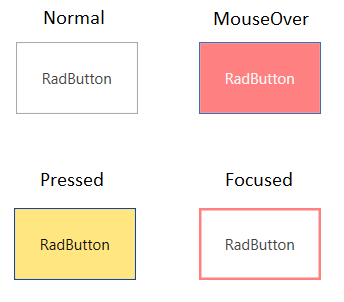
Figure 2: Office2016 RadButton with customized visual states
The general idea for customizing the colors of the control in its different states, is to find the right VisualState, a Trigger or visual element (for example, Border) and set the correct property - Background, Fill, Opacity, etc. The exact modification depends on the desired effect.
You can find a runnable example showing the modifications described in this article, in the CustomizeVisualStates SDK example.