WPF Badge Overview
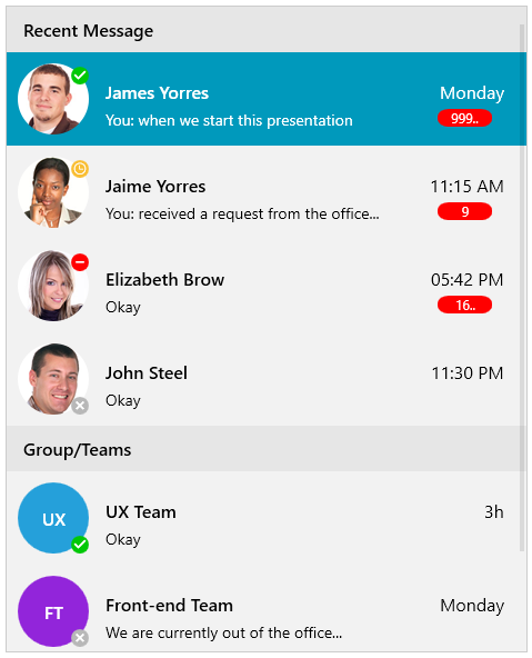
The RadBadge component is a visual indicator for UI elements. It enables you to easily show statuses, notifications and short messages in your app. Badges provide additional contextual information for other elements on the page.
The RadBadge is part of Telerik UI for WPF, a
professional grade UI library with 160+ components for building modern and feature-rich applications. To try it out sign up for a free 30-day trial.

Key Features
Position: The control allows you to specify its relative position to the element which is attached to. You can read more in the Key Properties help article.
Badge Types: You can choose between various predefined badge types. Also, you have the option to apply a custom geometry to the control if none of the predefined types works for you. Read more in the Key Properties article.
Animation: You can choose whether to have an Animation while displaying the badge.
Flexible Customization: Allows you to change the Background, Geometry, BorderBrush, etc.
Get started with the control with its Getting Started help article that shows how to use it in a basic scenario.
Check out the online demos at demos.telerik.com.
Telerik UI for WPF Support and Learning Resources
- Telerik UI for WPF BadgeControl Homepage
- Get Started with the Telerik UI for WPF BadgeControl
- Telerik UI for WPF API Reference
- Getting Started with Telerik UI for WPF Components
- Telerik UI for WPF Virtual Classroom (Training Courses for Registered Users)
- Telerik UI for WPF BadgeControl Forums
- Telerik UI for WPF Knowledge Base