Key Properties
This article will list the key properties provided by the RadBadge control.
-
Position: A property of type Point that gets or sets the relative position of the badge to the element which is attached to it.
The RadBadge control uses its center point for positioning it relative to the attached element.
AnchorPosition: A property of type Point that gets or sets the anchor position of the badge, relative to the size of the badge control. Default value is (0.5, 0.5).
PlayChangeAnimation: A property of type ICommand that gets or sets the play change animation of the badge.
InheritDataContext: A property of type bool that gets or sets a value indicating whether the badge should take the data context from its target element.
-
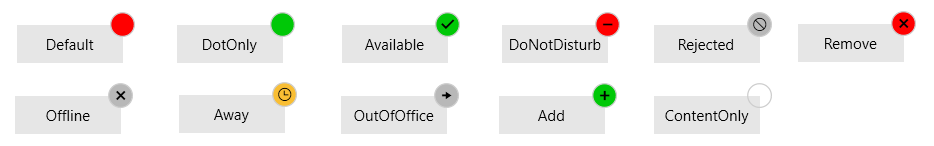
BadgeType: A property of type BadgeType that gets or sets the badge type of the badge control. The BadgeType is an enumeration and it allows the following values:
- Default
- DotOnly
- Available
- DoNotDisturb
- Rejected
- Remove
- Offline
- Away
- OutOfOffice
- Add
-
ContentOnly:
Figure 3: RadBadge Types
-
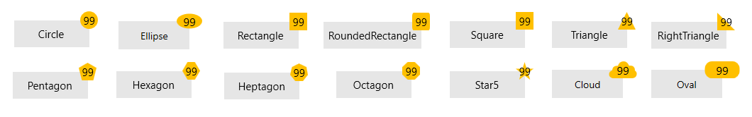
Geometry: A property of type Geometry that gets or sets the geometry of the badge control. You can apply one of the following geometries which our geometry markup extension provides.
- Circle
- Ellipse
- Rectangle
- RoundedRectangle
- Square
- Triangle
- RightTriangle
- Pentagon
- Hexagon
- Heptagon
- Octagon
- Star5
- Cloud
- Oval
To set a custom geometry to the RadBadge control, the BadgeType property needs to be set to ContentOnly.
Example 1: Set Custom Geometry
To apply a custom geometry in code-behind, you can use the GeometryFactory.SetGeometry() method.<telerik:RadButton Width="85" Height="30" Content="Notifications" VerticalAlignment="Center" HorizontalAlignment="Center"> <telerik:RadBadge.Badge> <telerik:RadBadge Content="99" BadgeType="ContentOnly" Background="#FFFFC000" Geometry="{telerik:Geometry Type=Oval}" /> </telerik:RadBadge.Badge> </telerik:RadButton>Example 1: Set Custom Geometry In Code
    public Example()
    {
        this.InitializeComponent();
        this.badge.Geometry = GeometryFactory.SetGeometry(GeometryType.Hexagon);
    }
Figure 3: Custom Geometries
TextAlignment: A property of type TextAlignment that gets or sets the text alignment of the underlying TextBlock.
Change Badge Animation
By default, the RadBadge control is load and change with an animation. The load\change animations are FadeAnimation by default. If you want to change/modify the animations of the RadBadge control you can use the AnimationManager.AnimationSelector attached property. The AnimationName property needs to be specified to either LoadAnimation or ChangeAnimation depending on which animation you want to change/modify.
Example 2: Modify Badge Animations
    <telerik:RadButton Width="100" Height="40" Content="Oval" FontSize="14" VerticalAlignment="Center" HorizontalAlignment="Center">
        <telerik:RadBadge.Badge>
            <telerik:RadBadge Content="99"  BadgeType="ContentOnly" FontSize="16" Foreground="Black"  Background="#FFFFC000" Geometry="{telerik:Geometry Type=Oval}" >
                <telerik:AnimationManager.AnimationSelector>
                    <telerik:AnimationSelector>
                        <telerik:FadeAnimation AnimationName="LoadAnimation" Direction="In" SpeedRatio="0.25"  />
                        <telerik:FadeAnimation AnimationName="ChangeAnimation" Direction="Out" SpeedRatio="0.25"/>
                    </telerik:AnimationSelector>
                </telerik:AnimationManager.AnimationSelector>
            </telerik:RadBadge>
        </telerik:RadBadge.Badge>
    </telerik:RadButton>