Customizing the DropDownItemTemplate and DropDownItemTemplateSelector
In the RadAutoCompleteBox control you can customize the way items are rendered in the DropDown portion of the control. You can do that by setting the DropDownItemTemplate or DropDownItemTemplateSelector properties. They allow you to show different templates for the DropDown items.
Creating custom DropDownItemTemplate
The next example will demonstrate how to create a custom DropDownItemTemplate in order to show two of the properties of the bound items from the ItemsSource collection.
Before proceeding with this example you should get familiar with Binding To Object.
The next steps show how to create and set a custom DropDownItemTemplate to the RadAutoCompleteBox control:
First we will need to create and populate the ViewModel with some sample data, more details can be found here.
Next we need to create a valid DataTemplate and set the necessary binding for the Name, Capital properties of the ItemsSource items:
Example 1: Declaring valid DataTemplate
<DataTemplate x:Key="CustomDropDownItemTemplate">
<Border BorderBrush="Gray" BorderThickness="1" Margin="2">
<Grid>
<Grid.ColumnDefinitions>
<ColumnDefinition Width="Auto"/>
<ColumnDefinition Width="*"/>
</Grid.ColumnDefinitions>
<Grid.RowDefinitions>
<RowDefinition/>
<RowDefinition/>
<RowDefinition/>
</Grid.RowDefinitions>
<TextBlock Grid.Column="0" Grid.Row="0"
Margin="5"
FontWeight="Bold"
Text="Name" />
<TextBlock Grid.Row="0" Grid.Column="1" Margin="0 5 0 0"
Text=":"
FontWeight="Bold"/>
<TextBlock Grid.Column="2" Grid.Row="0" Margin="5"
Text="{Binding Name}" />
<Border BorderBrush="Gray" BorderThickness="0.5" Grid.Row="1" Grid.Column="0" Grid.ColumnSpan="3"/>
<TextBlock Grid.Column="0" Grid.Row="2" Margin="5"
FontWeight="Bold"
Text="Capital" />
<TextBlock Grid.Row="2" Grid.Column="1" Margin="0 5 0 0"
Text=":"
FontWeight="Bold"/>
<TextBlock Grid.Column="2" Grid.Row="2" Margin="5"
Text="{Binding Capital}" />
</Grid>
</Border>
</DataTemplate>
- Finally you will need to declare the RadAutoCompleteBox in the xaml and set its ItemsSource, DisplayMemberPath and DropDownItemTemplate properties:
Example 2: Setting the DropDownItemTemplate
<telerik:RadAutoCompleteBox ItemsSource="{Binding Countries}"
Width="200"
DisplayMemberPath="Name"
DropDownItemTemplate="{StaticResource CustomDropDownItemTemplate}"/>
The next screenshots show the final result:
Figure 1
Figure 2
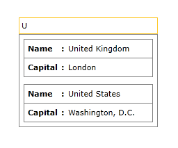
Figure 3
Creating custom DropDownItemTemplateSelector
This section will describe how you can create a custom DropDownItemTemplateSelector in order to display different template depending on a property. We are going to extend the Example 1. First, we need to create a class which derives from DataTemplateSelector and overrides the SelectTemplate method. Inside the method, we can return different template depending on our condition.
Example 3: Custom DataTemplateSelector class
public class MyDropDownItemTemplateSelector : DataTemplateSelector
{
public DataTemplate CustomDropDownItemTemplate { get; set; }
public DataTemplate RegularDropDownItemTemplate { get; set; }
public override DataTemplate SelectTemplate(object item, DependencyObject container)
{
var country = item as Country;
if(country.Name == "United States")
{
return RegularDropDownItemTemplate;
}
return CustomDropDownItemTemplate;
}
}
The next step is to specify the MyDropDownItemTemplateSelector in the Resources of the Window and set our custom templates. Then we can set our custom DataTemplateSelector to the DropDownItemTemplateSelector property.
Example 4: Setting the DropDownItemTemplateSelector
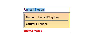
<Window.Resources>
<DataTemplate x:Key="CustomDropDownItemTemplate">
<Border BorderBrush="Gray" BorderThickness="1" Margin="2">
<Grid>
<Grid.ColumnDefinitions>
<ColumnDefinition Width="Auto"/>
<ColumnDefinition Width="*"/>
</Grid.ColumnDefinitions>
<Grid.RowDefinitions>
<RowDefinition/>
<RowDefinition/>
<RowDefinition/>
</Grid.RowDefinitions>
<TextBlock Grid.Column="0" Grid.Row="0"
Margin="5"
FontWeight="Bold"
Text="Name" />
<TextBlock Grid.Row="0" Grid.Column="1" Margin="0 5 0 0"
Text=":"
FontWeight="Bold"/>
<TextBlock Grid.Column="2" Grid.Row="0" Margin="5"
Text="{Binding Name}" />
<Border BorderBrush="Gray" BorderThickness="0.5" Grid.Row="1" Grid.Column="0" Grid.ColumnSpan="3"/>
<TextBlock Grid.Column="0" Grid.Row="2" Margin="5"
FontWeight="Bold"
Text="Capital" />
<TextBlock Grid.Row="2" Grid.Column="1" Margin="0 5 0 0"
Text=":"
FontWeight="Bold"/>
<TextBlock Grid.Column="2" Grid.Row="2" Margin="5"
Text="{Binding Capital}" />
</Grid>
</Border>
</DataTemplate>
<DataTemplate x:Key="RegularDropDownItemTemplate">
<TextBlock Text="{Binding Name}" Foreground="Red" FontWeight="Bold"/>
</DataTemplate>
<local:MyDropDownItemTemplateSelector x:Key="dropDownItemTemplateSelector" CustomDropDownItemTemplate="{StaticResource CustomDropDownItemTemplate}"
RegularDropDownItemTemplate="{StaticResource RegularDropDownItemTemplate}" />
</Window.Resources>
<Grid>
<telerik:RadAutoCompleteBox ItemsSource="{Binding Countries}"
Width="200" VerticalAlignment="Center"
DisplayMemberPath="Name"
DropDownItemTemplateSelector="{StaticResource dropDownItemTemplateSelector}"/>
</Grid>