Indicating Focus in RadDropDownList
Environment
| Product Version | 2019.3.911 |
| Product | RadDropDownList for WinForms |
Description
RadDropDownList defines two styles affecting the editor and determining whether the end user can type in it or not. A common requirement is to set the DropDownStyle to DropDownList which will disable the input in the editor. In this kind of setup, the control shows that it has the focus by painting a border around the textbox in most of the themes. The example here will demonstrate how the focus cues can be enabled, and additionally, how the fore-color and back color of the editor can be changed when it receives and looses the focus.
Solution
The AllowShowFocusCues property of the control needs to be set to true. The control also needs to be subscribed to its GotFocus and LostFocus where the its Back and Fore colors will be changed using the Override Theme Settings at Run-time API.
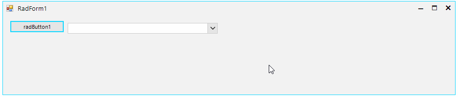
Figure 1: Indicating Focus
Form`s class
public partial class RadForm1 : Telerik.WinControls.UI.RadForm
{
    private BindingList<DataObject> data;
    public RadForm1()
    {
        InitializeComponent();

        this.radDropDownList1.AllowShowFocusCues = true;
        this.radDropDownList1.DropDownStyle = Telerik.WinControls.RadDropDownStyle.DropDownList;

        this.data = new BindingList<DataObject>();
        this.data.Add(new DataObject() { Name = "Item 0" });
        this.data.Add(new DataObject() { Name = "Item 1" });
        this.data.Add(new DataObject() { Name = "Item 2" });

        this.radDropDownList1.DataSource = this.data;
        this.radDropDownList1.DisplayMember = "Name";

        this.radDropDownList1.GotFocus += RadDropDownList1_GotFocus;
        this.radDropDownList1.LostFocus += RadDropDownList1_LostFocus;
    }

    private void RadDropDownList1_LostFocus(object sender, EventArgs e)
    {
        this.radDropDownList1.DropDownListElement.EditableElement.ResetThemeValueOverrides();
    }

    private void RadDropDownList1_GotFocus(object sender, EventArgs e)
    {
        this.radDropDownList1.DropDownListElement.EditableElement.SetThemeValueOverride(RadItem.BackColorProperty, Color.FromArgb(51, 153, 255), "RadDropDownListEditableAreaElement");
        this.radDropDownList1.DropDownListElement.EditableElement.SetThemeValueOverride(RadItem.ForeColorProperty, Color.White, "RadDropDownListEditableAreaElement");
    }
}
Public Class RadForm1

    Private data As BindingList(Of DataObject)

    Public Sub New()
        InitializeComponent()

        Me.radDropDownList1.AllowShowFocusCues = True
        Me.radDropDownList1.DropDownStyle = Telerik.WinControls.RadDropDownStyle.DropDownList

        Me.data = New BindingList(Of DataObject)()
        Me.data.Add(New DataObject() With {
            .Name = "Item 0"
        })
        Me.data.Add(New DataObject() With {
            .Name = "Item 1"
        })
        Me.data.Add(New DataObject() With {
            .Name = "Item 2"
        })

        Me.radDropDownList1.DataSource = Me.data
        Me.radDropDownList1.DisplayMember = "Name"
        AddHandler Me.radDropDownList1.GotFocus, AddressOf RadDropDownList1_GotFocus
        AddHandler Me.radDropDownList1.LostFocus, AddressOf RadDropDownList1_LostFocus
    End Sub

    Private Sub RadDropDownList1_LostFocus(ByVal sender As Object, ByVal e As EventArgs)
        Me.radDropDownList1.DropDownListElement.EditableElement.ResetThemeValueOverrides()
    End Sub

    Private Sub RadDropDownList1_GotFocus(ByVal sender As Object, ByVal e As EventArgs)
        Me.radDropDownList1.DropDownListElement.EditableElement.SetThemeValueOverride(RadItem.BackColorProperty, Color.FromArgb(51, 153, 255), "RadDropDownListEditableAreaElement")
        Me.radDropDownList1.DropDownListElement.EditableElement.SetThemeValueOverride(RadItem.ForeColorProperty, Color.White, "RadDropDownListEditableAreaElement")
    End Sub
End Class