Properties
Here are the most important properties for changing the control appearance and behavior:
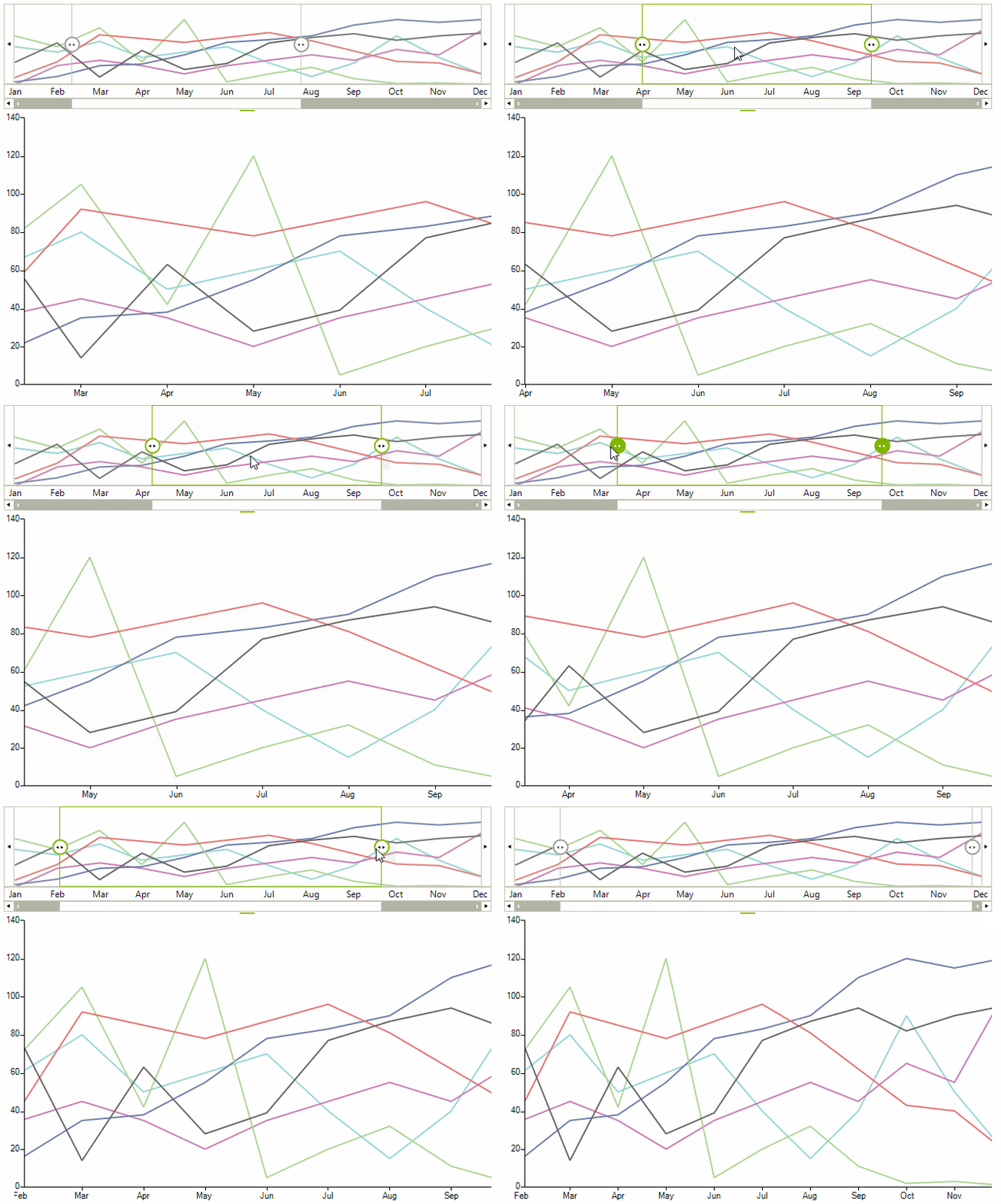
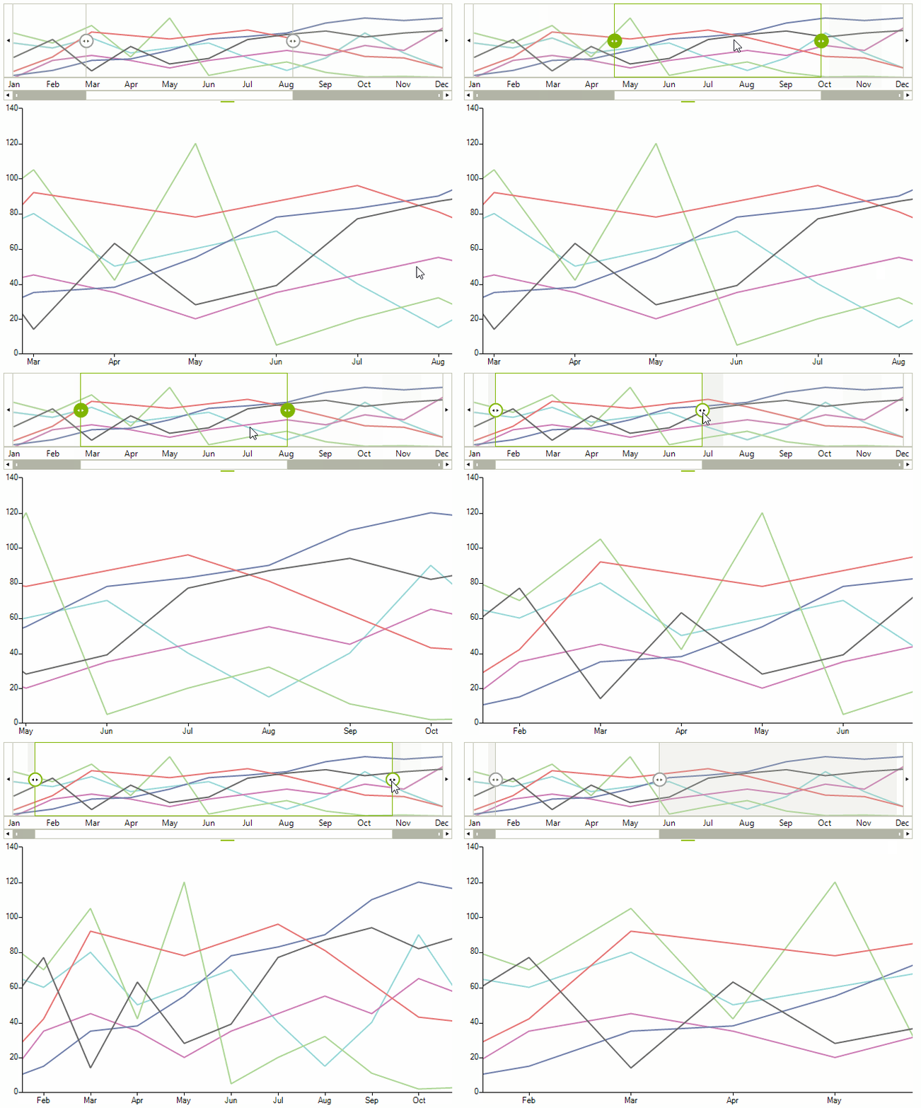
- The UpdateMode property determines how the associated chart control will be updated.
- Immeadiate: This is the default value, the chart is updated as the range selector element is being moved
- Deferred : The chat will be updated when the range selector element is released.
The Deferred update mode may be suitable for scenarios in which the chart has been loaded with extremely large data sets.
Figure 1: UpdateMode.Immediate

UpdateMode.Immediate
this.radRangeSelector1.UpdateMode = UpdateMode.Deferred;
Me.radRangeSelector1.UpdateMode = UpdateMode.Deferred
Figure 2: UpdateMode.Deferred

UpdateMode.Defferred
this.radRangeSelector1.UpdateMode = UpdateMode.Deferred;
Me.radRangeSelector1.UpdateMode = UpdateMode.Deferred
- The StartRange and EndRange properties specify the range area. The values of these properties are from type double and should between 0 and 100.
Start and End Range
this.radRangeSelector1.StartRange = 20;
this.radRangeSelector1.EndRange = 50;
Me.radRangeSelector1.StartRange = 20
Me.radRangeSelector1.EndRange = 50
- The RangeSelectorViewZoomStart and RangeSelectorViewZoomEnd define the start and end zoom factor of RadRangeSelector. These zoom is in percentages and can be controlled from track bar at the bottom of control. You can use these properties only if associated element implements the IRangeSelectorElement interface. The values of these properties are of type double and should between 0 and 100.
Zoom Start and End
this.radRangeSelector1.RangeSelectorViewZoomStart = 20;
this.radRangeSelector1.RangeSelectorViewZoomEnd = 50;
Me.radRangeSelector1.RangeSelectorViewZoomStart = 20
Me.radRangeSelector1.RangeSelectorViewZoomEnd = 50
- The ShowButtons property controls the visibility of the navigation buttons in RadRangeSelector. By default these buttons are displayed. To hide them, set the property to false.
ShowButtons Property
this.radRangeSelector1.ShowButtons = false;
Me.radRangeSelector1.ShowButtons = False
- The AssociatedControl is the most important property of RadRangeSeletor. This property establishes the connection between the RadRangeSelector and the associated control. This property can accept every object that inherits RadControl except RadRangeSelector.
Associated Control
this.radRangeSelector1.AssociatedControl = this.radChartView1;
Me.radRangeSelector1.AssociatedControl = Me.radChartView1
To take all advantages of RadRangeSelector - like scales, track bar and controlling the associated control without any additional implementation, the element of associated control should implement the IRangeSelectorElement interface. By design if the associated control implements the IRangeSelectorControl the returned element should implement the IRangeSelectorElement interface as well. For all controls that not implement the IRangeSelectorControl interface the associated elements will be their RootElement.
If you want to associate only element without control you can use the following approach:
Associated Element
this.radRangeSelector1.RangeSelectorElement.AssociatedElement = new RangeSelectorViewElement(new RadChartElement());
Me.radRangeSelector1.RangeSelectorElement.AssociatedElement = New RangeSelectorViewElement(New RadChartElement())
Events
There are several events that you will find useful in the context of RadRangeSelector:
ThumbLeftValueChanging: Occurs when the value of left thumb is changing.
ThumbLeftValueChanged: Occurs when the value of left thumb is changed.
ThumbRightValueChanging: Occurs when the value of right thumb is changing.
ThumbRightValueChanged: Occurs when the value of left thumb is changed.
SelectionChanging: This event is fired when the selection range is about to change.
SelectionChanged: This event is fired when the range is changed.
ScaleInitializing: Occurs when scale of the control is initializing. This event is cancelable and can be used to hide some scale or to change its dock position.
Initializing Scale
void radRangeSelector1_ScaleInitializing(object sender, ScaleInitializingEventArgs e)
{
    RangeSelectorChartScaleContainerElement scaleElement = e.ScaleElement as RangeSelectorChartScaleContainerElement;
    if (scaleElement == null)
    {
        return;
    }
    if (scaleElement.Title == "axe1")
    {
        e.Cancel = true;
    }
    else
    {
        scaleElement.ScalePostion = ViewPosition.TopLeft;
    }
}
Private Sub radRangeSelector1_ScaleInitializing(sender As Object, e As ScaleInitializingEventArgs)
    Dim scaleElement As RangeSelectorChartScaleContainerElement = TryCast(e.ScaleElement, RangeSelectorChartScaleContainerElement)
    If scaleElement Is Nothing Then
        Return
    End If
    If scaleElement.Title = "axe1" Then
        e.Cancel = True
    Else
        scaleElement.ScalePostion = ViewPosition.TopLeft
    End If
End Sub
Custom Rendering
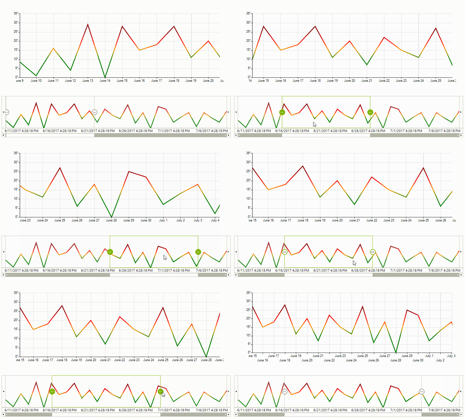
RadRangeSelector can also be setup to use a custom renderer just as the stand-alone RadChartView control. In order to utilize this feature, one needs to subscribe to the CreateRenderer event of the RangeSelectorViewElement instance.
Figure 3: Custom Rendering

public RadRangeSelectorCustomRenderer()
{
    InitializeComponent();
    this.radChartView1.CreateRenderer += OnCreateRenderer;
    this.radChartView1.ShowPanZoom = true;
    LineSeries series = new LineSeries();
    Random rnd = new Random();
    for (int i = 0; i < 30; i++)
    {
        series.DataPoints.Add(new CategoricalDataPoint(rnd.Next(0, 30), DateTime.Now.AddDays(i)));
    }
    this.radChartView1.Series.Add(series);
    series.VerticalAxis.LabelFormat = "{0}°";
    series.HorizontalAxis.LabelFormat = "{0:M}";
    series.HorizontalAxis.LabelFitMode = AxisLabelFitMode.MultiLine;
    this.radChartView1.ShowGrid = true;
    this.radRangeSelector1.AssociatedControl = this.radChartView1;
    RangeSelectorViewElement chartElement = this.radRangeSelector1.RangeSelectorElement.AssociatedElement as RangeSelectorViewElement;
    chartElement.CreateRenderer += OnCreateRenderer;
}
private void OnCreateRenderer(object sender, ChartViewCreateRendererEventArgs e)
{
    e.Renderer = new CustomCartesianRenderer((CartesianArea)e.Area);
}
Public Sub New()
    InitializeComponent()
    AddHandler Me.radChartView1.CreateRenderer, AddressOf OnCreateRenderer
    Me.radChartView1.ShowPanZoom = True
    Dim series As New LineSeries()
    Dim rnd As New Random()
    For i As Integer = 0 To 29
        series.DataPoints.Add(New CategoricalDataPoint(rnd.[Next](0, 30), DateTime.Now.AddDays(i)))
    Next
    Me.radChartView1.Series.Add(series)
    series.VerticalAxis.LabelFormat = "{0}°"
    series.HorizontalAxis.LabelFormat = "{0:M}"
    series.HorizontalAxis.LabelFitMode = AxisLabelFitMode.MultiLine
    Me.radChartView1.ShowGrid = True
    Me.radRangeSelector1.AssociatedControl = Me.radChartView1
    Dim chartElement As RangeSelectorViewElement = TryCast(Me.radRangeSelector1.RangeSelectorElement.AssociatedElement, RangeSelectorViewElement)
    AddHandler chartElement.CreateRenderer, AddressOf OnCreateRenderer
End Sub
Private Sub OnCreateRenderer(sender As Object, e As ChartViewCreateRendererEventArgs)
    e.Renderer = New CustomCartesianRenderer(DirectCast(e.Area, CartesianArea))
End Sub
The example above is using the the custom implementation as suggested here.