Structure
This article describes the inner structure and organization of the elements which build the RadGroupBox control.
Like all Telerik WinForms controls RadGroupBox is build upon Telerik Presentation Framework (TPF). TPF consists of various elements (such as primitives and layouts) that are the building blocks of the controls.
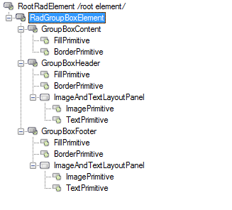
Figure 1: RadGroupBox`s Element Hierarchy
The most important nodes are GroupBoxContent, GroupBoxHeader, GroupBoxFooter, and RadGroupBoxElement. The last one also plays the role of the layout node for the control which arranges its child nodes - content, header, and footer (all three extending the GroupBoxVisualElement class). The footer node if not collapsed (the default value is collapsed) is always arranged as a bar at the bottom of the control, while the content and the header are arranged above the area occupied by the footer. All high level arrangement properties such as GroupBoxStyle, HeaderPosition, HeaderAlignment, etc. are defined as dependency properties.
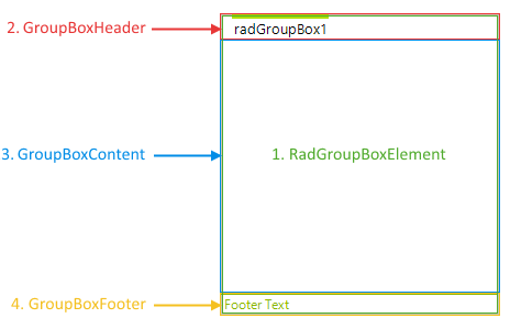
Figure 2: RadGroupBox`s Structure
- RadGroupBoxElement: Represents the main element of the control responsible for arranging the layout.
- GroupBoxContent: Represents the content element.
- GroupBoxHeader: Represents the header.
- GroupBoxFooter: Represents the footer.

