Themes
This help article will demonstrate a step by step tutorial how to customize the ControlDefault theme for RadTextBoxControl.
- Open Visual Style Builder
- Export the built-in themes in a specific folder by selecting
File>>Export Built-in Themes. - Load a desired theme from the just exported files by selecting
File>>Open Package. Expand RadTextBoxControl and select
RadTextBoxControlElementand the select the Disabled state in theElement Stateswindow.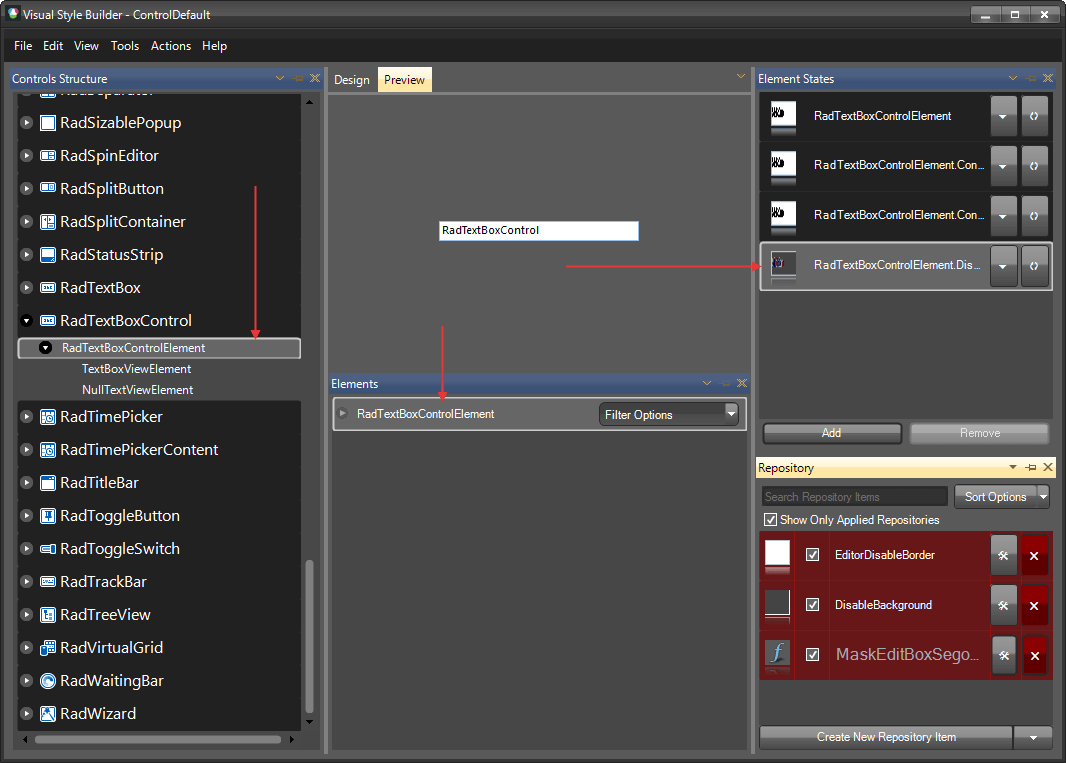
Open the
Edit Repository Itemdialog and change theBackColorand theGradientStyle: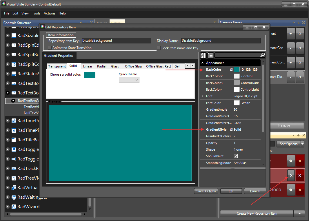
Select
RadTextBoxControland change the UseDefaultDisabledPaint property to false.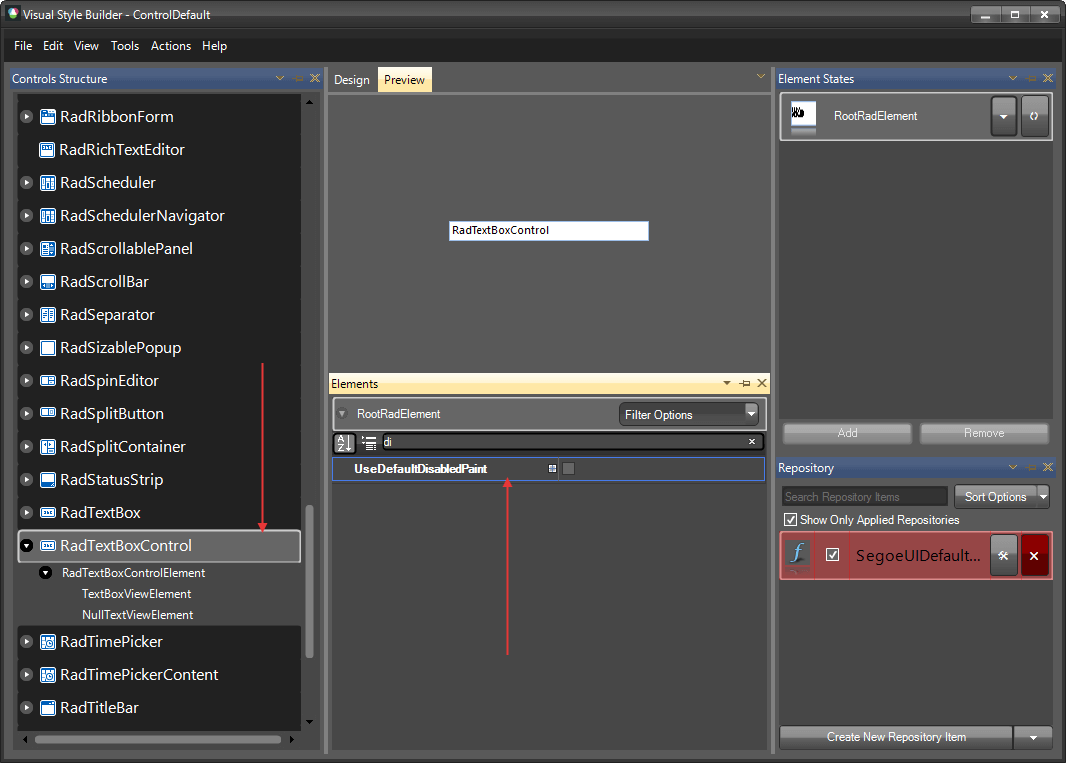
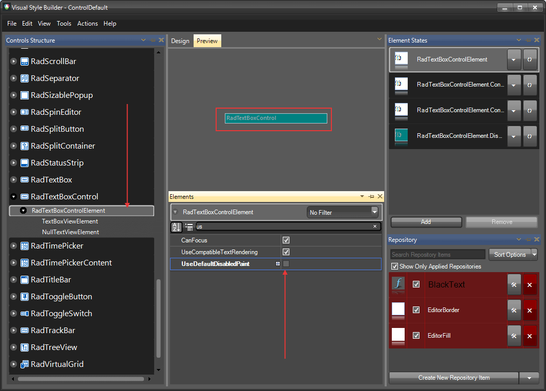
Go back to RadTextBoxControlElement and change the UseDefaultDisabledPaint for it as well.
The following article shows how you can use the new theme: Using Custom Themes.