Control Element Structure
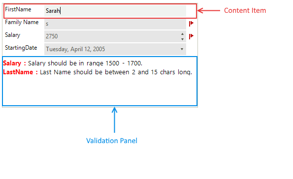
RadDataLayout uses the RadLayoutControl to create and arrange its items. There is embedded Validation Panel that can be used to show some additional information according to the validation requirements. The figure below demonstrates the structure of RadDataLayout.
Figure 1: RadDataLayout structure

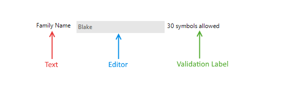
RadDataLayout generates content item for each public property that can be edited. These items represent one DataLayoutControlItem. This item has display text, contains the editor control and a small validation label.
Figure 2: Single item structure

The Validation label does not have any text by default. It is designed to be used in cases where users want to show some additional information.