Properties, Events and Attributes
Properties
The main purpose of RadDataEntry is to generate editors according to the object properties and to create simple data bindings for them. For this reason, most of the control properties will take effect only if they are set before setting the DataSource.
- The most important property of RadDataEntry is DataSource. Through this property user can set the business object or a collection of objects that should be editing. When this property is set RadDataEntry generates editors for each public property which does not have its Browsable attribute set to false.
RadDataEntry Binding.
this.radDataEntry1.DataSource = new Employee()
{
    FirstName = "Sarah",
    LastName = "Blake",
    Occupation = "Supplied Manager",
    StartingDate = new DateTime(2005, 04, 12),
    IsMarried = true,
    Salary = 3500, Gender = Gender.Female
};
Me.radDataEntry1.DataSource = New Employee() With { _
  .FirstName = "Sarah", _
  .LastName = "Blake", _
  .Occupation = "Supplied Manager", _
  .StartingDate = New DateTime(2005, 4, 12), _
  .IsMarried = True, _
  .Salary = 3500, _
  .Gender = Gender.Female _
 }
Figure 1: Set The Data Source of RadDataEntry
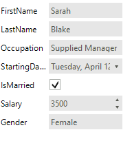
- The ColumnCount property controls the amount of columns that RadDataEntry will use to arrange generated controls. Default value is 1
Set the Columns Count.
this.radDataEntry1.ColumnCount = 2;
Me.radDataEntry1.ColumnCount = 2
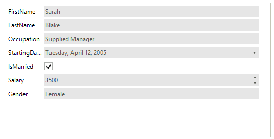
Figure 2: Set The Columns Count.

- The FitToParentWidth property controls whether the generated editors should fit their width to width of the RadDataEntry. Default Value is false.
Set FitToParentWidth Property.
this.radDataEntry1.FitToParentWidth = true;
Me.radDataEntry1.FitToParentWidth = True
Figure 3. Set FitToParentWidth
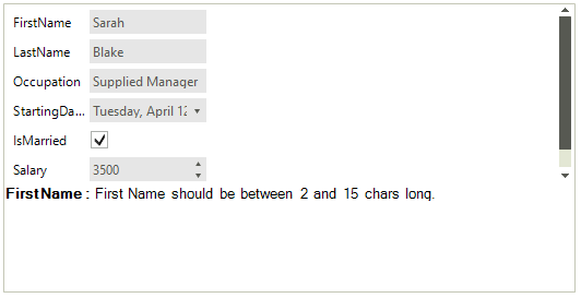
- The ShowValidationPanel property controls the visibility of validation panel. Please note that this property will change the visibility of panel if only there are controls inside it. By default this panel is disabled.
Setup the Validation Panel.
this.radDataEntry1.ShowValidationPanel = true;
RadLabel label = new RadLabel();
label.Name = "First Name";
label.Text = "<html><size=10><b>First Name : </b>First Name should be between 2 and 15 chars long.";
label.Dock = DockStyle.Top;
label.AutoSize = false;
label.BackColor = Color.Transparent;
this.radDataEntry1.ValidationPanel.PanelContainer.Controls.Add(label);
Me.radDataEntry1.ShowValidationPanel = True
Dim label As New RadLabel()
label.Name = "First Name"
label.Text = "<html><size=10><b>First Name : </b>First Name should be between 2 and 15 chars long."
label.Dock = DockStyle.Top
label.AutoSize = False
label.BackColor = Color.Transparent
Me.radDataEntry1.ValidationPanel.PanelContainer.Controls.Add(label)
Figure 4: The Validation Panel.
- The FlowDirection controls the direction the editors will be generated when the ColumnCount property has value bigger than 1.
Set the Flow Direction.
this.radDataEntry1.ColumnCount = 2;
this.radDataEntry1.FlowDirection = FlowDirection.BottomUp;
Me.radDataEntry1.ColumnCount = 2
Me.radDataEntry1.FlowDirection = FlowDirection.BottomUp
Figure 5: Set the flow direction.

- The ItemSpace property controls the space that between the generated items. Default value is 5 pixels.
Set Space Between The Items.
this.radDataEntry1.ItemSpace = 10;
Me.radDataEntry1.ItemSpace = 10
Figure 6 Set the items space.
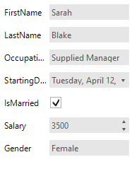
- The ItemDefaultSize property sets the size that generated items should have if FitToParentWidth property has value false. When property the FitToParentWidth has value true the width of items are calculated according the width of the RadDataEntry control and the number of the columns. In this case the width defined with ItemDefaultSize is ignored.
Set items default size.
this.radDataEntry1.ItemDefaultSize = new Size(300, 30);
Me.radDataEntry1.ItemDefaultSize = New Size(300, 30)
Figure 7. Set items size.
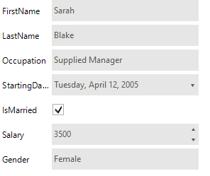
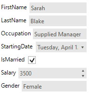
- In RadDataEntry control there is logic that arranges the labels of the editors in one column according to the longest text. This logic can be controlled by the AutoSizeLabels property. By default the property value is false and the labels width will equals the longest label width. If you set this property to true, the labels will be sized according to their content, as shown on the following figure:
Set The AutoSizeLabels Property.
this.radDataEntry1.AutoSizeLabels = true;
Me.radDataEntry1.AutoSizeLabels = True
Figure 8: The Labels are not Auto-Sized.
Events
There are several events that you will find useful in the context of RadDataEntry:
EditorInitializing - Occurs when editor is being initialized. This event is cancelable. In this event you can change the default editors with custom ones.
EditorInitialized - Occurs when the editor is Initialized.
BindingCreating - Occurs when a binding object for an editor is about to be created. This event is cancelable.
BindingCreated - Occurs when binding object is created.
ItemInitializing – this event is firing when the panel that contains the label, editor and validation label is about to be Initialized. This event is cancelable.
ItemInitialized - occurs the item is already Initialized.
ItemValidating – this event is fired when any of the generated editors fires its Validating event.
ItemValidated – this event is fired when any of the generated editors fires its Validated event.
Attributes
RadDataEntry has support for several attributes that can be used to change the behavior of the control.
With the Browsable attribute users can easily control which properties should be displayed
The Browsable attribute set to false will make the property on which it is used not bindable. This will prevent other controls which use the CurrencyManager for extracting properties to bind to such a class. A suitable solution for this scenario is to leave the property Browsable set to true and handle the RadDataEntry.ItemInitializing setting the e.Cancel property to true for items which need to hidden in RadDataEntry.
Set The Browsable Attribute.
[Browsable(false)]
public string PhoneNumber
{
    get;
    set;
}
<Browsable(False)> _
Public Property PhoneNumber() As String
    Get
        Return m_PhoneNumber
    End Get
    Set(value As String)
        m_PhoneNumber = Value
    End Set
End Property
Private m_PhoneNumber As String
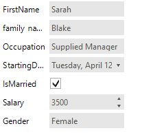
The DisplayName attribute defines what text should be displayed in the label that is associated with the editor.
Set The DisplayName Attribute.
[DisplayName("family name")]
public string LastName
{
    get;
    set;
}
<DisplayName("family name")> _
Public Property LastName() As String
    Get
        Return m_LastName
    End Get
    Set(value As String)
        m_LastName = Value
    End Set
End Property
Private m_LastName As String
With RadRange attribute users can define range that can be used into validation process. This attribute is provided in validation events.
Set The RadRange Attribute
[RadRange(1500,2000)]
public int Salary
{
    get;
    set;
}
<RadRange(1500, 2000)> _
Public Property Salary() As Integer
    Get
        Return m_Salary
    End Get
    Set(value As Integer)
        m_Salary = Value
    End Set
End Property
Private m_Salary As Integer