Styling Chart Elements
RadChart offers a set of properties to modify the look and feel of its elements. See those elements marked on the image below consider the table showing where their customization properties are located in the chart properties grid.
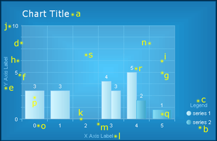
| Element | Properties |
|---|---|
| a. Chart Title | Elements -> ChartTitle -> Appearance Elements -> ChartTitle -> TextBlock |
| b. Legend | Elements -> Legend -> Appearance |
| c. Legend TextBlock (Legend Title) | Elements -> Legend -> TextBlock |
| d. Y Axis | PlotArea -> YAxis -> Appearance |
| e. Y Axis Label (Axis Title) | PlotArea -> YAxis -> AxisLabel |
| f. Y Axis Major Tick | PlotArea -> YAxis -> Appearance -> MajorTick |
| g. Y Axis Major GridLine | PlotArea -> YAxis -> Appearance -> MajorGridLines |
| h. Y Axis Minor Tick | PlotArea -> YAxis -> Appearance -> MinorTicк |
| i. Y Axis Minor GridLine | PlotArea -> YAxis -> Appearance -> MinorGridLines |
| j. Y Axis Label (Digit) | PlotArea -> YAxis -> Appearance -> LabelAppearance |
| k. X Axis | PlotArea -> XAxis -> Appearance |
| l. X Axis Label (Axis Title) | PlotArea -> XAxis -> AxisLabel |
| m. X Axis Major Tick | PlotArea -> XAxis -> Appearance -> MajorTick |
| n. X Axis Major GridLine | PlotArea -> XAxis -> Appearance -> MajorGridLines |
| o. X Axis Label (Digit) | PlotArea -> XAxis -> Appearance -> LabelAppearance |
| p. Series 1 | Data -> Series -> [series name] -> Appearance -> Appearance |
| q. Series 2 | Data -> Series -> [series name] -> Appearance -> Appearance |
| r. Series Item Label | Data -> Series -> [series name] -> Appearance -> Appearance -> TextAppearance |
| s. PlotArea | Elements -> PlotArea -> Appearance |
Common Appearance Properties
All chart elements have common appearance settings, which are:
Border – border width, color and style
Corners – corner style and size
Dimensions – width, height, margin, padding
FillStyle – background color, image and gradients
Position
Shadow – color, distance and position
Visible – true or false