Customizing Columns
There are three parts of the column that can be customized separately from each other:
Content Cells
To change the default appearance of a cell you have to either style it or template it:
- In order to template it use CellTemplate property.
- If you want to style it, define an appropriate style targeting all elements of the type or set is as CellStyle for a column. To learn more read the Styling a Cell chapter.
- You can also change the default look of a cell when it is in edit mode by setting an appropriate CellEditTemplate.
This help article explains how to set CellTemplate/CellEditTemplate in details.
In a scenario when there is a column.CellEditTemplate defined, the new value of the editor is not available in the arguments of the CellEditEnded event raised when commiting an edit. To get the right value in e.NewValue, you can create your own custom column and override its GetNewValueFromEditor method.
This help article explains how to create a custom column with a button in details.
This help article explains how to create a column with a custom editor in details.
You can also check CellStyleSelector and CellTemplateSelector topics on how to conditionally apply a cell style or a cell template.
Footer Cells
RadGridView provides a way to change the default look and appearance of both column and group footers:
- to change column footers' style use FooterCellStyle property. To learn more read the Styling the Column Footers topic.
- to customize group footers' style use GroupFooterCellStyle property. To learn more read the Styling the Group Footers topic.
To learn more about the group footers take a look at the Group Footers topic. For the column footers visit the Column Footers topic.
Header Cells
To change the look and the appearance of header cells you have to define an appropriate style and set it to the HeaderCellStyle property of the column. To learn how to do that take a look at the Styling the Column Headers topic.
To learn more about the column headers take a look at the Column Headers topic.
The customizations apply to all cells of a type.
Text Properties
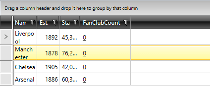
GridViewColumn provides out-of-the-box mechanism for customizing the visual appearance of its text content. This can be achieved through the TextWrapping, TextAlignment, TextTrimming and TextDecorations properties.
Example 1: Setting the Text Properties of GridViewColumn
<telerik:RadGridView Name="clubsGrid"
                 ItemsSource="{Binding Clubs}"
                 AutoGenerateColumns="False"
                 GroupRenderMode="Flat"
                 Margin="5">
        <telerik:RadGridView.Columns>
            <telerik:GridViewDataColumn DataMemberBinding="{Binding Name}"
                                        TextWrapping="Wrap"/>
            <telerik:GridViewDataColumn DataMemberBinding="{Binding Established}"
                                        TextAlignment="Right"
                                        Header="Est."
                                        DataFormatString="{}{0:yyyy}"/>
            <telerik:GridViewDataColumn DataMemberBinding="{Binding StadiumCapacity}"
                                        TextTrimming="WordEllipsis"
                                        Header="Stadium"
                                        DataFormatString="{}{0:N0}"/>
            <telerik:GridViewDataColumn DataMemberBinding="{Binding FanClubCount}"
                                    TextDecorations="Underline"/>
        </telerik:RadGridView.Columns>
</telerik:RadGridView>
Figure 1: GridViewColumn with customized text properties