Styling Group Footers
Before reading this topic, you might find it useful to get familiar with the GridViewGroupFooterCell and GridViewGroupFooterRow.
In this article we will discuss the following topics:
Targeting the GridViewGroupFooterRow Element
If you want to style all group footer rows of your application, you should create an appropriate style targeting the GridViewGroupFooterRow element.
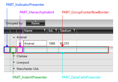
Figure 1: GridViewGroupFooterRow template structure
You have two options:
To create an empty style and set it up on your own.
To copy the default style of the control and modify it.
To learn how to modify the default GridViewFooterCell style, please refer to the Modifying Default Styles article.
Example 1: Styling all group footer rows of an application
<Style TargetType="telerik:GridViewGroupFooterRow">
            <Setter Property="Foreground" Value="White"/>
            <Setter Property="Background" Value="LightBlue"/>
        </Style>
If you're using Implicit Styles, you should base your style on the GridViewGroupFooterRowStyle.
Setting RadGridView's GroupFooterRowStyle
RadGridView's footer rows can also be styled by creating an appropriate Style for the GridViewGroupFooterRow element and setting it as RadGridView's GroupFooterRowStyle property.
Example 2: Setting RadGridView's GroupFooterRowStyle
<telerik:RadGridView GroupFooterRowStyle="{StaticResource GridViewFooterRowStyle}" />
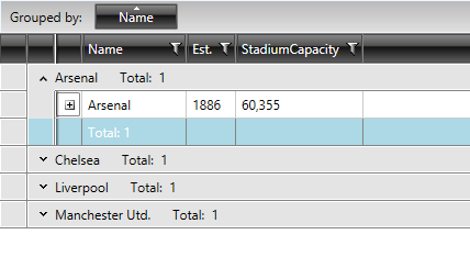
Figure 2: RadGridView with styled group footer rows
Setting RadGridView's GroupFooterRowStyleSelector
You could also use RadGridView's GroupFooterRowStyleSelector property to style group footer rows differently based on a specific condition. More details about how this can be achieved can be found in the GroupFooterRowStyleSelector article.
Targeting the GridViewGroupFooterCell Element
In order to style all RadGridView cells of an application, you should create an appropriate style targeting the GridViewGroupFooterCell element.
Example 6: Styling all group footer cells of an application
<Style TargetType="telerik:GridViewGroupFooterCell">
            <Setter Property="BorderBrush" Value="Red"/>
            <Setter Property="Background" Value="Blue"/>
        </Style>
If you're using Implicit Styles, you should base your style on the GridViewGroupFooterCellStyle.
Setting a Column's GroupFooterCellStyle
RadGridView's footer cells can also be styled by creating an appropriate Style for the GridViewGroupFooterCell element and setting it as the GroupFooterCellStyle property of the respective GridViewColumn.
Example 7: Setting a column's GroupFooterCellStyle
<telerik:GridViewDataColumn DataMemberBinding="{Binding Name}"
                                Header="Name"
                                GroupFooterCellStyle="{StaticResource GridViewFooterCellStyle}" />
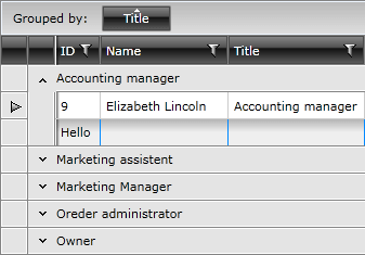
Figure 2: RadGridView with styled group footer cells
Setting a Column's GroupFooterCellStyleSelector
You could also use RadGridView's GroupFooterCellStyleSelector property to style group footer rows differently based on a specific condition. More details about how this can be achieved can be found in the GroupFooterCellStyleSelector article.