Bound/Unbound Columns
When populating RadGridView with data two logical types of columns can be used - bound and unbound.
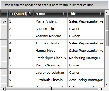
Bound columns represent the data from RadGridView's ItemsSource. They support data related functionality such as sorting, filtering, grouping, aggregates, etc. Typically the bound columns are of type GridViewDataColumn with its DataMemberBinding property set.
<telerik:GridViewDataColumn DataMemberBinding="{Binding EmployeeID}"
                Header="ID (Bound)" />

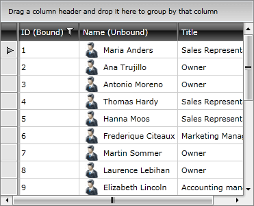
Unbound columns are used for displaying a custom content. Such custom content can be buttons which are not directly related to the underlying data, textbox for adding comments, images etc. The unbound column's content is defined by setting cell template. When using unbound columns you will be unable to perform filtering, sorting and grouping.
Here is an example for unbound column:
<telerik:GridViewColumn Header="Name">
    <telerik:GridViewColumn.CellTemplate>
        <DataTemplate>
            <StackPanel Orientation="Horizontal">
                <Image Stretch="None"
       Source="../../Images/User.png"
       Margin="0,0,5,0" />
                <TextBlock Text="{Binding Name}"
           VerticalAlignment="Center" />
            </StackPanel>
        </DataTemplate>
    </telerik:GridViewColumn.CellTemplate>
</telerik:GridViewColumn>

In the example above a DataTemplate containing a StackPanel with an Image and a TextBox is shown. In this case the StackPanel and the Image are not related to the data items. The TextBox is bound to the data item. In the same time the unbound column lacks such data functionalities as sorting, grouping and filtering.
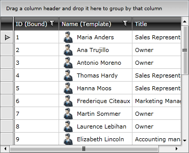
Using GridViewDataColumn, however, can give you the advantages of both the bound and unbound column allowing you to perform data operations like sorting, grouping and filtering. In this case you can simultaneously set DataMemberBinding and provide CellTemplate, thus giving you the freedom to create rich visualizations.
Here is the above sample of an unbound column transformed into a template column.
<telerik:GridViewDataColumn DataMemberBinding="{Binding Name}" Header="Name (Unbound)">
    <telerik:GridViewDataColumn.CellTemplate>
        <DataTemplate>
            <StackPanel Orientation="Horizontal">
                <Image Stretch="None"
       Source="../../Images/User.png"
       Margin="0,0,5,0" />
                <TextBlock Text="{Binding Name}"
           VerticalAlignment="Center" />
            </StackPanel>
        </DataTemplate>
    </telerik:GridViewDataColumn.CellTemplate>
</telerik:GridViewDataColumn>
