Styling the RootCompass
The compasses that you see, when rearranging the containers in the RadDocking control, are represented by the Compass and RootCompass controls. The one that marks the possible docking positions within the root container is the RootCompass control. This article will demonstrate how to create a style targeting RootCompass.
Targeting the RootCompass Element
In order to style the RootCompass element in a RadDocking, you should create a style targeting RootCompass and set it to the RootCompassStyle property of the RadDocking.
Example 1: Setting the RootCompassStyle property
<Application.Resources>
    <!-- If you are using the NoXaml binaries, you will have to base the style on the default one for the theme like so:
    <Style x:Key="CustomRootCompassStyle" TargetType="telerik:RootCompass" BasedOn="{StaticResource RootCompassStyle}">-->

    <Style x:Key="CustomRootCompassStyle" TargetType="telerik:RootCompass">
        <Setter Property="IsLeftIndicatorVisible" Value="False" />
        <Setter Property="IsRightIndicatorVisible" Value="False" />
    </Style>
</Application.Resources>

<Grid>
    <telerik:RadDocking RootCompassStyle="{StaticResource CustomRootCompassStyle}">
        <telerik:RadSplitContainer InitialPosition="FloatingDockable">
            <telerik:RadPaneGroup >
                <telerik:RadPane Header="Pane 1"/>
            </telerik:RadPaneGroup>
        </telerik:RadSplitContainer>
    </telerik:RadDocking>
</Grid>
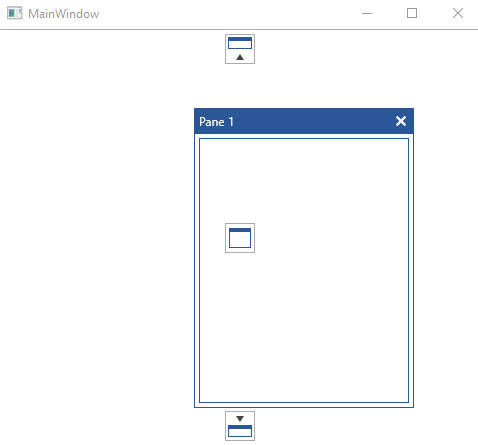
Figure 1: RootCompass without left and right indicator in the Office2016 theme
In order to learn how to further modify the control by extracting its ControlTemplate, read the Editing Control Templates article.