Getting Started with Silverlight Docking
This tutorial will walk you through the creation of a sample application that contains the RadDocking control.
- Assembly References
- Adding RadDocking to the Project
- Adding DocumentHost, RadSplitContainer, RadPaneGroup and RadPanes
- Header, Content, CanFloat of RadPane
- Pinned Panes
- Setting a Theme
Assembly References
In order to use the RadDocking control in your projects, you have to add references to the following assemblies:
- Telerik.Windows.Controls
- Telerik.Windows.Controls.Navigation
- Telerik.Windows.Controls.Docking
- Telerik.Windows.Data
Adding RadDocking to the Project
Before proceeding with adding a RadDocking control to your project, make sure the required assembly references are added to the project.
You can add a RadDocking control manually by writing the XAML code in Example 1. You can also add the control by dragging it from the Visual Studio Toolbox and dropping it over the XAML view.
Example 1: Adding RadDocking in XAML
<telerik:RadDocking/>
In order to use a RadDocking control in XAML, you have to add the following namespace declaration:
Example 2: Declaring Telerik Namespace
xmlns:telerik="http://schemas.telerik.com/2008/xaml/presentation"
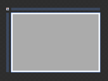
If you run the application, you will see an empty docking with no SplitContainers, PaneGroups and Panes, as shown in Figure 1.
Figure1: The empty RadDocking generated by the code in Example 1
Adding DocumentHost, RadSplitContainer, RadPaneGroup and RadPanes
Using RadSplitContainers, RadPaneGroups and RadPanes you could easily create Explorer and Outlook-like layouts. Without them, RadDocking will look like an empty container.
Adding DocumentHost
The Document Host is meant to be the default container for the editable documents in your application. By default, it occupies the whole central area of RadDocking and each newly added pane is docked as a new tab page inside it. In order to add DocumentHost inside RadDocking, you need to set the RadDocking.DocumentHost property as shown in Example 3.
Example 3: Adding DocumentHost in XAML
<telerik:RadDocking>
    <telerik:RadDocking.DocumentHost>
        <telerik:RadSplitContainer>
            ...
        </telerik:RadSplitContainer>
    </telerik:RadDocking.DocumentHost>
</telerik:RadDocking>
The DocumentHost control is not a required element. As an experiment, remove it from the XAML above and run your application to see how the application changes.
Adding RadSplitContainer
RadSplitContainer allows you to use movable bars to divide the displayed area into resizable parts. With RadDocking's SplitContainers you can build complex layouts. Some practical examples of such layouts are Explorer-like and Outlook-like interfaces.
Example 4 demonstrates how to add RadSplitContainer inside the DocumentHost.
Example 4: Adding RadSplitContainer in XAML
<telerik:RadDocking>
    <telerik:RadDocking.DocumentHost>
        <telerik:RadSplitContainer>
        </telerik:RadSplitContainer>
    </telerik:RadDocking.DocumentHost>
</telerik:RadDocking>
Adding RadPaneGroup
Before adding panes to your RadDocking declaration, you need to add a RadPaneGroup first. RadPane cannot exist separately, it always has to be placed inside of a RadPaneGroup. The reason for this requirement is that RadPaneGroup directly inherits RadTabControl, while the RadPane derives from RadTabItem.
Example 5: Adding RadPaneGroup in XAML
<telerik:RadDocking>
    <telerik:RadDocking.DocumentHost>
        <telerik:RadSplitContainer>
            <telerik:RadPaneGroup>
            </telerik:RadPaneGroup>
        </telerik:RadSplitContainer>
    </telerik:RadDocking.DocumentHost>
</telerik:RadDocking>
Adding RadPane
RadPane is the main content unit of RadDocking. Its main purpose is to act as a host of your content. That's why in order to have functional RadDocking, you need to have at least one RadPane placed inside it.
Example 6: Adding RadPane in XAML
<telerik:RadDocking>
    <telerik:RadDocking.DocumentHost>
        <telerik:RadSplitContainer>
            <telerik:RadPaneGroup>
                <telerik:RadPane>
                </telerik:RadPane>
                <telerik:RadPane>
                </telerik:RadPane>
            </telerik:RadPaneGroup>
        </telerik:RadSplitContainer>
    </telerik:RadDocking.DocumentHost>
</telerik:RadDocking>
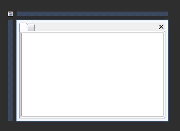
Figure2: The panes generated by the code in Example 6
Header, Content, CanFloat of RadPane
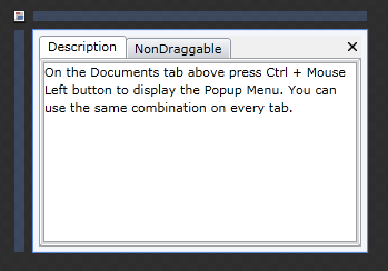
The RadDocking from Example 6 does not have any Header or Content set for the declared panes. Example 7 demonstrates how you can manually set some headers and content for the panes:
Example 7: Adding header and content for the panes
<telerik:RadDocking Width="300" Height="200">
    <telerik:RadDocking.DocumentHost>
        <telerik:RadSplitContainer>
            <telerik:RadPaneGroup>
                <telerik:RadPane Header="Description">
                    <TextBlock TextWrapping="Wrap" Text="On the Documents tab above press Ctrl + Mouse Left button to display the Popup Menu. You can use the same combination on every tab."/>
                </telerik:RadPane>
                <telerik:RadPane Header="NonDraggable">
                    <TextBlock TextWrapping="Wrap" Text="This pane cannot be dragged, because it has its property CanFloat set 'False'."/>
                </telerik:RadPane>
            </telerik:RadPaneGroup>
        </telerik:RadSplitContainer>
    </telerik:RadDocking.DocumentHost>
</telerik:RadDocking>
Figure3: The docking and panes generated by the code in Example 6
If you need to prevent the pane from being dragged and dropped the CanFloat property needs to be set to False.
Example 8: Setting CanFloat
<telerik:RadDocking>
    <telerik:RadDocking Width="300" Height="200">
        <telerik:RadDocking.DocumentHost>
            <telerik:RadSplitContainer>
                <telerik:RadPaneGroup>
                    <telerik:RadPane Header="Description">
                        <TextBlock TextWrapping="Wrap" Text="On the Documents tab above press Ctrl + Mouse Left button to display the Popup Menu. You can use the same combination on every tab."/>
                    </telerik:RadPane>
                    <telerik:RadPane Header="NonDraggable" CanFloat="False">
                        <TextBlock TextWrapping="Wrap" Text="This pane cannot be dragged, because it has its property CanFloat set 'False'."/>
                    </telerik:RadPane>
                </telerik:RadPaneGroup>
            </telerik:RadSplitContainer>
        </telerik:RadDocking.DocumentHost>
    </telerik:RadDocking>
</telerik:RadDocking>
If you try to drag and drop the "NonDraggable" pane to another PaneGroup, it will not be allowed due to the False value set for the CanFloat property.
Pinned Panes
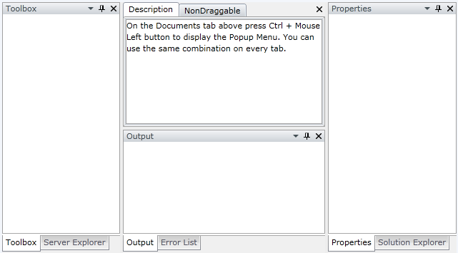
Each RadPane provides built-in pin/unpin functionality that allows you to control the behavior and the visualization of the docked RadPanes during run-time; by default the panes are pinned.
You can easily change the pin state of RadPane programmatically using the IsPinned property. Example 9 demonstrates RadDocking with panes that are initially pinned to all sides of the docking area.
Example 9: Pinned Panes
<telerik:RadDocking>
    <telerik:RadDocking.DocumentHost>
        <telerik:RadSplitContainer>
            <telerik:RadPaneGroup>
                <telerik:RadPane Header="Description">
                    <TextBlock TextWrapping="Wrap" Text="On the Documents tab above press Ctrl + Mouse Left button to display the Popup Menu. You can use the same combination on every tab."/>
                </telerik:RadPane>
                <telerik:RadPane Header="NonDraggable" CanFloat="False">
                    <TextBlock TextWrapping="Wrap" Text="This pane cannot be dragged, because it has its property CanFloat set 'False'."/>
                </telerik:RadPane>
            </telerik:RadPaneGroup>
        </telerik:RadSplitContainer>
    </telerik:RadDocking.DocumentHost>

    <telerik:RadSplitContainer InitialPosition="DockedLeft">
        <telerik:RadPaneGroup>
            <telerik:RadPane Header="Toolbox"/>
            <telerik:RadPane Header="Server Explorer"/>
        </telerik:RadPaneGroup>
    </telerik:RadSplitContainer>

    <telerik:RadSplitContainer InitialPosition="DockedRight">
        <telerik:RadPaneGroup>
            <telerik:RadPane Header="Properties"/>
            <telerik:RadPane Header="Solution Explorer"/>
        </telerik:RadPaneGroup>
    </telerik:RadSplitContainer>

    <telerik:RadSplitContainer InitialPosition="DockedBottom">
        <telerik:RadPaneGroup>
            <telerik:RadPane Header="Output"/>
            <telerik:RadPane Header="Error List"/>
        </telerik:RadPaneGroup>
    </telerik:RadSplitContainer>
</telerik:RadDocking>
Two things must be mentioned about the Example 9 code snippet:
- Note that the three RadSplitContainers you added are not hosted in DocumentHost. The result will be that these splitters can be initially docked to any side of the dock area.
- Note the InitialPosition property. It indicates where the splitter will be initially docked.
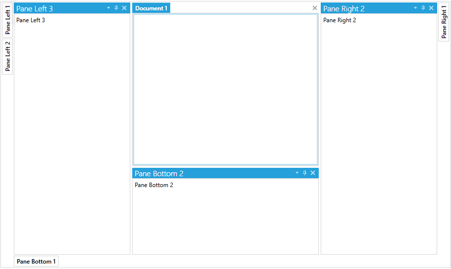
Figure4: RadDocking generated by the code in Example 9
Setting a Theme
The controls from our suite support different themes. You can see how to apply a theme different than the default one in the Setting a Theme help article.
Changing the theme using implicit styles will affect all controls that have styles defined in the merged resource dictionaries. This is applicable only for the controls in the scope in which the resources are merged.
To change the theme, you can follow the steps below:
Choose between the themes and add reference to the corresponding theme assembly (ex: Telerik.Windows.Themes.Windows8.dll). You can see the different themes applied in the Theming examples from our Silverlight Controls Examples application.
-
Merge the ResourceDictionaries with the namespace required for the controls that you are using from the theme assembly. For RadDocking, you will need to merge the following resources:
- Telerik.Windows.Controls
- Telerik.Windows.Controls.Navigation
- Telerik.Windows.Controls.Docking
Example 8 demonstrates how to merge the ResourceDictionaries so that they are applied globally for the entire application.
Example 8: Merge the ResourceDictionaries
    <Application.Resources>
        <ResourceDictionary>
            <ResourceDictionary.MergedDictionaries>
                <ResourceDictionary Source="/Telerik.Windows.Themes.Windows8;component/Themes/System.Windows.xaml"/>
                <ResourceDictionary Source="/Telerik.Windows.Themes.Windows8;component/Themes/Telerik.Windows.Controls.xaml"/>
                <ResourceDictionary Source="/Telerik.Windows.Themes.Windows8;component/Themes/Telerik.Windows.Controls.Navigation.xaml"/>
                <ResourceDictionary Source="/Telerik.Windows.Themes.Windows8;component/Themes/Telerik.Windows.Controls.Docking.xaml"/>
            </ResourceDictionary.MergedDictionaries>
        </ResourceDictionary>
    </Application.Resources>
Figure 4: RadDocking with the Windows8 theme
