Styling the RadPane
The RadPane can be styled by creating an appropriate Style and setting it to the Style property of the control or by creating an implicit style.
Targeting the RadPane Element
In order to style all RadPane elements in a RadDocking, you should create a style targeting RadPane.
Example 1: Creating an implicit style targeting RadPane
<Application.Resources>
    <!-- If you are using the NoXaml binaries, you will have to base the style on the default one for the theme like so:
    <Style TargetType="telerik:RadPane" BasedOn="{StaticResource RadPaneStyle}">-->

    <Style TargetType="telerik:RadPane">
        <Setter Property="Background" Value="Red" />
    </Style>
</Application.Resources>

<Grid>
    <telerik:RadDocking  x:Name="radDocking" >
        <telerik:RadSplitContainer >
            <telerik:RadPaneGroup >
                <telerik:RadPane Header="Pane 1" />
                <telerik:RadPane Header="Test 2"/>
                <telerik:RadPane Header="Test 3" />
                <telerik:RadPane Header="Test 4" />
            </telerik:RadPaneGroup>
        </telerik:RadSplitContainer>
    </telerik:RadDocking>
</Grid>
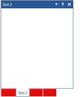
Figure 1: RadPane with Red Background in the Office2016 theme

You will notice that in Figure 1 all RadPanes are red except the selected one. Inside the ControlTemplate of the RadPane there are triggers/visual states which set the Background when a pane becomes selected and that value takes precedence over the value from the implicit style. In order to change this behavior, you can extract and modify the RadPane ControlTemplate for the theme(s) that you are using. For more information on how to do that read, the Editing Control Templates article.