Styling Shapes When Using GraphSource
This article describes which styles need to be applied when using a different ActiveTool of the RadDiagram when the GraphSource property is set.
For the purpose of this example, we will create the following ViewModels:
ContainerModel: A class deriving from the ContainerNodeViewModelBase ViewModel that represents a container node.
Model: A class deriving from the NodeViewModelBase ViewModel that represents a node.
Link: A class deriving from the LinkViewModelBase ViewModel that represents a link.
MyGraphSource: A class deriving from the ObservableGraphSourceBase ViewModel that represents the RadDiagram GraphSource.
Example 1: Creating the ViewModels
    public class ContainerModel : ContainerNodeViewModelBase<object>
    {
    }
    public class Model : NodeViewModelBase
    {
    }
    public class Link : LinkViewModelBase<NodeViewModelBase>
    {
    }
    public class MyGraphSource : ObservableGraphSourceBase<NodeViewModelBase, Link>
    {
        public MyGraphSource()
        {
            ContainerModel containerModel = new ContainerModel() { Content = "Container Model", Position = new Point(250, 100) };
            Model model = new Model()
            {
                Content = "Custom Model",
                Position = new Point(250, 100),
            };
            containerModel.AddItem(model);
            this.AddNode(containerModel);
        }
    }
Next, we can go ahead and define a RadDiagram control in our view. We can add three buttons to change the ActiveTool property of the RadDiagram at runtime.
Example 2: Defining RadDiagram in XAML
    <Grid>
        <Grid.RowDefinitions>
            <RowDefinition Height="auto"/>
            <RowDefinition Height="*"/>
        </Grid.RowDefinitions>
        <StackPanel Orientation="Horizontal" HorizontalAlignment="Center" Margin="10">
            <telerik:RadButton Content="Pointer Tool" Click="RadButton_Click" VerticalAlignment="Center" HorizontalAlignment="Center"/>
            <telerik:RadButton Content="Text Tool" Click="RadButton_Click" VerticalAlignment="Center" HorizontalAlignment="Center"/>
            <telerik:RadButton Content="Path Tool" Click="RadButton_Click" VerticalAlignment="Center" HorizontalAlignment="Center"/>
            <telerik:RadButton Content="Pencil Tool" Click="RadButton_Click" VerticalAlignment="Center" HorizontalAlignment="Center"/>
            <telerik:RadButton Content="Connector Tool" Click="RadButton_Click" VerticalAlignment="Center" HorizontalAlignment="Center"/>
        </StackPanel>
        <telerik:RadDiagram x:Name="diagram" Grid.Row="1"/>
    </Grid>
Example 3: Setting GraphSource property
    public MainWindow()
    {
        InitializeComponent();
        this.diagram.GraphSource = new MyGraphSource();
    }
    private void RadButton_Click(object sender, RoutedEventArgs e)
    {
        var button = sender as RadButton;
        switch (button.Content)
        {
            case "Pointer Tool":
                this.diagram.ActiveTool = Telerik.Windows.Diagrams.Core.MouseTool.PointerTool;
                break;
            case "Path Tool":
                this.diagram.ActiveTool = Telerik.Windows.Diagrams.Core.MouseTool.PathTool;
                break;
            case "Pencil Tool":
                this.diagram.ActiveTool = Telerik.Windows.Diagrams.Core.MouseTool.PencilTool;
                break;
            case "Text Tool":
                this.diagram.ActiveTool = Telerik.Windows.Diagrams.Core.MouseTool.TextTool;
                break;
            case "Connector Tool":
                diagram.ActiveTool = Telerik.Windows.Diagrams.Core.MouseTool.ConnectorTool;
                break;
            default:
                break;
        }
    }
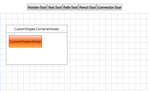
Note that CustomShapes is the name of the project used in the example and this will be different on your end.
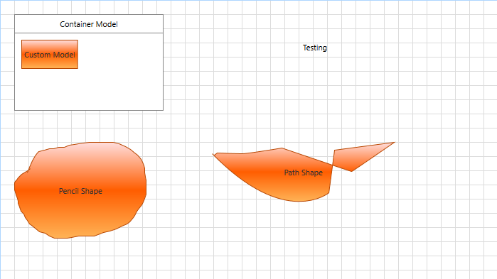
You can observe that the container and the shape inside does not show our custom text. By clicking on any of the buttons (without PointerTool) at the top you can see that every created shape displays the respective NodeViewModelBase class string.
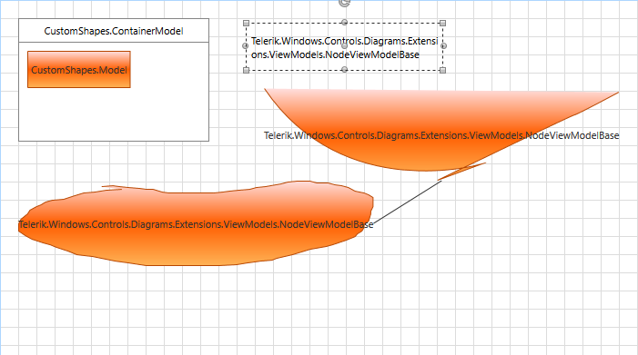
The different active tools correspond to different shapes:
- TextTool: Creates a RadDiagramTextShape
- PathTool: Creates a RadDiagramShape
- PencilTool: Creates a RadDiagramShape
- ConnectorTool: Creates a RadDiagramConnection
To overcome this you can create a StyleSelector and apply it to the ShapeStyleSelector of the RadDiagram. Example 4 demonstrates the custom StyleSelector.
Example 4: Creating a custom StyleSelector
    public class ShapeStyleSelector : StyleSelector
    {
        public Style ContainerStyle { get; set; }
        public Style ShapeStyle { get; set; }
        public Style TextToolShape { get; set; }
        public override Style SelectStyle(object item, DependencyObject container)
        {
            if (container is RadDiagramContainerShape)
            {
                return ContainerStyle;
            }

            if (container is RadDiagramShape)
            {
                return ShapeStyle;
            }

            if(container is RadDiagramTextShape)
            {
                return TextToolShape;
            }
            return base.SelectStyle(item, container);
        }
    }
Example 5: Creating custom styles for every shape
    <Window.Resources>
        <DataTemplate x:Key="contentTemplate">
            <TextBlock Text="{Binding Content}" />
        </DataTemplate>
        <DataTemplate x:Key="editTemplate">
            <TextBox Text="{Binding Content, Mode=TwoWay}" />
        </DataTemplate>
        <local:ShapeStyleSelector x:Key="shapeStyleSelector" >
            <local:ShapeStyleSelector.ContainerStyle>
                <Style TargetType="telerik:RadDiagramContainerShape" BasedOn="{StaticResource RadDiagramContainerShapeStyle">
                    <Setter Property="Position" Value="{Binding Position, Mode=TwoWay}" />
                    <Setter Property="ContentTemplate" Value="{StaticResource contentTemplate}" />
                    <Setter Property="EditTemplate" Value="{StaticResource editTemplate}" />
                </Style>
            </local:ShapeStyleSelector.ContainerStyle>
            <local:ShapeStyleSelector.ShapeStyle>
                <Style TargetType="telerik:RadDiagramShape" BasedOn="{StaticResource RadDiagramShapeStyle">
                    <Setter Property="Position" Value="{Binding Position, Mode=TwoWay}" />
                    <Setter Property="ContentTemplate" Value="{StaticResource contentTemplate}" />
                    <Setter Property="EditTemplate" Value="{StaticResource editTemplate}" />
                </Style>
            </local:ShapeStyleSelector.ShapeStyle>
            <local:ShapeStyleSelector.TextToolShape>
                <Style TargetType="telerik:RadDiagramTextShape" BasedOn="{StaticResource RadDiagramTextShapeStyle">
                    <Setter Property="Position" Value="{Binding Position, Mode=TwoWay}" />
                    <Setter Property="ContentTemplate" Value="{StaticResource contentTemplate}"/>
                    <Setter Property="EditTemplate" Value="{StaticResource editTemplate}"/>
                </Style>
            </local:ShapeStyleSelector.TextToolShape>
        </local:ShapeStyleSelector>
    </Window.Resources>
    <Grid>
        <Grid.RowDefinitions>
            <RowDefinition Height="auto"/>
            <RowDefinition Height="*"/>
        </Grid.RowDefinitions>
        <StackPanel Orientation="Horizontal" HorizontalAlignment="Center" Margin="10">
            <telerik:RadButton Content="Pointer Tool" Click="RadButton_Click" VerticalAlignment="Center" HorizontalAlignment="Center"/>
            <telerik:RadButton Content="Text Tool" Click="RadButton_Click" VerticalAlignment="Center" HorizontalAlignment="Center"/>
            <telerik:RadButton Content="Path Tool" Click="RadButton_Click" VerticalAlignment="Center" HorizontalAlignment="Center"/>
            <telerik:RadButton Content="Pencil Tool" Click="RadButton_Click" VerticalAlignment="Center" HorizontalAlignment="Center"/>
            <telerik:RadButton Content="Connector Tool" Click="RadButton_Click" VerticalAlignment="Center" HorizontalAlignment="Center"/>
        </StackPanel>
        <telerik:RadDiagram x:Name="diagram" Grid.Row="1"
            ConnectionEditTemplate="{StaticResource editTemplate}"
            ConnectionTemplate="{StaticResource contentTemplate}"
            ShapeStyleSelector="{StaticResource shapeStyleSelector}">
        </telerik:RadDiagram>
    </Grid>