Customize Appearance
This article describes how to customize the appearance of the RadDiagram,RadDiagramShape and RadDiagramConnection through a set of properties exposed by their API.
Customizing the RadDiagram Appearance
Controlling the Diagramming Surface Appearance
You can control the background settings of the diagramming surface through the following set of properties:
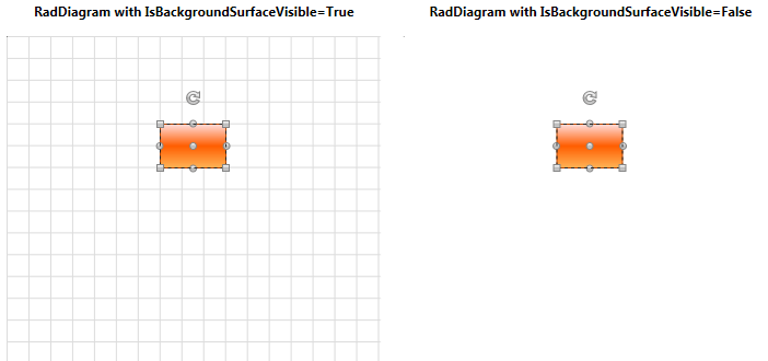
IsBackgroundSurfaceVisible - a Boolean property that determines whether the background surface of the RadDiagram should be displayed. When set to true both the background grid and the Preview Pages canvas are displayed. Its default value is true.
Background - this property is of type Brush and it controls the fill of the RadDiagram background.
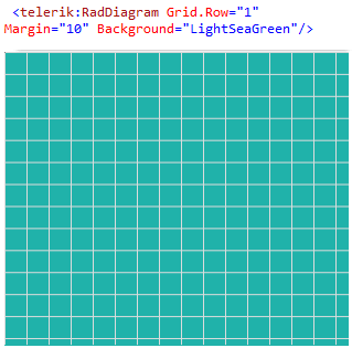
The settings and appearance of the RadDiagram background grid are controlled through the following set of attached properties:
You can access the BackgroundGrid attached properties through an alias pointing to the Telerik.Windows.Controls.Diagrams.Primitives namespace:
xmlns:primitives="clr-namespace:Telerik.Windows.Controls.Diagrams.Primitives;assembly=Telerik.Windows.Controls.Diagrams"or by adding a using for the Telerik.Windows.Controls.Diagrams.Primitives namespace in your code-behind file.
-
BackgroundGrid.IsGridVisible - this is a Boolean property that controls the visibility of the background grid. Its default value is True.
<telerik:RadDiagram primitives:BackgroundGrid.IsGridVisible="True" /> -
BackgroundGrid.IsDynamic - this is a Boolean property that determines whether the background grid should be moved and resized accordingly to the RadDiagram viewport changes (panning and zooming). Its default value is True thus enabling the background grid to reflect the changes implemented by a pan and/or a zoom operation.
<telerik:RadDiagram primitives:BackgroundGrid.IsDynamic="True" /> -
BackgroundGrid.CellSize - this property is of type Size and it controls the size of the cells in the RadDiagram.BackgroundGrid surface. The default value of this property is a size of 20x20 units.
<telerik:RadDiagram primitives:BackgroundGrid.CellSize="40,40" /> -
BackgroundGrid.LineStroke - this property is of type Brush and it specifies how the cells outline is painted.
<telerik:RadDiagram primitives:BackgroundGrid.LineStroke="Red" />
BackgroundGrid.LineStrokeDashArray - this property gets or sets a collection of Double values that indicate the pattern of dashes and gaps that is used to outline the cells in the RadDiagram BackgroundGrid.
-
BackgroundGrid.LineStrokeThickness - this property is of type double and it gets or sets the thickness of the RadDiagram background grid lines.
<telerik:RadDiagram primitives:BackgroundGrid.LineThickness="5" />
If you need to customize the appearance and the settings of the RadDiagram PagesPreview canvas, you can examine the Pages Preview section in the Printing article.
DiagramAdorners
The RadDiagram exposes a set of properties that allow you to control which Diagramming adorners to be displayed:
IsInformationAdornerVisible: A Boolean property that controls the visibility of the InformationAdorner of the RadDiagram. The InformationAdorner displays information about the diagram's elements settings like current position and rotation angle. The default value of the IsInformationAdornerVisible property is true.

IsManipulationAdornerVisible: A Boolean property that controls the visibility of the ManipulationAdorner of the RadDiagram. The ManipulationAdorner visualizes the resizing and rotation thumbs of the RadDiagram elements. It also visualizes selections. The default value of the IsManipulationAdornerVisible property is true.

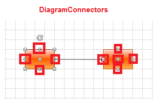
IsConnectorsManipulationEnabled: A Boolean property that controls the visibility of the RadDiagram elements connectors. The default value of the property is true.
The RadDiagram also contains AlignmentAdorner. This adorner provides visual feedback about the alignment of the Diagramming elements.
The AlignmentAdorner definition is placed in the Telerik.Windows.Controls.Diagrams.Primitives namespace. This is why in order to control its settings, you need to add an alias to that namespace: >
xmlns:primitives="clr-namespace:Telerik.Windows.Controls.Diagrams.Primitives;assembly=Telerik.Windows.Controls.Diagrams"<telerik:RadDiagram primitives:AlignmentAdorner.VerticalLineStroke="Blue"/>
The RadDiagram allows you to control the following properties of the AlignmentAdorner:
AlignmentAdorner.HorizontalLineStroke: A property of type Brush that specifies how the horizontal alignment lines are painted.
AlignmentAdorner.HorizontalLineStrokeDashArray: A property that gets or sets a collection of Double values that indicate the pattern of dashes and gaps that is used to outline the horizontal alignment lines.
AlignmentAdorner.HorizontalLineStrokeThickness: A property of type double that gets or sets the thickness of the horizontal alignment lines.
AlignmentAdorner.VerticalLineStroke: A property of type Brush that specifies how the vertical alignment lines are painted.
AlignmentAdorner.VerticalLineStrokeDashArray: A property of type Brush that specifies how the vertical alignment lines are painted.
AlignmentAdorner.VerticalLineStrokeThickness: A property that gets or sets a collection of Double values that indicate the pattern of dashes and gaps that is used to outline the vertical alignment lines.
Customizing the RadDiagramShape Appearance
You can easily customize the visual appearance of the RadDiagramShape by using the following properties:
Background: Gets or sets the brush that specifies the RadDiagramShape background color.
BorderBrush: Gets or sets the brush that specifies the RadDiagramShape border color.
StrokeDashArray: Gets or sets a collection of Double values that indicate the pattern of dashes and gaps that is used to outline the RadDiagramShape.
StrokeThickness: Gets or sets the width of the RadDiagramShape outline.
You can also control what visual information should be displayed on a RadDiagramShape through the following set of properties:
IsConnectorsManipulationEnabled: A Boolean property that controls the visibility of the RadDiagramShape connectors. The default value of the property is true.
IsManipulationAdornerVisible: A Boolean property that controls the visibility of the ManipulationAdorner of the RadDiagramShape. The ManipulationAdorner visualizes the resizing and rotation thumbs of the shape, along with the selections it is part of. The default value of the IsManipulationAdornerVisible property is true.
IsResizingEnabled: A Boolean property that controls the resizing functionality of the shape along with the visibility of the resizing thumb. Its default value is True.
IsRotationEnabled: A Boolean property that controls the visibility of the rotation thumb as well as the rotation functionality of the shape. Its default value is True.
IsDraggingEnabled: A Boolean property that controls the dragging functionality of the shape, along with the visibility of the dragging thumb. Its default value is True.
Customizing the RadDiagramConnection Appearance
You can easily customize the visual appearance of the RadDiagramConnection by using the following properties:
Stroke: Gets or sets the brush that specifies how the RadDiagramConnection is painted.
StrokeDashArray: Gets or sets a collection of Double values that indicate the pattern of dashes and gaps that is used to outline the RadDiagramConnection.
StrokeThickness: Gets or sets the width of the RadDiagramConnection outline.
Background: Gets or sets the brush that specifies the SourceCap and TargetCap inner background.
Customizing the BackgroundPageGrid Appearance
RadDiagram supports pages preview canvas. The pages background is enabled by default, but you can control its visibility and appearance through the following set of attached properties:
BackgroundPageGrid.IsGridVisible: A Boolean property that controls the visibility of the page preview canvas. Its default value is True.
BackgroundPageGrid.PageSize: A property of type Size that determines the size that describes a single page in the RadDiagram surface. The default value of the property is a size of 1092x763 units - the size of an A4 page format.
BackgroundPageGrid.LineStroke: A property of type Brush that specifies how the pages outline is painted.
BackgroundPageGrid.LineStrokeDashArray: A property which gets or sets a collection of Double values that indicate the pattern of dashes and gaps that is used to outline the pages.
BackgroundPageGrid.LineStrokeThickness: A property of type double that gets or sets the thickness of the lines that visualize the pages.
The BackgroundPageGrid attached properties are defined in the Telerik.Windows.Controls.Diagrams.Primitives namespace. This is why in order to use them you need to add a using statement for that namespace in code-behind or define an alias in XAML:
xmlns:primitives="clr-namespace:Telerik.Windows.Controls.Diagrams.Primitives;assembly=Telerik.Windows.Controls.Diagrams"